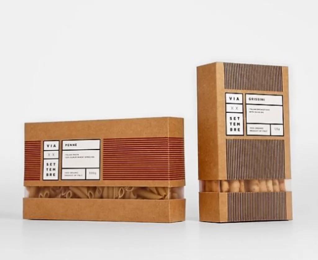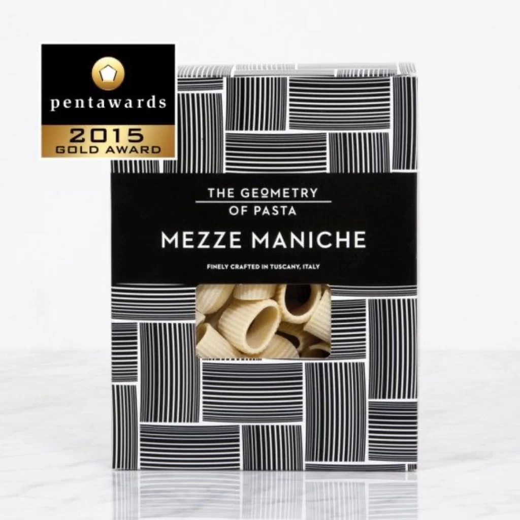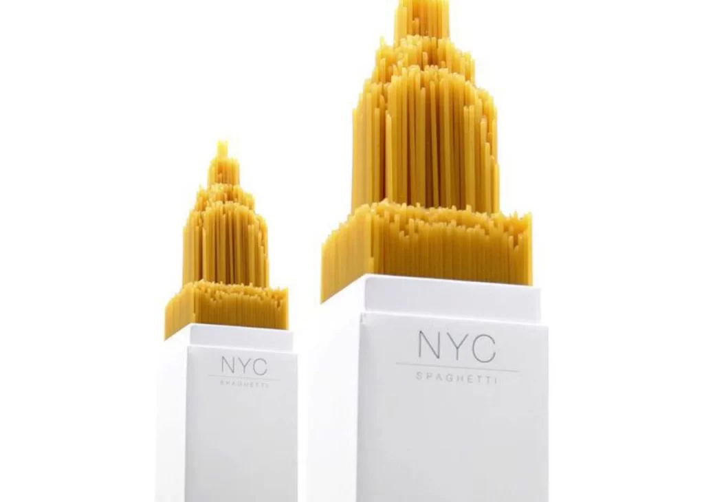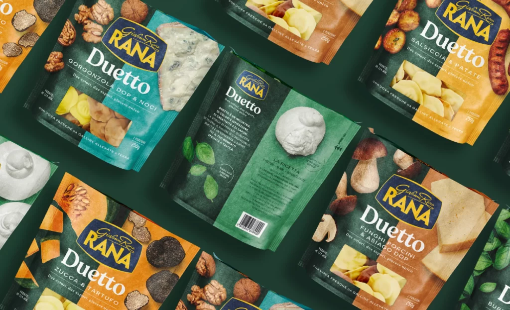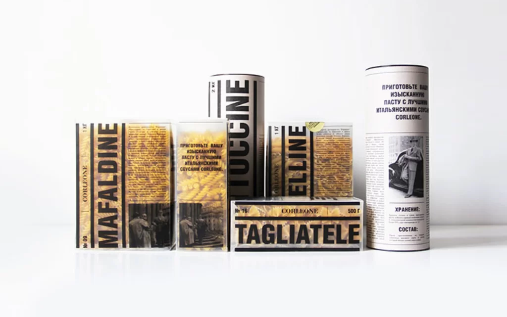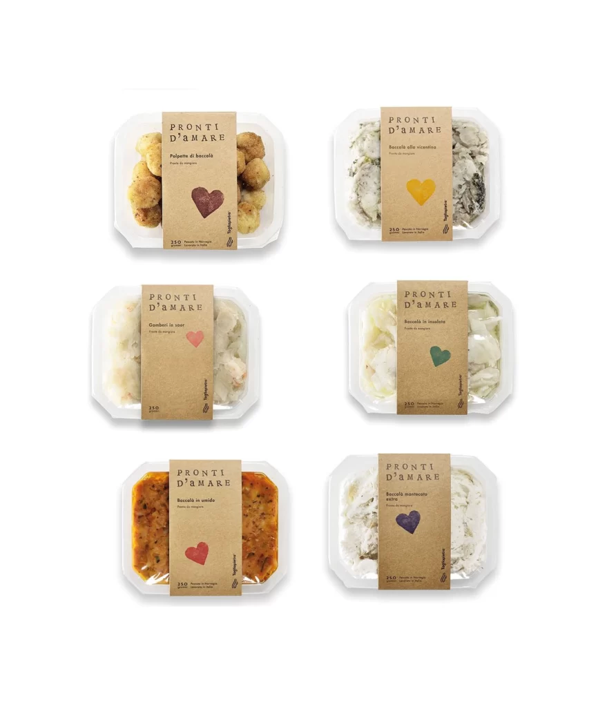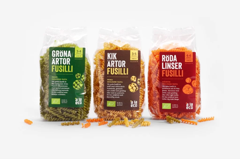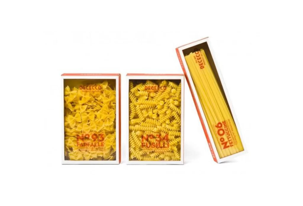
Pasta Packaging Stripes Yellow Green Pink White
DownloadTopics
Details
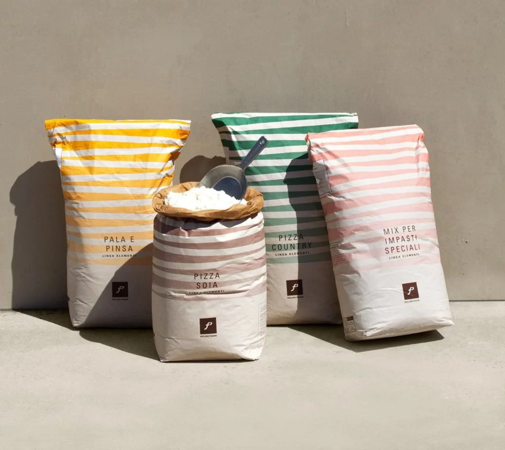
Four flour sacks stand in a staggered row on a pale concrete surface, each wrapped in paper featuring horizontal stripes of varying widths and hues. The leftmost bag displays alternating bands of golden yellow and cream, while the center-back sack shows deep green stripes against white, and the rightmost features soft pink lines. A fourth bag in the foreground wears muted taupe and white stripes, its brown paper rim folded back to reveal white powder and a metal scoop resting inside, all illuminated by bright daylight casting sharp shadows against a neutral gray wall.
The visual rhythm of these striped patterns transforms utilitarian packaging into a cohesive yet varied product line, where color coding likely distinguishes flour types for bakers. Typography remains minimal and centered—'PALA E PINSA,' 'PIZZA SOIA,' 'PIZZA COUNTRY,' and 'MIX PER IMPASTI SPECIALI' appear in clean sans-serif beneath a small square logo with a stylized 'P.' Designers studying this composition will appreciate how the consistent stripe motif unifies the collection while individual colors create instant visual differentiation on retail shelves.
Food photographers and packaging designers might study this arrangement to understand how natural lighting interacts with matte paper textures and how product grouping creates depth without clutter. Art directors developing artisanal baking brands could reference the color palette and typographic hierarchy when conceptualizing their own flour or grain packaging systems. Anyone needing to examine the precise stripe ratios or label placement can access the full-resolution file at no cost directly from the resource library.