Pasta Rotelle Blue Yellow Branding
DownloadTopics
Details
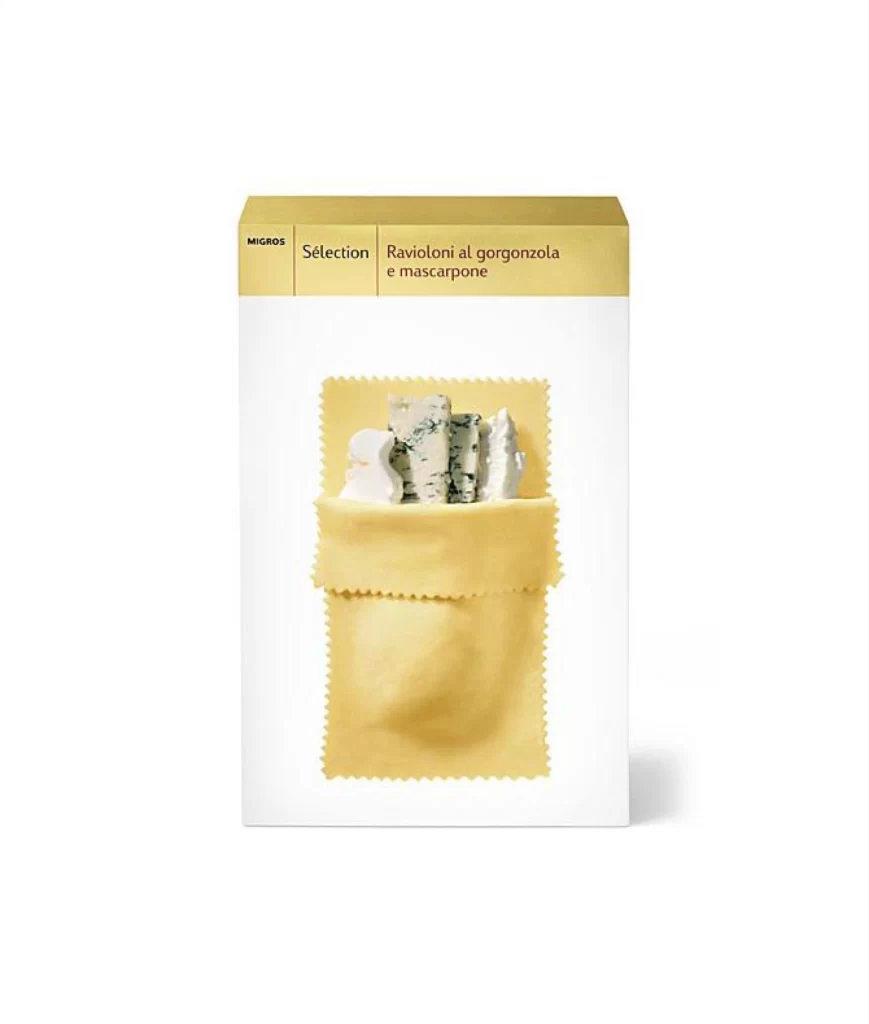
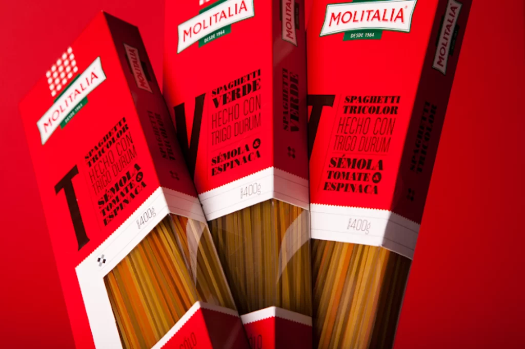
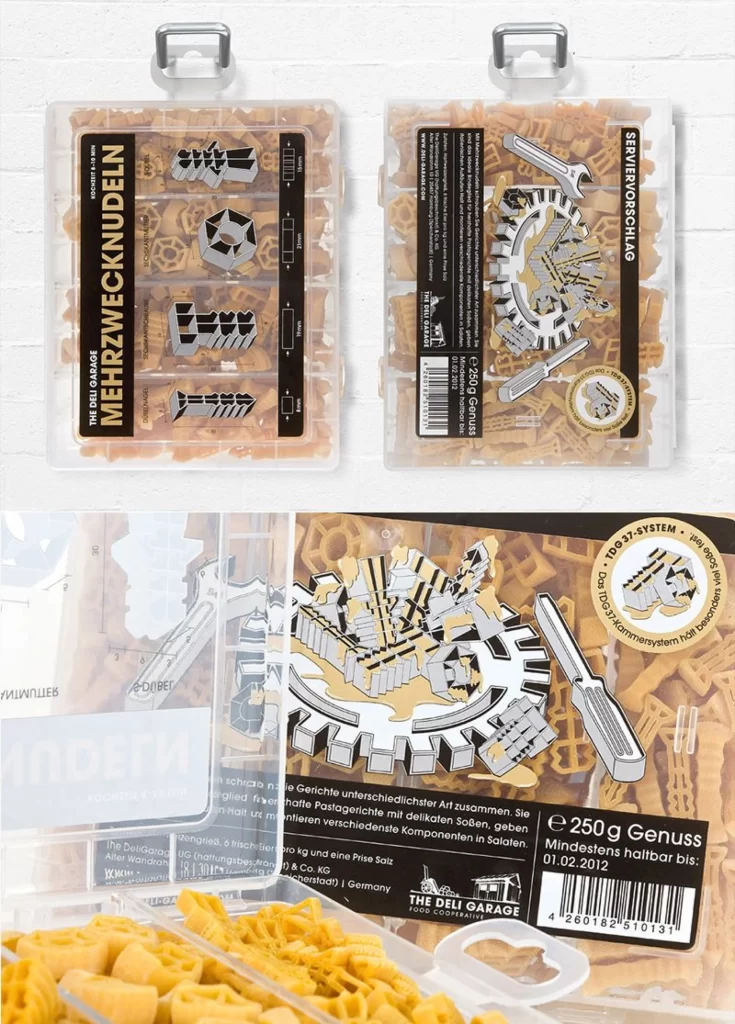
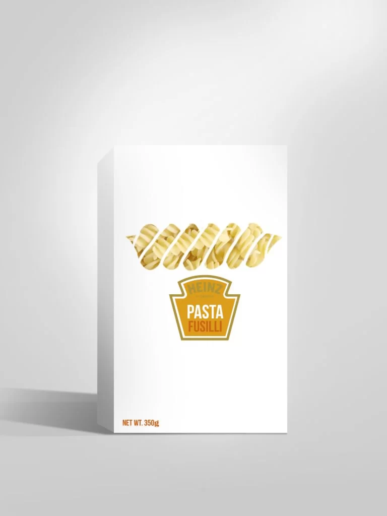
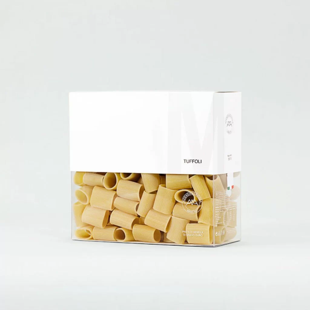
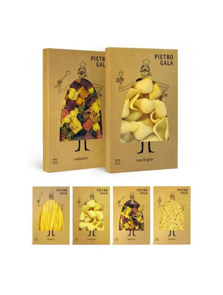
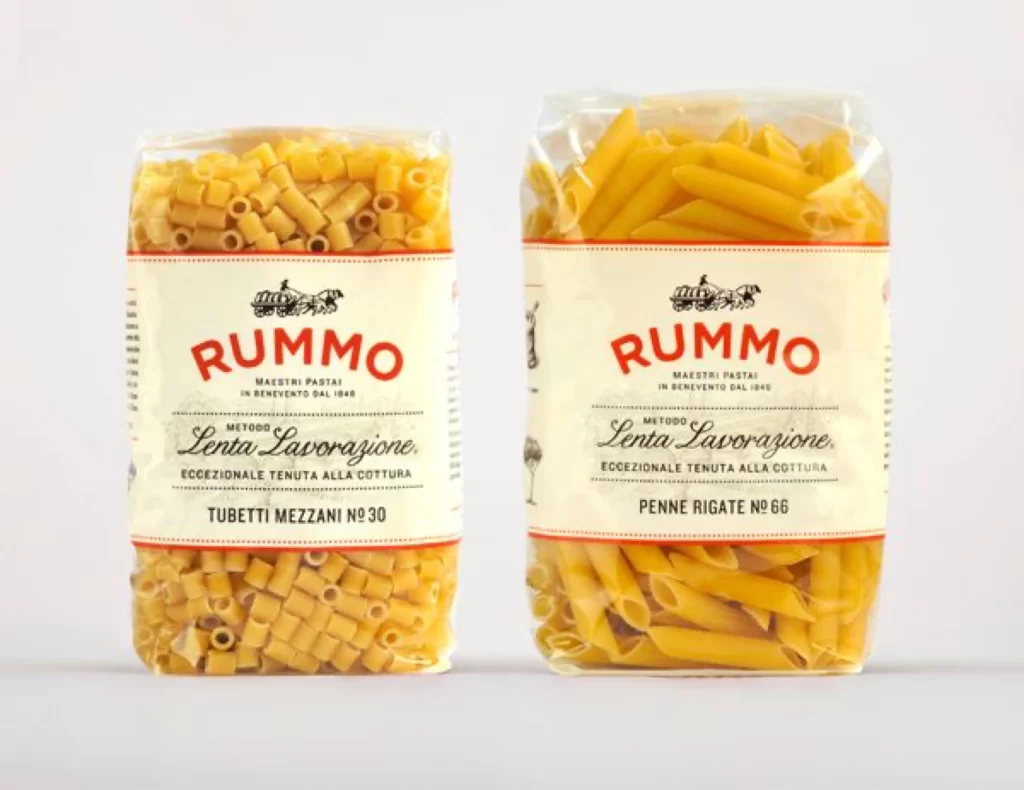
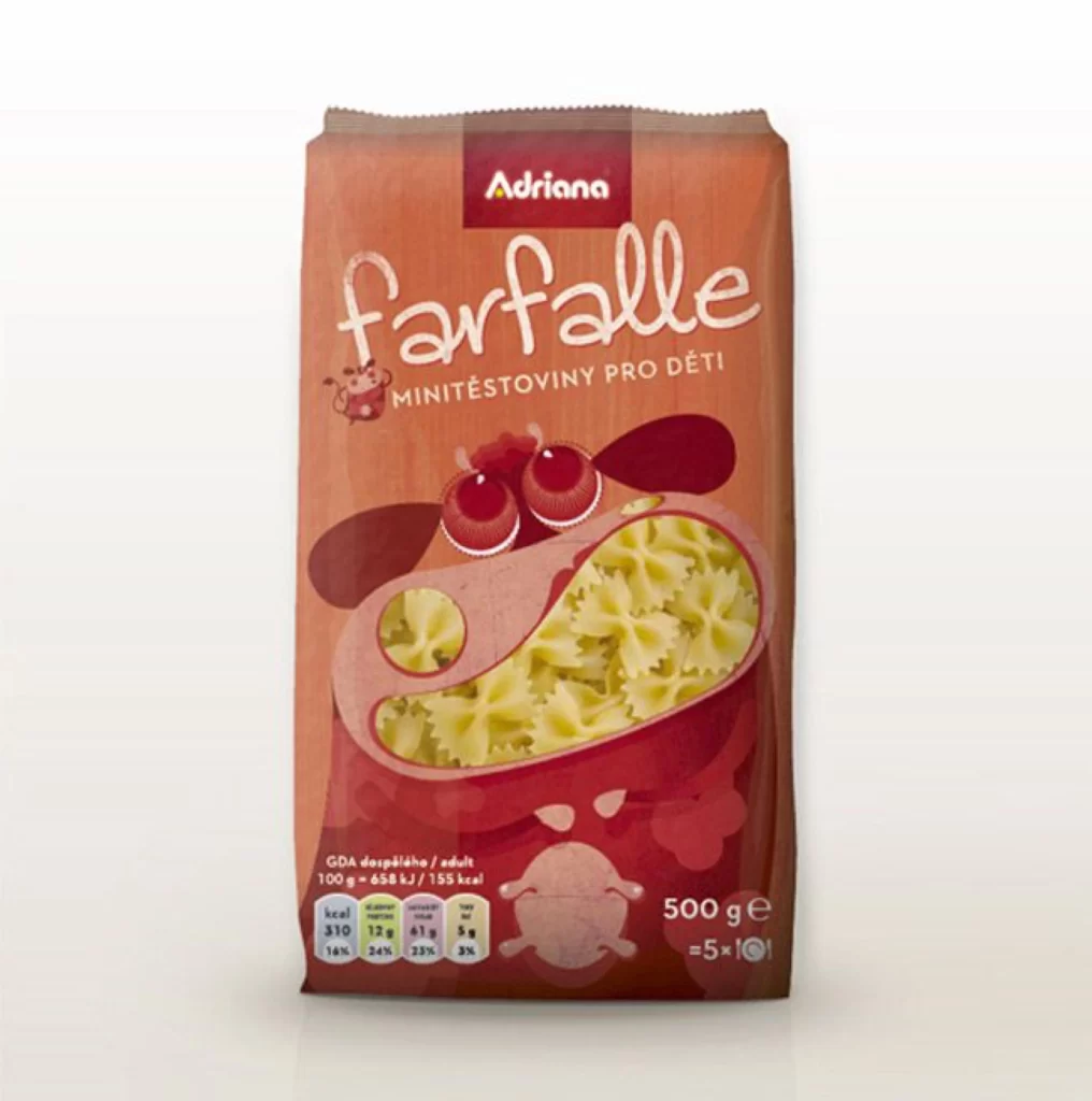
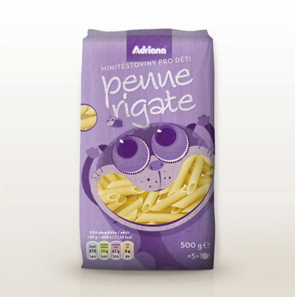
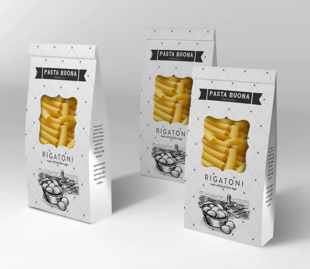
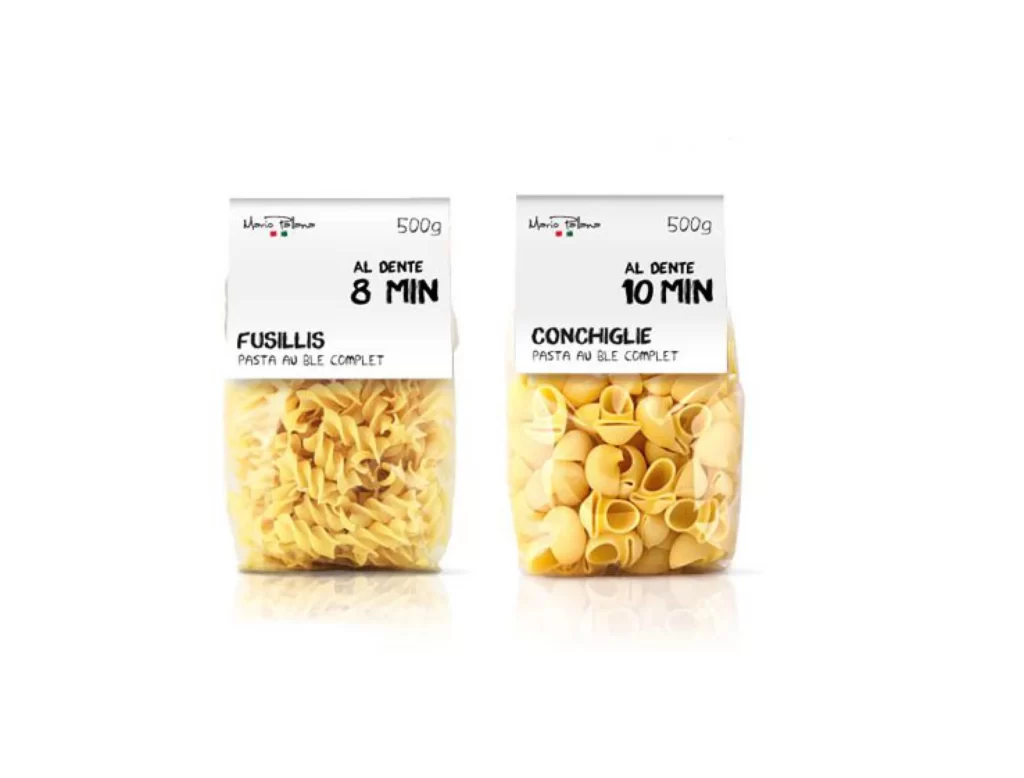
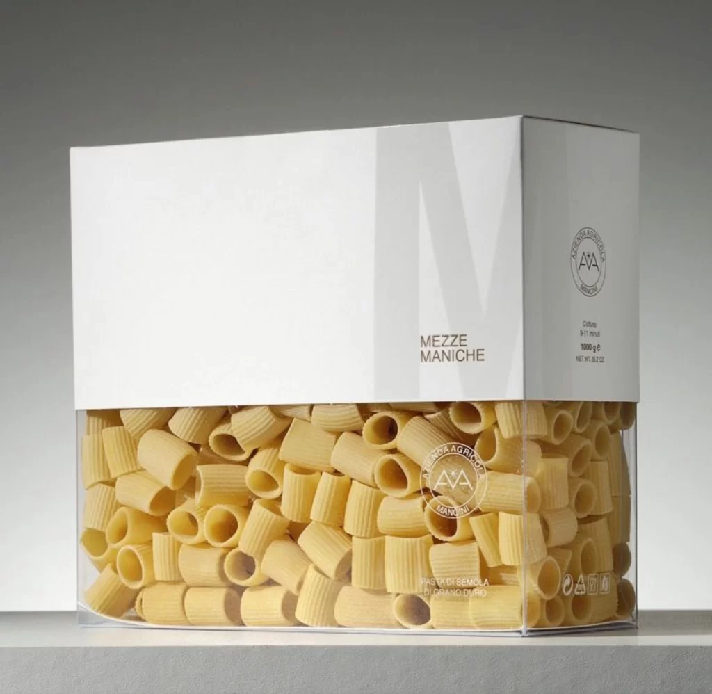
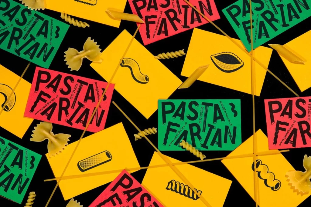
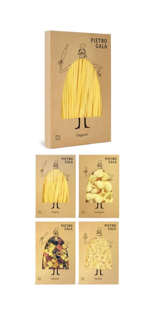
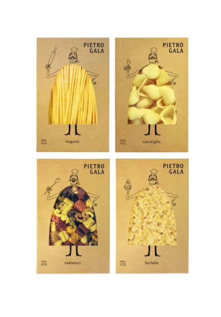
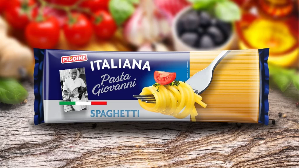
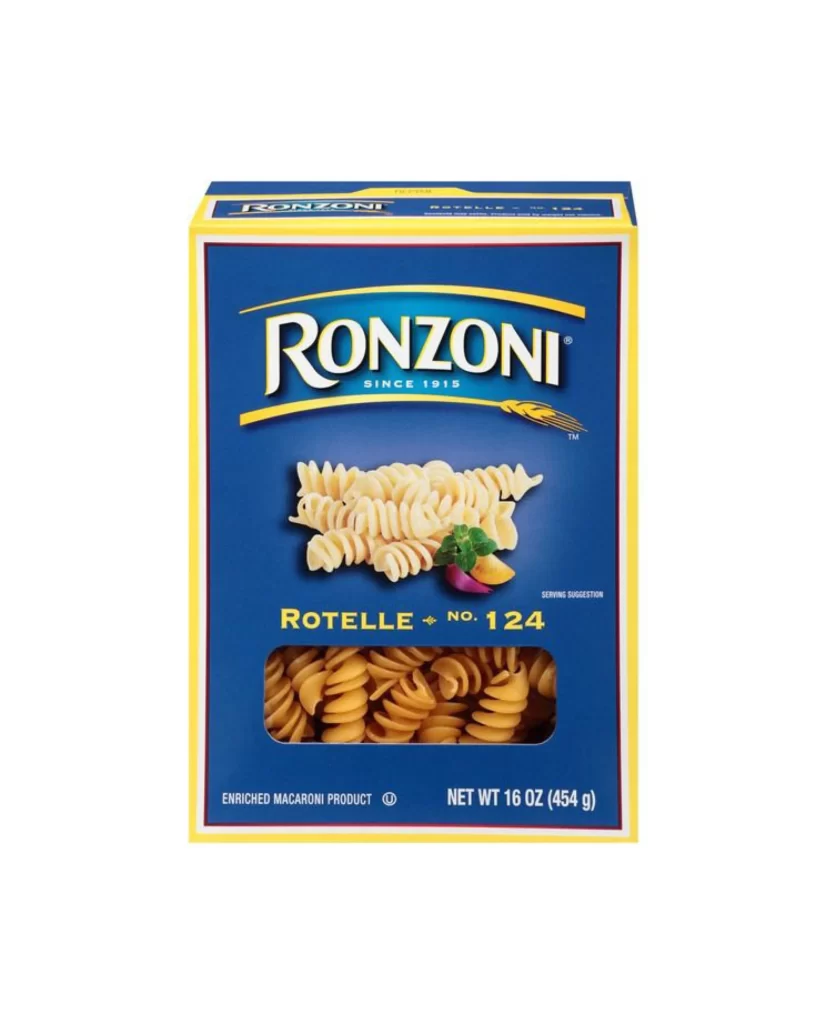
A rectangular cardboard box of Ronzoni Rotelle pasta dominates the frame, featuring a deep royal blue front panel bordered by a thin yellow trim. The brand name appears in large white serif lettering with a golden swoosh underneath, while the product name 'Rotelle No. 124' sits below in bold yellow text. A clear plastic window near the bottom reveals the actual spiral-shaped pasta inside, and small garnish graphics of basil and vegetables accent the central product photograph.
The high-contrast blue and yellow color scheme creates immediate visual impact, making this packaging stand out on retail shelves through its bold primary palette. Typography hierarchy is clearly established between the prominent logo and secondary product information, demonstrating effective brand identity application across different text scales. Designers studying packaging layouts can examine how the window cutout integrates with the printed elements to create a cohesive presentation.
Food photographers might reference this shot to understand standard e-commerce lighting setups for grocery items, while packaging students could analyze the balance between photography and graphic elements. Brand identity professionals examining historical food packaging trends will find the consistent use of the wheat sheaf motif particularly noteworthy for trademark studies. Anyone needing detailed visual specifications can access the full-resolution file at no cost directly from the resource library.