Pasta Rummo Yellow Red Vintage
DownloadTopics
Details
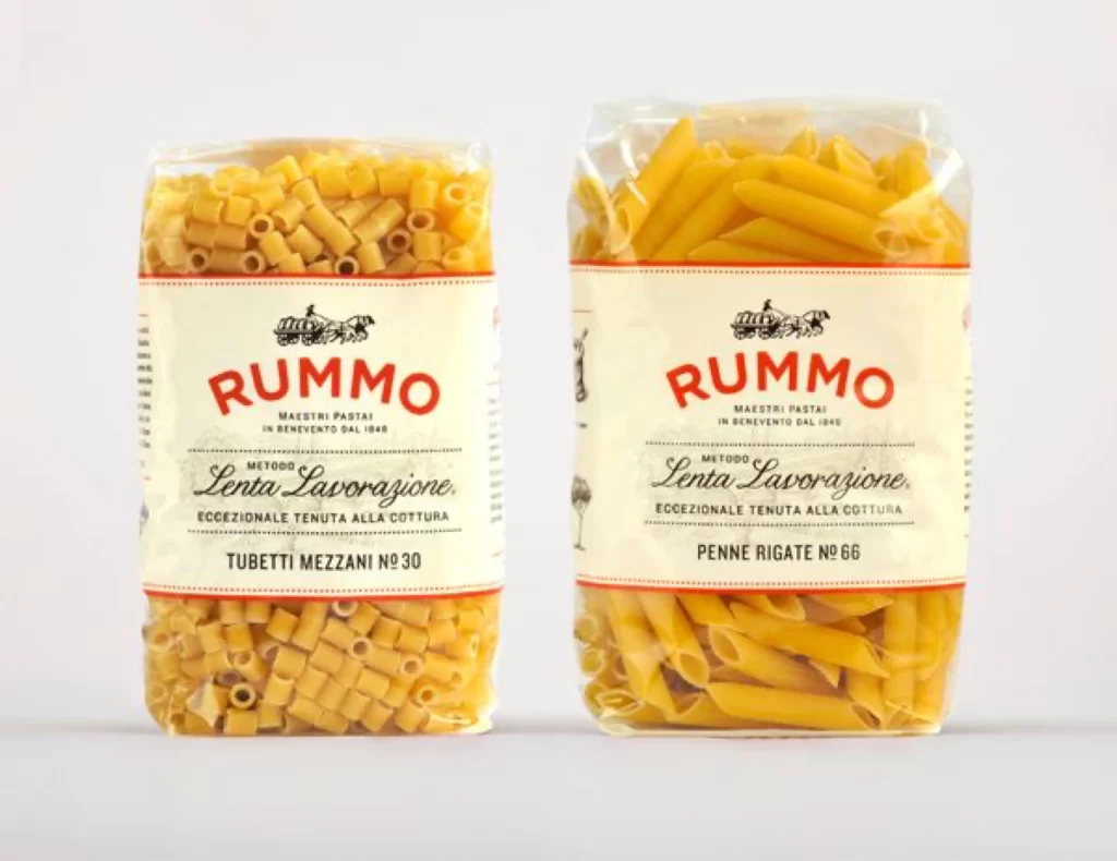
Two transparent plastic bags of Rummo pasta stand side by side, each filled with golden-yellow dried noodles and wrapped with a cream-colored paper label. The left package contains short, hollow cylindrical tubes identified as Tubetti Mezzani No 30, while the right holds angled penne shapes labeled Penne Rigate No 66. Both labels feature bold red serif lettering spelling RUMMO above an illustration of a horse-drawn carriage, with black cursive script reading Lenta Lavorazione beneath it. A thin red border lines the top and bottom of each label, and the entire arrangement sits on a light gray surface under even studio lighting that eliminates harsh shadows.
The visual identity relies on a restrained palette of cream, crimson red, and black that evokes early twentieth-century Italian packaging traditions without veering into kitsch. Typography choices create deliberate contrast between the authoritative weight of the brand name and the elegant, handwritten quality of the production method descriptor. This particular iteration balances industrial transparency—letting the product color and texture remain visible—with nostalgic graphic elements that signal artisanal craftsmanship. Designers studying this composition can access the full-resolution file at no cost to examine how the carriage iconography reinforces the slow-processing narrative.
Brand strategists developing heritage food identities might study the hierarchy between the manufacturer name, regional origin text, and specific cut designation to understand effective information layering. Packaging engineers could reference the material interplay between glossy film and matte paper stock when planning premium dry-goods presentations. Art directors working on editorial spreads about Italian culinary traditions would find the symmetrical two-SKU layout useful for demonstrating product line consistency across different pasta shapes.