Coffee Gallo Black Yellow Vintage Typography
DownloadTopics
Details
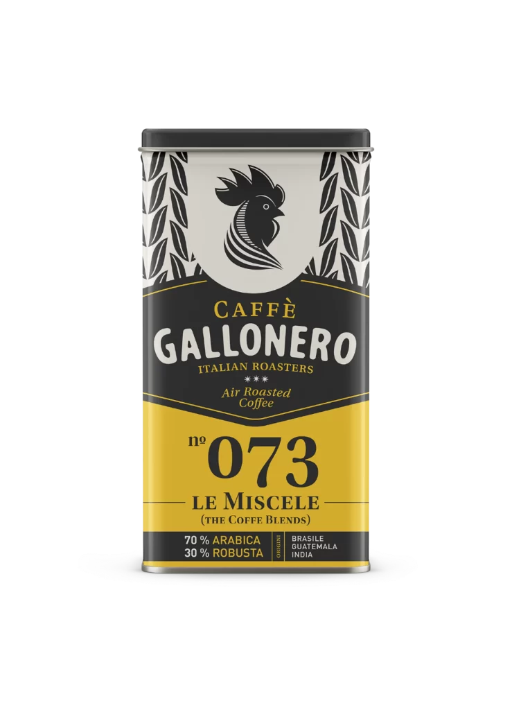
A rectangular metal tin with a dark charcoal lid stands as the central subject, its surface divided into distinct horizontal bands of black, cream, and golden yellow. At the top, a stylized rooster head in solid black sits within a circular cream field, flanked by vertical columns of leaf-like patterns. Bold serif typography spells out 'CAFFÈ GALLONERO' above the product number 'n° 073' and the blend name 'LE MISCELE', while a bottom strip details the 70% Arabica and 30% Robusta composition sourced from Brazil, Guatemala, and India. Soft studio lighting casts subtle shadows that emphasize the cylindrical form and metallic sheen of the container.
Visual interest stems from the deliberate contrast between the vintage-inspired color palette and modern typographic hierarchy, where the oversized numerals command immediate attention against the vibrant yellow field. The rooster iconography adds a rustic, artisanal character that balances the clean lines of the sans-serif origin text and decorative chevron borders. Designers studying this composition will appreciate how the three-tone structure creates natural reading zones while maintaining cohesive brand identity through consistent stroke weights across all graphic elements. The complete high-resolution asset can be accessed at no cost for detailed examination of these print techniques.
Packaging professionals developing premium coffee brands might analyze this tin to understand how vintage aesthetics communicate quality and tradition without appearing dated. Typography enthusiasts could reference the mixed-weight lettering system when constructing their own label hierarchies that require both elegance and readability. Illustrators seeking to master icon integration within circular frames would benefit from studying how the rooster silhouette interacts with surrounding negative space. Anyone building a mood board for retro-modern food packaging will find the specific combination of agricultural motifs and bold numbering particularly instructive for balancing heritage cues with contemporary clarity.