Vintage Retro Rounded Yellow Red Sparkle Typography Design
DownloadTopics
Details
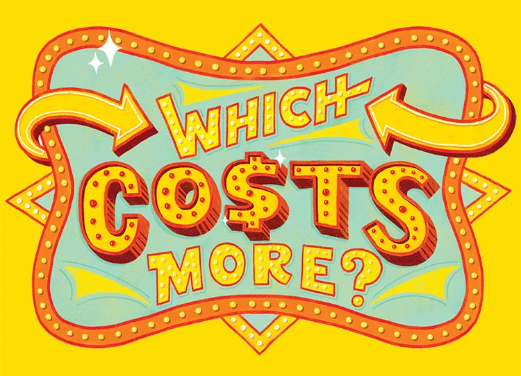
A marquee-style signboard dominates the composition, featuring a wavy red border studded with yellow light bulbs that encloses a pale cyan interior field. Bold, rounded typography in yellow with red drop shadows spells out the phrase "WHICH COSTS MORE?" across the center, where the letter S in COSTS is replaced by a dollar sign symbol. Two thick, curved yellow arrows point inward from the left and right edges toward the text, while small white starbursts and diamond shapes accent the upper and lower portions of the frame against a solid bright yellow backdrop.
The visual appeal stems from its theatrical carnival aesthetic, combining bulb-lit frame textures with playful 1950s-inspired letterforms that feature internal dot patterns suggesting illuminated signage. This particular execution balances high-contrast warm tones against cool cyan fields to create immediate visual pop without sacrificing legibility. Designers seeking the complete asset can access the full-resolution file at no cost through the platform's repository.
Game developers creating price-comparison mini-games or quiz interfaces would find this graphic immediately applicable as a title card or transition screen. Educational content creators building financial literacy materials for children might deploy this eye-catching header to introduce lessons about value assessment. Event planners designing fairground or retro-themed promotional collateral could adapt the arrow motifs and color palette for directional signage or menu headers.