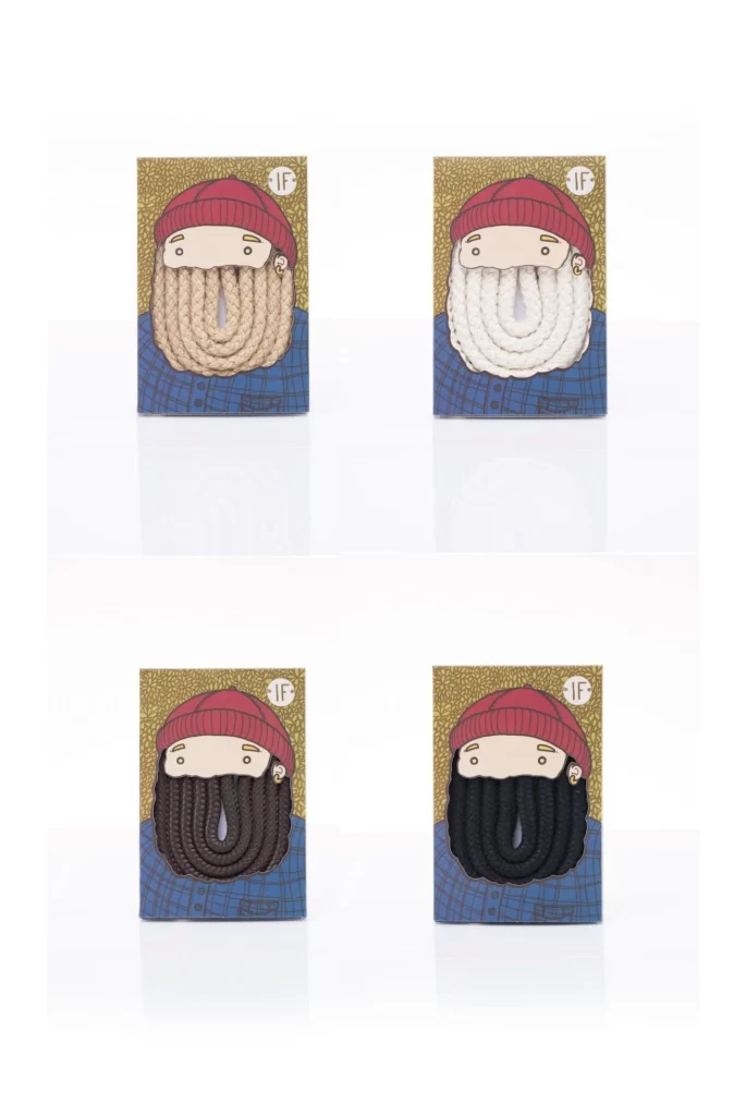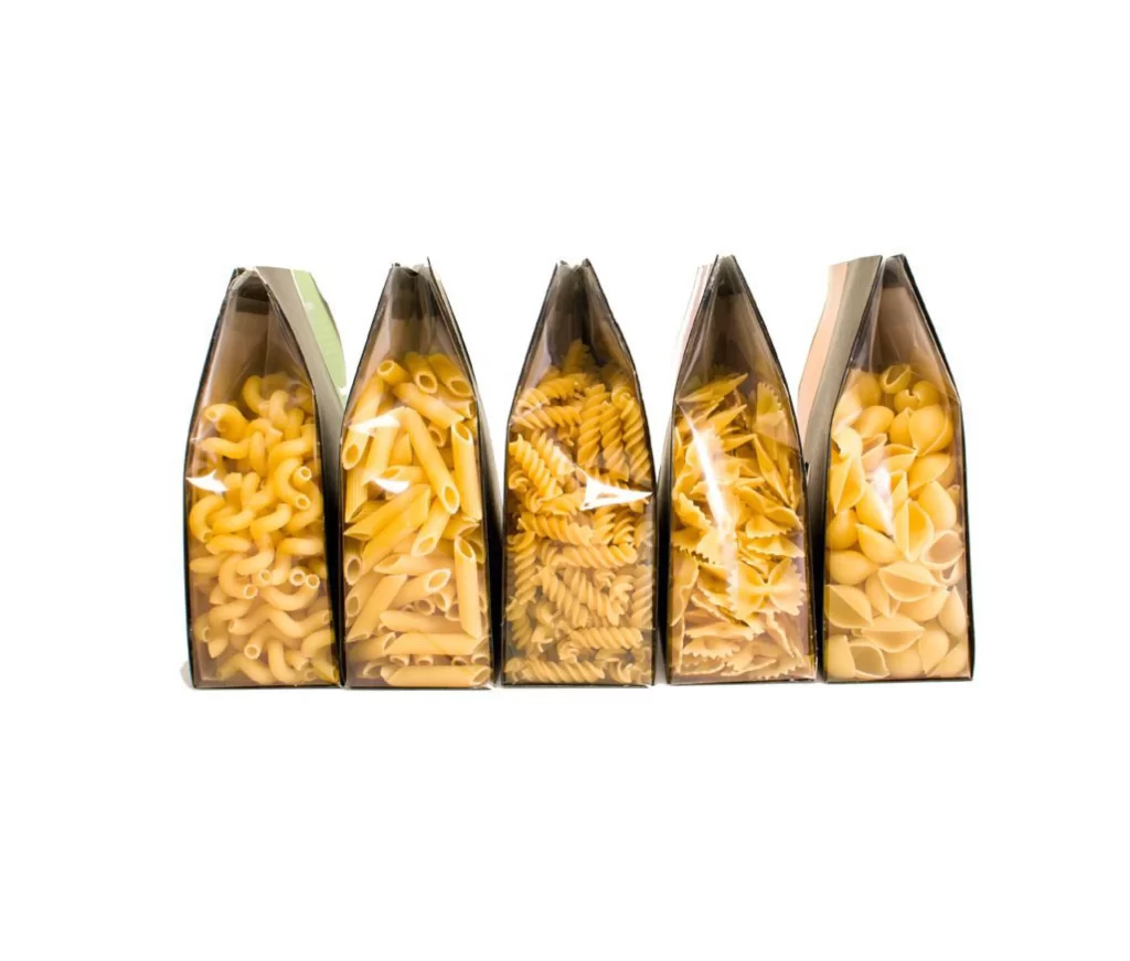
Pasta Packaging White Black Red Yellow
DownloadTopics
Details
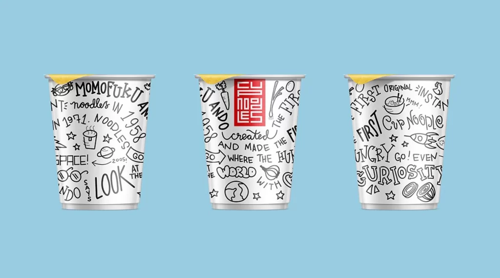
Three cylindrical noodle cups stand in a row against a light blue backdrop, each wrapped in white paper covered with dense, hand-drawn black doodles and text. The left and right containers display scattered phrases like "MOMOFUKU," "INSTANT NOODLES IN 1971," and "FIRST CUP NOODLE" alongside stars, planets, and noodle illustrations, while the center cup features a bold red rectangular logo with white geometric characters. A sliver of yellow peeks from the top rim of each cup, suggesting a foil seal or lid beneath the paper sleeve.
What sets this packaging apart is the chaotic yet playful energy of its sketch-style typography, which feels like a notebook page filled with food history trivia and space-age enthusiasm. The red logo on the middle cup provides a striking focal point that breaks up the monochrome pattern, creating visual rhythm across the trio. Anyone studying this composition can grab the full-resolution file at no cost to examine how the line weights and lettering styles interact across the curved surfaces.
Brand designers working on artisanal snack products might study these cups to understand how hand-lettered elements can convey authenticity without looking messy. Packaging illustrators could reference the way text wraps around cylindrical forms to plan their own label layouts for round containers. Students of visual communication might also analyze the balance between the busy doodle fields and that clean red centerpiece as a lesson in focal hierarchy.