Pasta Packaging Kanro Yellow Orange
DownloadTopics
Details
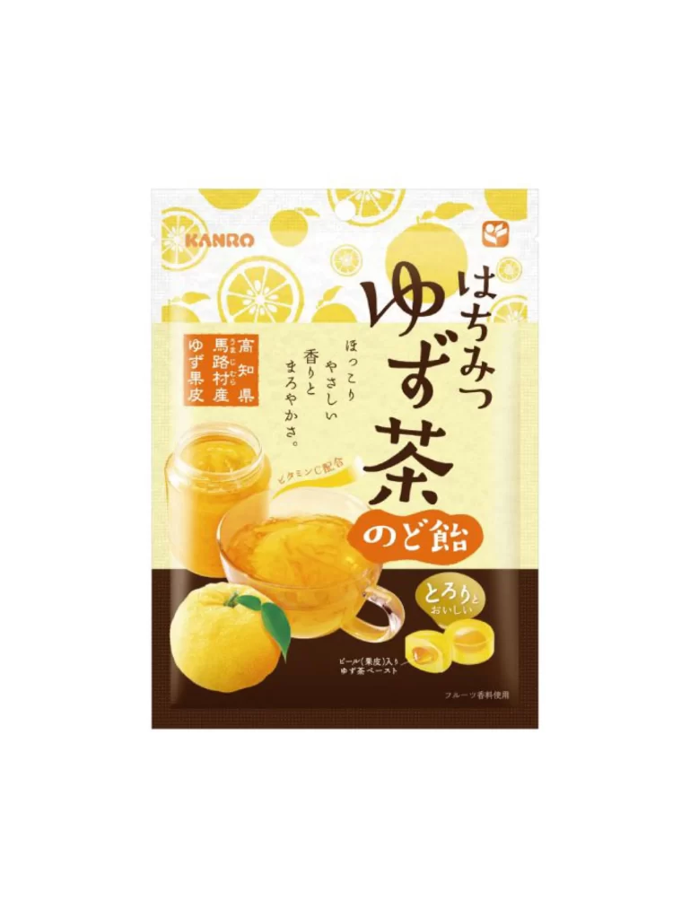
A rectangular foil pouch displays a bright yellow and cream color palette, featuring the KANRO brand logo in the upper left corner. The central composition includes a glass jar of golden honey, a clear mug filled with amber liquid, and a whole yuzu fruit with a green leaf resting in the foreground. Large black Japanese characters spell out 'Hachimiyuzu Cha no Dorame' (Honey Yuzu Tea Candy) against a patterned background of sliced citrus fruits and whole lemons.
Visual interest arises from the strategic contrast between the dark brown lower band and the luminous upper section, which draws immediate attention to the product photography. The typography employs a mix of bold calligraphic strokes for the main title and smaller sans-serif text for descriptive elements, creating a clear hierarchy that guides the eye across the package surface. Designers studying Japanese confectionery packaging will appreciate how the translucent candy samples in the bottom right corner reinforce the product's texture and form.
Food photographers and packaging specialists might utilize this reference to analyze lighting techniques on reflective glass surfaces and the arrangement of complementary props. Brand identity developers could examine the integration of traditional Japanese script with modern graphic elements to create culturally resonant yet contemporary aesthetics. The complete high-resolution asset can be accessed at no cost for those needing to inspect fine details like the embossed texture patterns or color calibration values.