Pasta Spaghetti Bobs Green Yellow White
DownloadTopics
Details
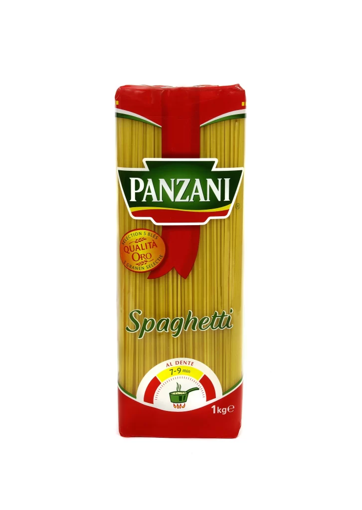
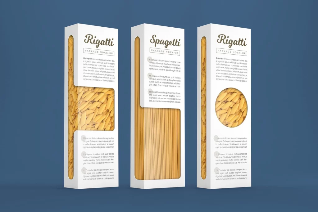
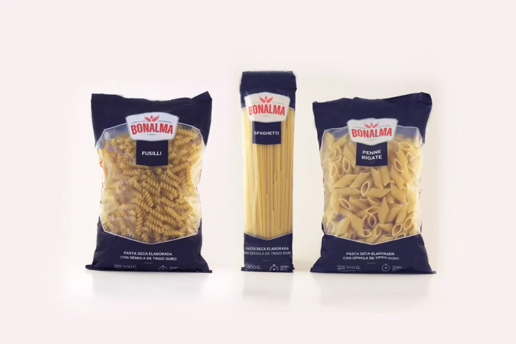
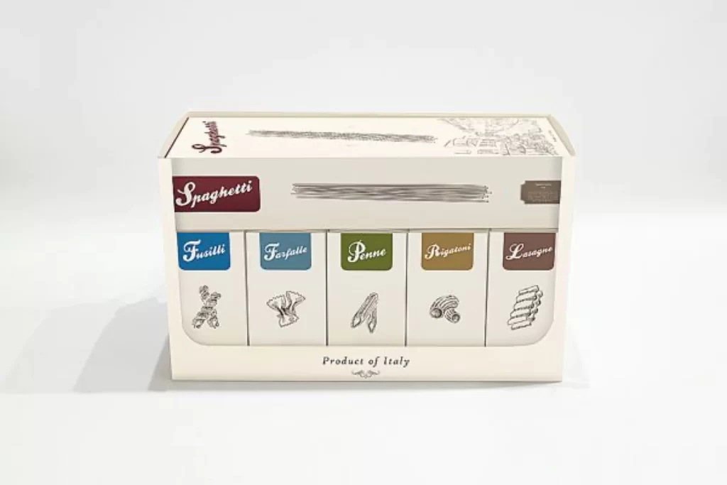
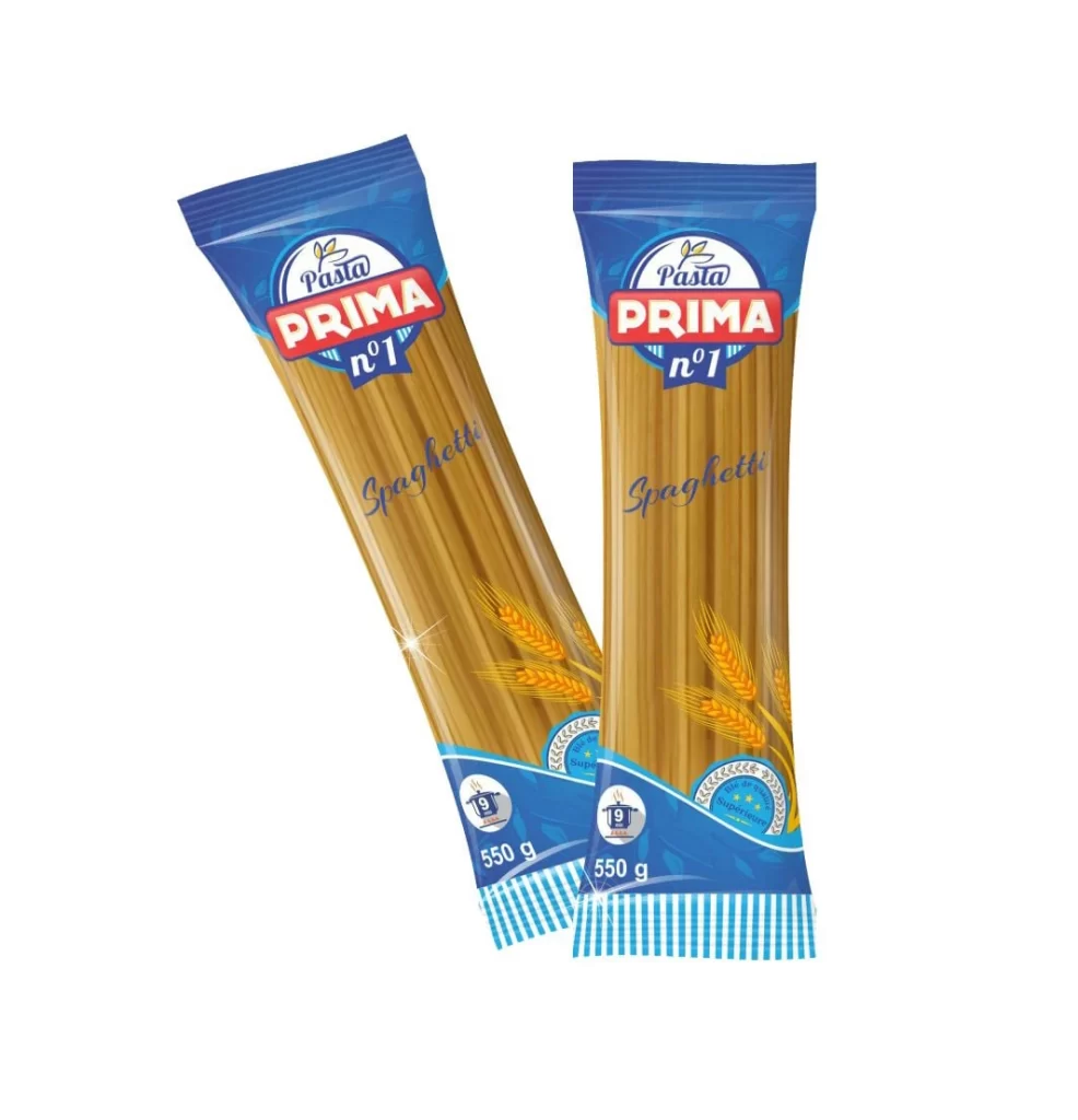
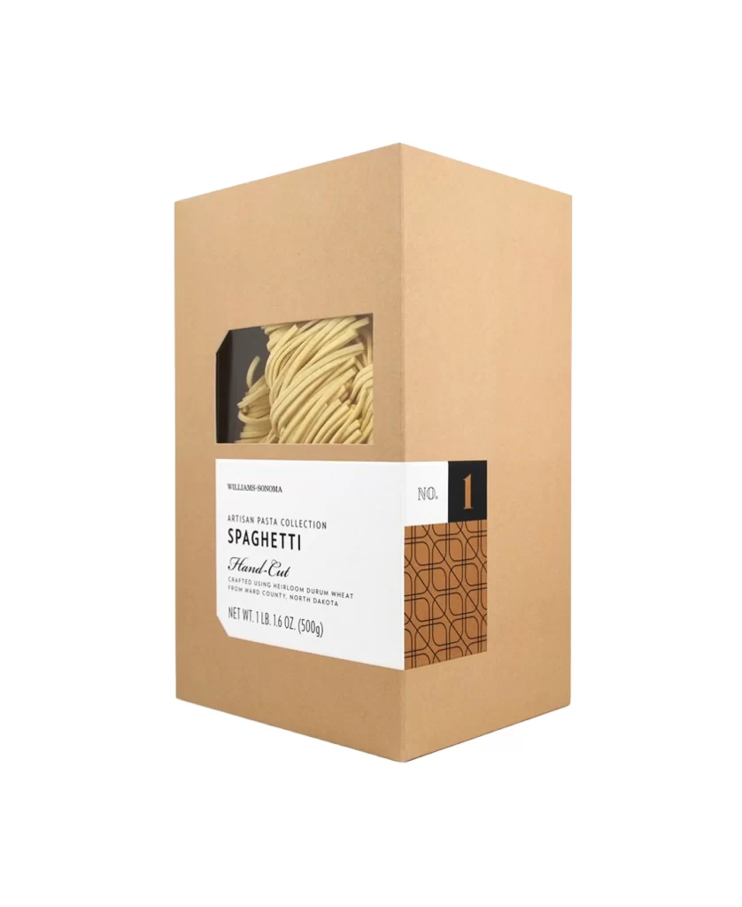
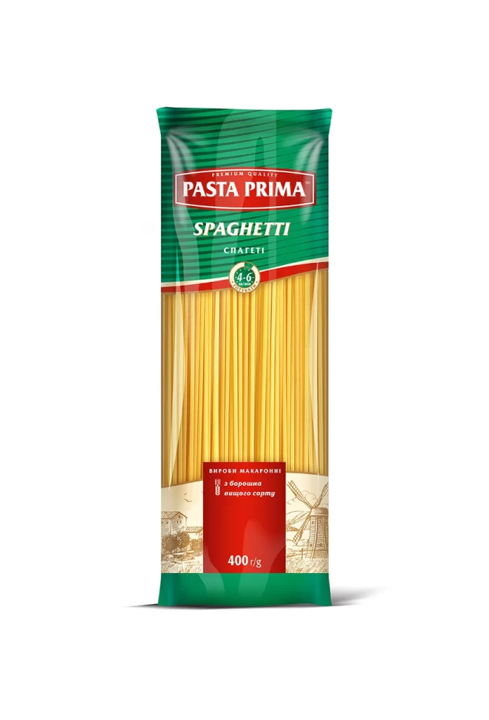
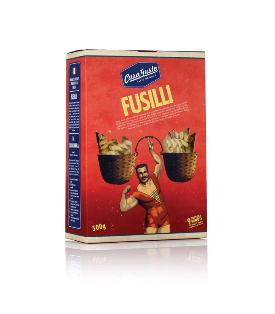
Three vertical pasta packages stand in a row against a solid blue backdrop, with the central bag rendered in sharp focus while the flanking ones blur into the distance. Each wrapper features a deep forest-green upper section that transitions into white at the bottom, separated by a wavy golden band revealing long, thin spaghetti strands inside. Bold yellow lettering spells out 'BOB'S' within an oval logo topped by a cartoon chef waving from beneath his toque, while elegant white cursive below identifies the product as 'Spaghetti' with a 1mm diameter specification printed in smaller type.
The packaging design leverages a vibrant color palette of green, yellow, and white to create strong shelf presence, complemented by realistic food photography showing twirled noodles on a fork garnished with basil and tomato. Bilingual text in French and English emphasizes quality claims such as '100% Durum wheat semolina' and cooking times of seven to eight minutes, appealing to diverse consumer markets. Designers studying this composition will appreciate how the depth-of-field effect draws immediate attention to the primary product while maintaining context through the supporting packages.
Brand identity specialists and packaging students can analyze the typographic hierarchy and mascot integration to understand effective grocery-store visual communication. Food photographers might reference the lighting setup and fork styling when planning their own dry-goods shoots. Anyone needing detailed texture samples of crinkled plastic film or printed cardboard surfaces for mockup work can grab the full-resolution file without cost from the resource library.