Giovanni Rana Spaghetti Pasta Packaging
DownloadTopics
Details
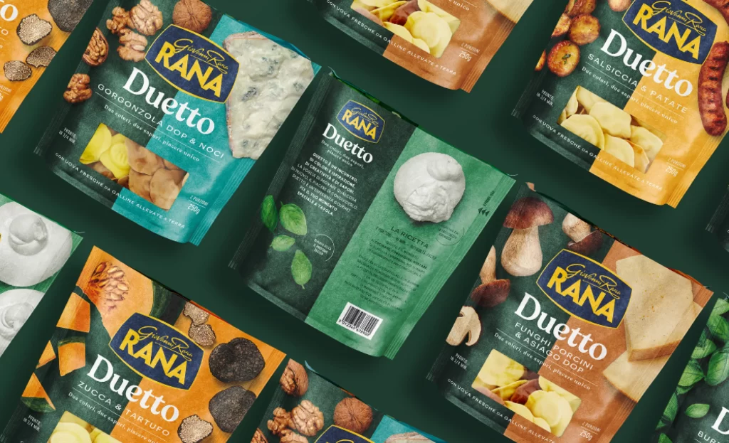
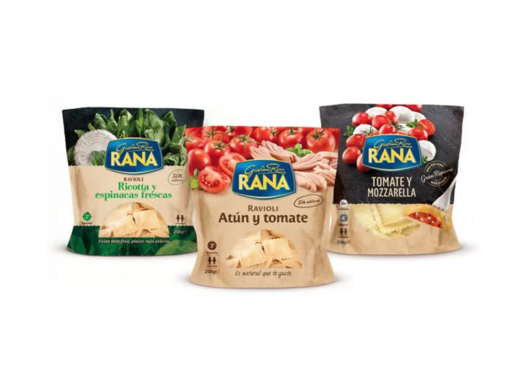
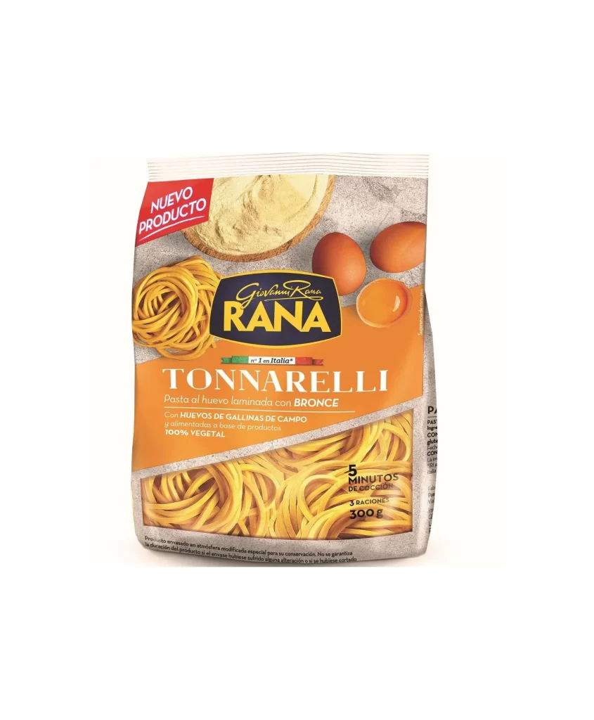
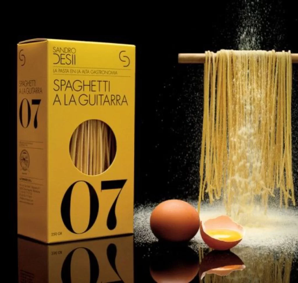
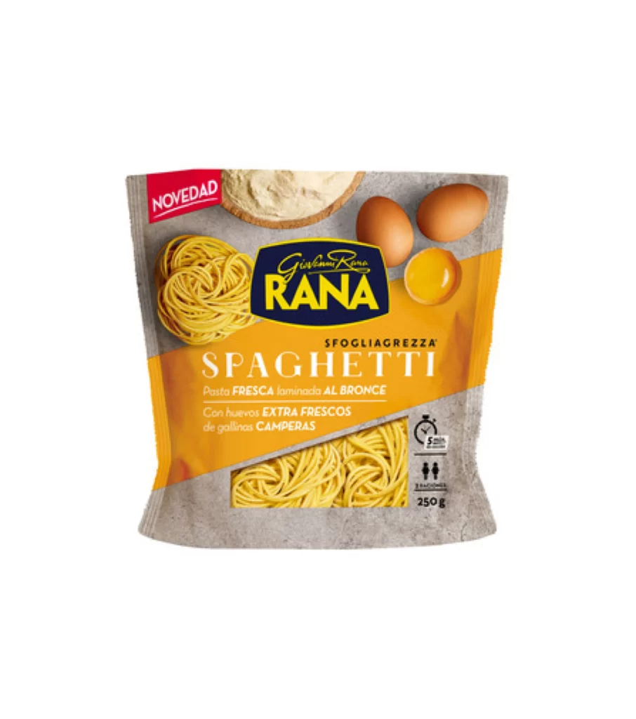
A 250g pouch of Giovanni Rana Spaghetti SfogliaGrezza dominates the frame with its industrial-chic aesthetic, featuring a textured gray kraft base overlaid by a bold diagonal orange band. The brand's signature navy blue shield anchors the upper center, displaying 'RANA' in heavy yellow sans-serif type above the product name in clean white lettering. Visual ingredients—including two whole brown eggs, one cracked yolk, a mound of pale flour, and a tangled nest of golden pasta—cluster across the top half, while a transparent window at the bottom reveals the actual spaghetti strands inside.
The packaging leverages a sophisticated split-composition strategy that balances artisanal cues with modern retail efficiency, using the rough paper texture to suggest handcrafted quality while the vibrant orange stripe ensures shelf visibility. A red 'NOVEDAD' banner in the upper left corner introduces urgency through color contrast, and the inclusion of cooking metrics—specifically a five-minute timer icon alongside serving-size pictograms—adds functional data without cluttering the primary visual hierarchy. Designers studying this reference will note how the diagonal geometry creates dynamic movement that guides the eye from brand mark to product window.
Food photographers and packaging art directors frequently utilize such commercial shots to reverse-engineer lighting setups for reflective plastic films and matte paper substrates, while 3D texture artists extract surface details for photorealistic material shaders. The typographic hierarchy here demonstrates effective weight distribution between script logotypes and utilitarian nutritional information, offering a template for balancing decorative branding with regulatory text. Anyone needing to analyze the print finish or color separation can access the full-resolution file directly from the resource library.