Spaghetti Antonio Amato Blue Red Yellow
DownloadTopics
Details
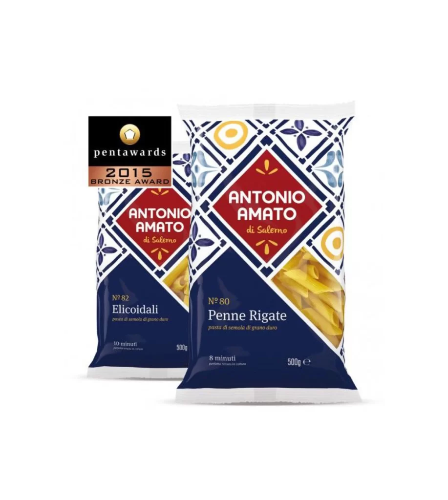
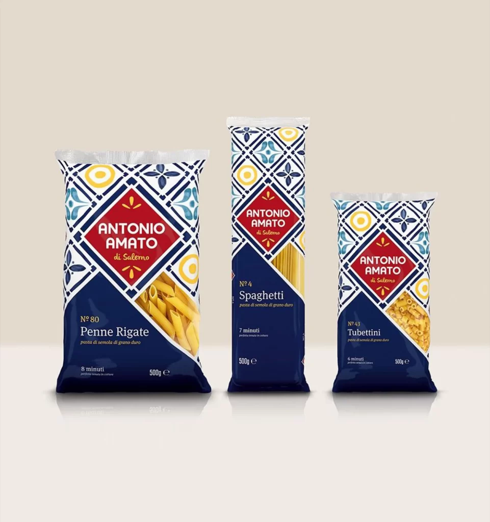
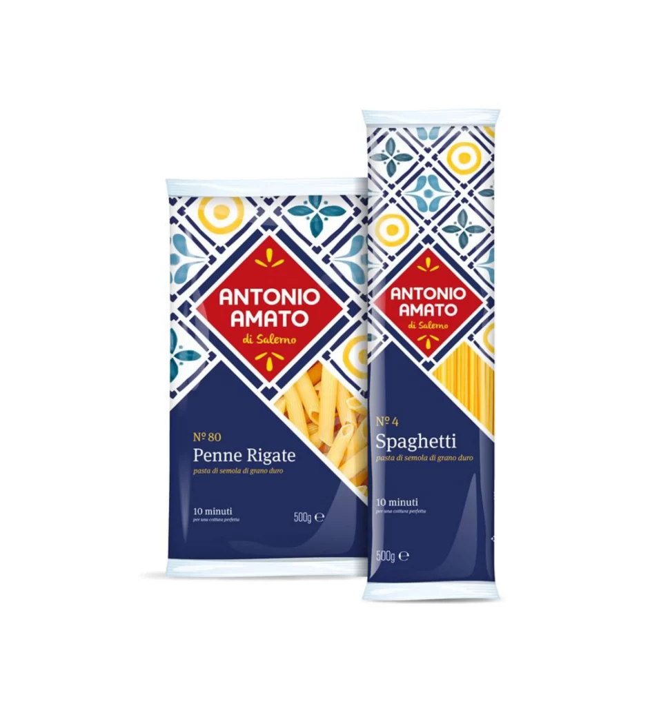
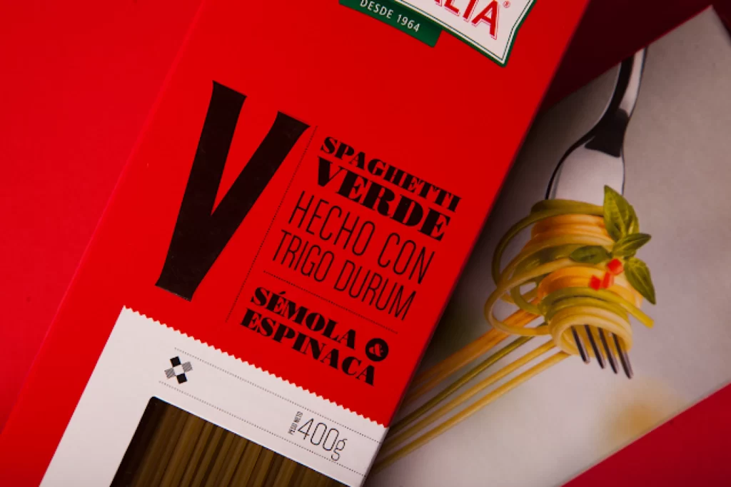
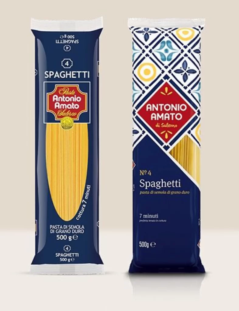
Two vertical pasta packages stand side by side, each housing 500 grams of spaghetti and sharing a deep navy base that anchors their distinct visual identities. The left wrapper features a traditional layout with a red shield crest bearing the 'Antonio Amato di Salerno' name in white serif lettering, while the right package introduces a bold geometric pattern of interlocking diamonds in cobalt, cream, and pale yellow that evokes Mediterranean tilework. Both designs display golden pasta strands through transparent windows, with cooking times and product specifications printed in clean typography along the lower portions.
Visual tension arises from the juxtaposition of heritage branding against contemporary pattern application, where the right-hand variant abandons the conventional shield logo for a diamond-framed wordmark that integrates seamlessly with its ornamental background. This duality offers a compelling case study in brand evolution, demonstrating how a single product line can maintain color consistency while radically shifting its decorative language to appeal to different market segments. Designers examining these packages will note the strategic use of the number four as a recurring motif that bridges both aesthetic approaches.
Packaging professionals analyzing this comparison can extract valuable insights regarding typographic hierarchy and the balance between illustrative elements and essential nutritional information. Brand strategists might leverage this reference when presenting rebranding options to clients in the food sector, illustrating how regional motifs like majolica patterns can modernize legacy packaging without alienating existing customers. The full-resolution asset is provided at no cost for those needing to inspect finer details of the print finishes or color separations.