Pasta Spaghetti Primvs Black Gold
DownloadTopics
Details
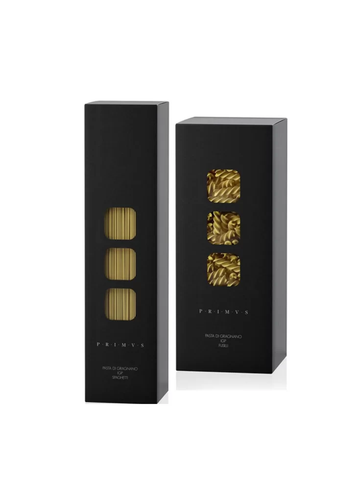
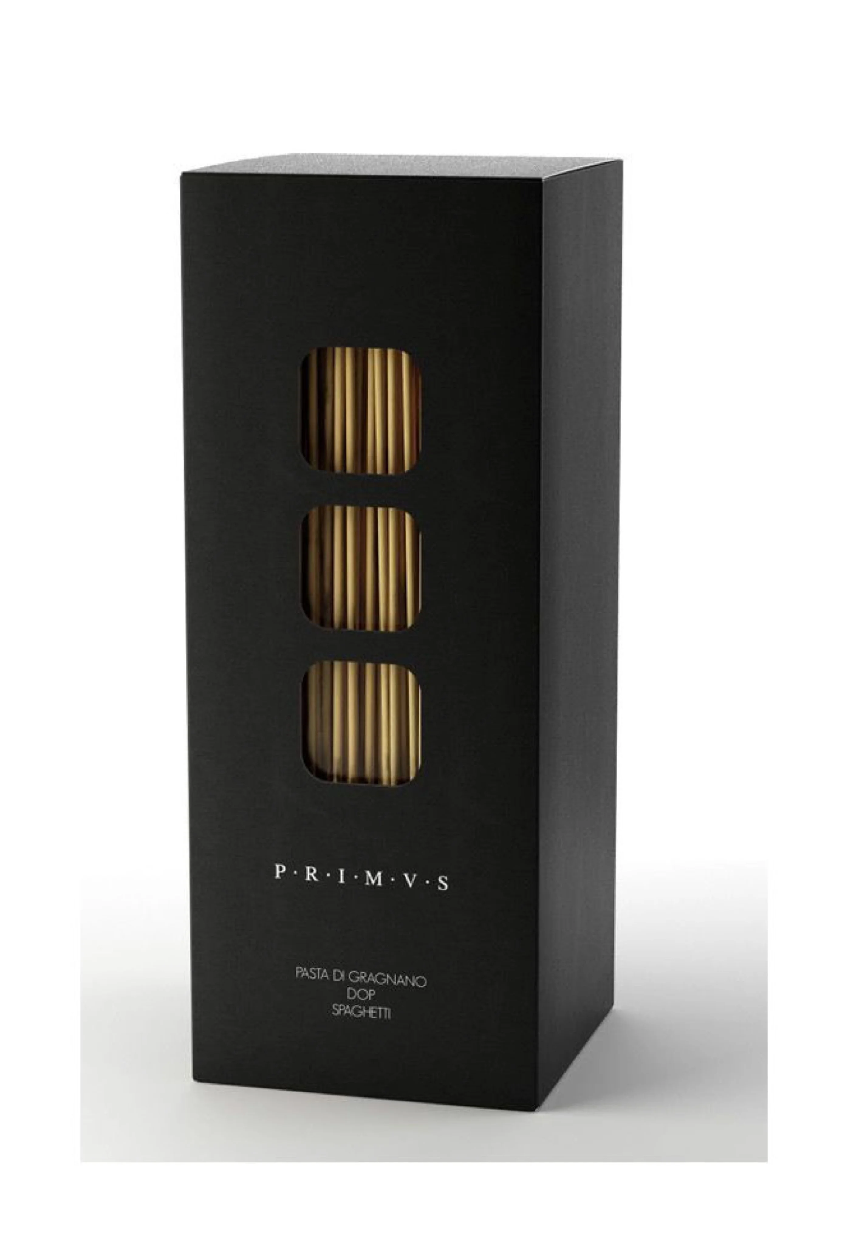
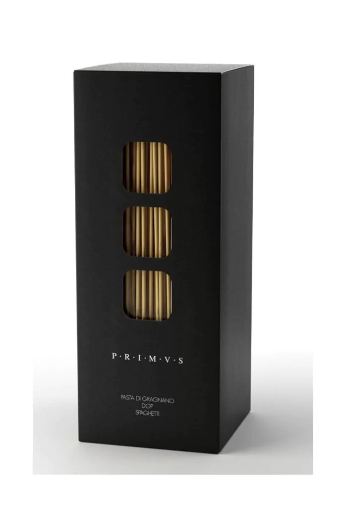
Matte black cardboard forms a tall rectangular prism, standing upright with three identical rounded-square windows cut into its front face. Through these apertures, bundles of pale golden spaghetti strands appear in vertical alignment, their cylindrical textures catching soft directional light from the upper left. The brand name PRIMVS sits below the windows in widely spaced white capitals, followed by smaller text identifying the contents as Pasta di Gragnano DOP Spaghetti, all set against a neutral light-gray surface that fades into white at the edges.
What distinguishes this packaging is the architectural rhythm of those three viewing portals, which transform a standard food container into something resembling a luxury perfume box or gallery display case. The extreme contrast between the light-absorbing black exterior and the luminous wheat-colored pasta within creates immediate visual tension, while the generous negative space around the typography signals premium positioning rather than mass-market commodity. Designers studying this composition will note how the transparent sections function as both practical product visibility and abstract geometric ornamentation.

Packaging architects and brand identity specialists might reference these proportions when developing high-end dry-goods containers that require both shelf presence and tactile sophistication. The specific typographic hierarchy—brand above product classification—offers a template for minimalist labeling systems where breathing room communicates value as much as the materials themselves. Anyone needing to analyze the interplay between opaque substrates and die-cut reveal windows can access the full-resolution file without cost directly from the resource archive.