Pasta Packaging Asian Black Gold Traditional
DownloadTopics
Details
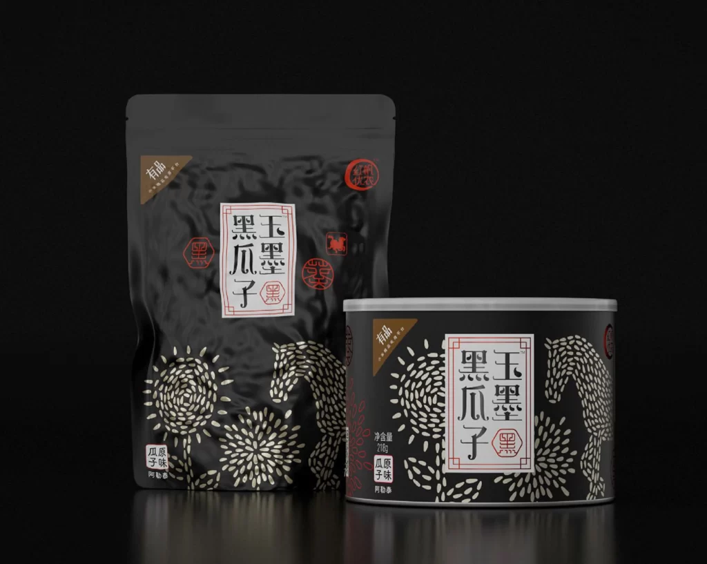
Matte black surfaces define both the stand-up pouch and the cylindrical tin, creating a sophisticated monochrome foundation for this product display. The packaging features prominent white Chinese characters reading '玉墨黑瓜子' within a red rectangular border, surrounded by intricate white patterns resembling sunbursts and stylized horses composed of seed-like dots. Soft studio lighting illuminates the scene from above, casting gentle reflections on the glossy black surface beneath while subtle brown accent labels and red circular seals add warm contrast to the otherwise dark palette.
Visual distinction emerges from the clever interplay between traditional calligraphy and contemporary graphic patterns, where organic seed motifs form recognizable animal silhouettes. The texture variation—ranging from the smooth matte finish of the pouch to the metallic sheen of the tin—creates tactile interest that translates well across digital mediums. Designers can access the complete high-resolution asset pack at no cost to study these material interactions in greater detail.
Brand identity specialists developing premium snack lines or luxury Asian food products would find this composition particularly valuable for understanding how minimal color palettes can convey elegance. Packaging engineers might reference the structural differences between flexible pouches and rigid containers when planning multi-format product launches. Art directors seeking to balance cultural authenticity with modern aesthetics could utilize these visual cues for mood boards or client presentations requiring sophisticated Eastern design elements.