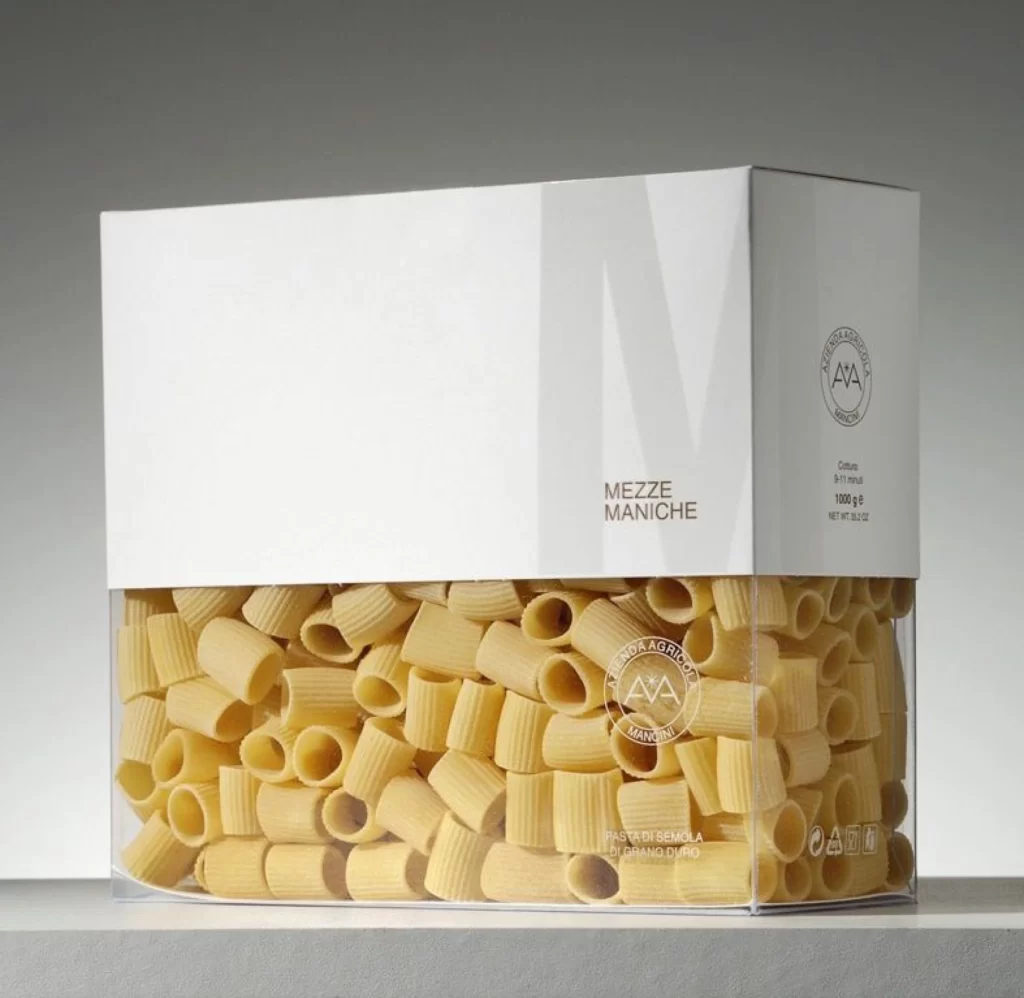
Pasta Mezze Maniche Black White Stripes Modern
DownloadTopics
Details
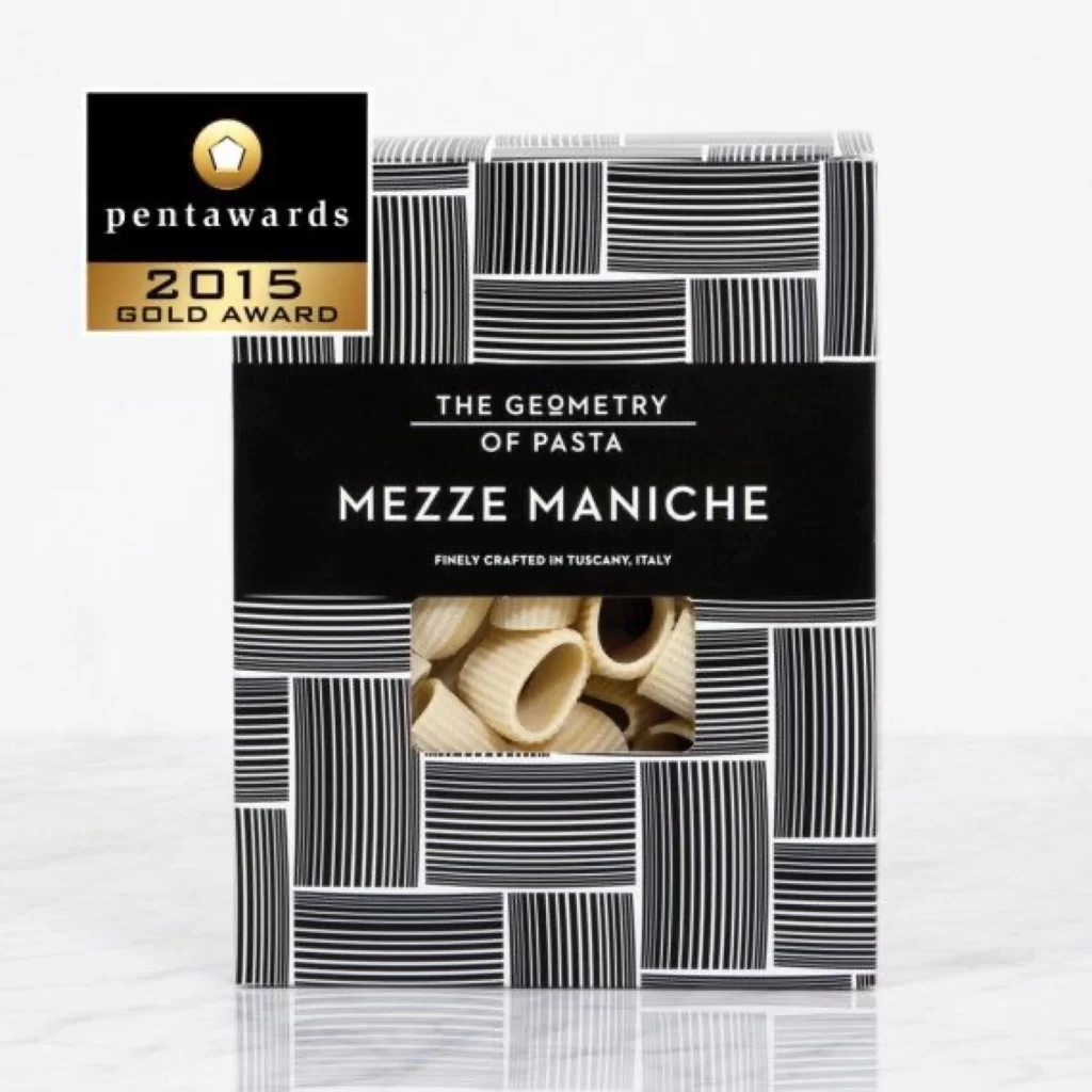
Black and white vertical stripes of varying widths tile across the box surface in an irregular grid pattern, creating a bold graphic texture that contrasts sharply with the solid black central band. White sans-serif text on this band reads 'THE GEOMETRY OF PASTA' above the larger 'MEZZE MANICHE' product name, with smaller copy below stating the item is finely crafted in Tuscany, Italy. A rectangular die-cut window reveals pale cream-colored tubular pasta shapes inside, while a gold and black Pentawards 2015 Gold Award badge sits in the upper left corner against a light gray backdrop.
What sets this packaging apart is its sophisticated play with linear rhythm and negative space, where the striped pattern creates visual movement without overwhelming the essential product information. The geometric theme extends logically from the pasta's cylindrical form to the box's architectural surface treatment, resulting in a cohesive identity that feels both contemporary and artisanal. Designers can grab the full-resolution file at no cost to study how typographic hierarchy balances against complex pattern work.
Brand strategists developing premium food packaging will find this reference particularly useful for understanding how monochromatic palettes can convey luxury without additional production costs. Art directors working on editorial layouts might pull this as a case study for integrating transparent windows into heavily patterned designs without breaking visual continuity. Students analyzing award-winning consumer goods could trace how the striped motif echoes the ridged texture of the dried pasta itself.