Pasta Packaging Brown Stripes Minimalist Design
DownloadTopics
Details
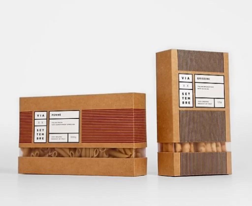
Kraft cardboard boxes with transparent window panels display penne and grissini against a bright, neutral surface. Warm terracotta and charcoal vertical stripes flank the central white label areas, where black sans-serif typography spells out 'VIA', 'SETTEMBRE', 'PENNE', and 'GRISSINI' in a rigid grid. Soft, even lighting eliminates harsh shadows while a straight-on camera angle presents both packages at eye level, emphasizing the tactile paper texture and the organic shapes of the dried pasta visible through the clear lower sections.
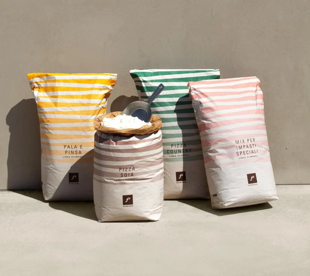
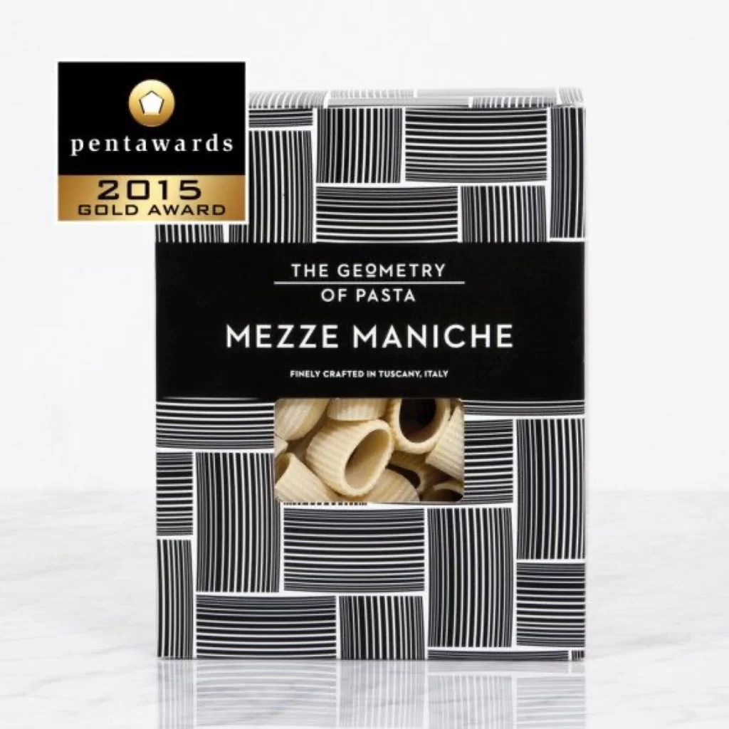
Graphic rhythm emerges from the disciplined interplay between linear hatching and generous negative space, creating a visual cadence that feels both industrial and artisanal. The restricted palette of natural browns, muted reds, and deep greys reinforces an earthy, unpretentious aesthetic that distinguishes these containers from typical supermarket fare. Designers can access the complete high-fidelity asset without cost to study how subtle material contrasts elevate simple geometric forms into sophisticated brand identity.
Brand strategists developing eco-conscious food lines will find this composition particularly useful for mapping out sustainable packaging hierarchies that balance transparency with structural integrity. Art directors tasked with refreshing heritage Italian product ranges might reference the typographic grid to modernize traditional labeling systems without losing cultural resonance. Packaging engineers could also analyze the window placement to optimize product visibility while maintaining the box's structural rigidity during shipping.