Pasta Udon Kanpyo Udon White Black Minimalist
DownloadTopics
Details
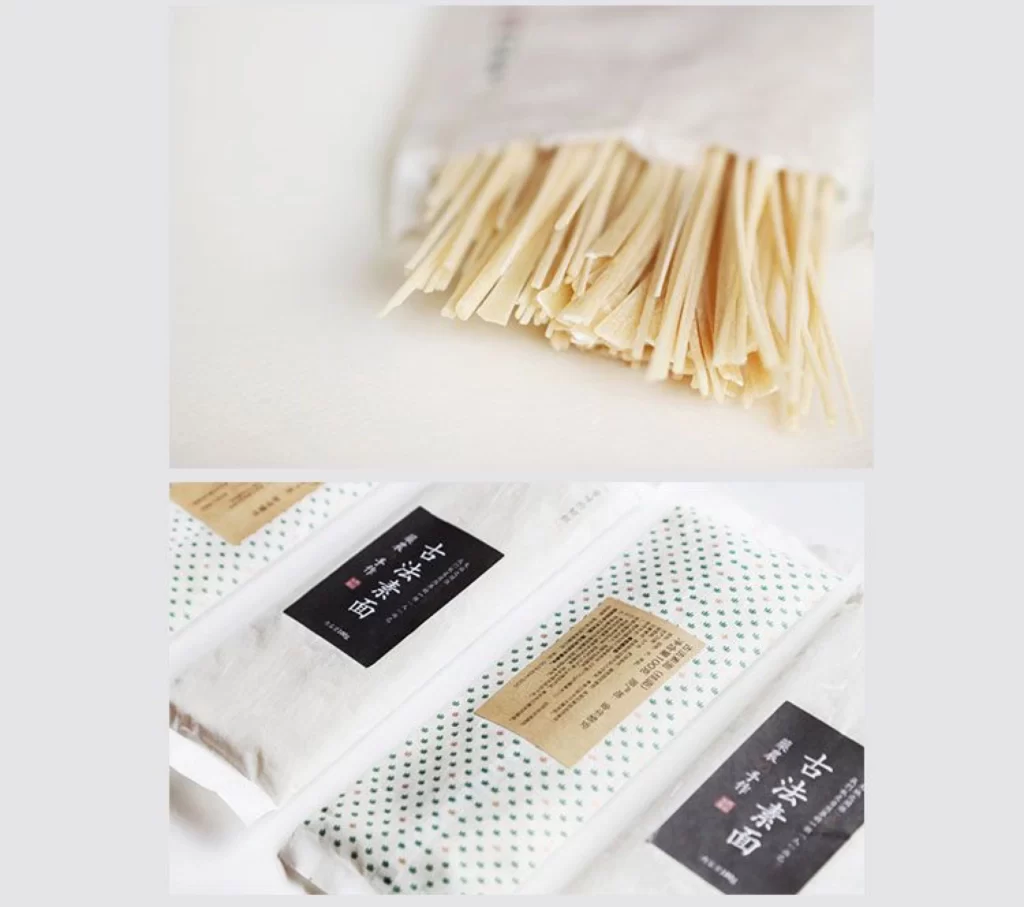
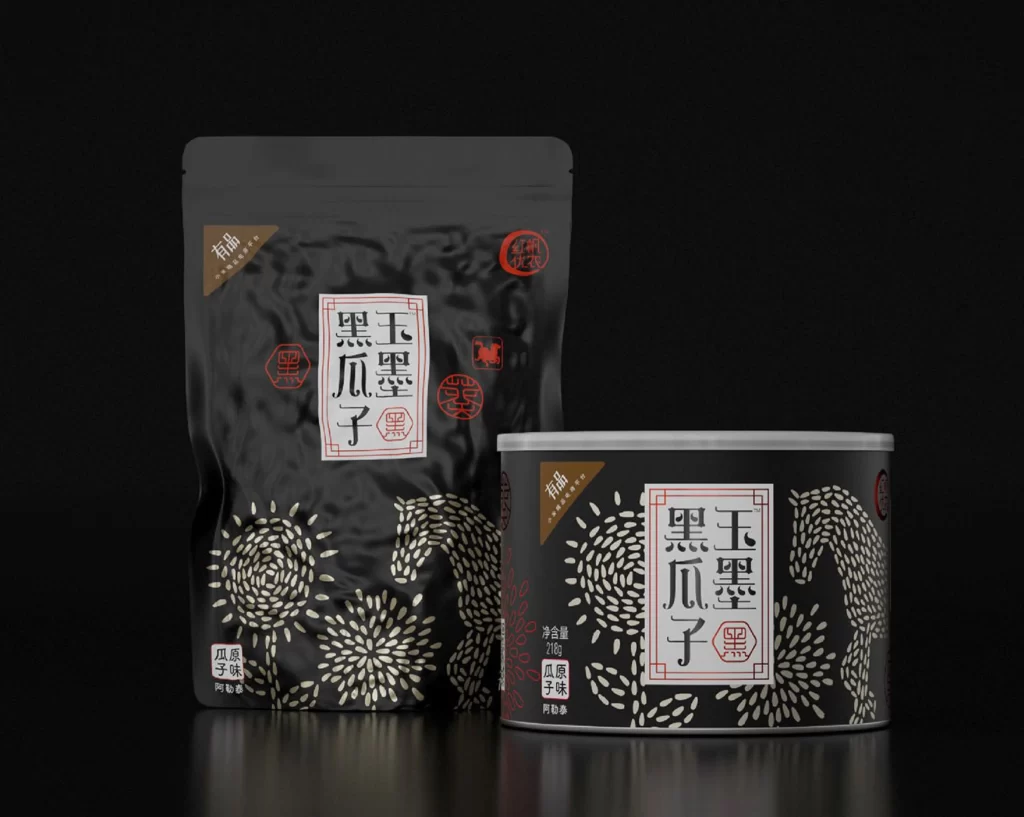
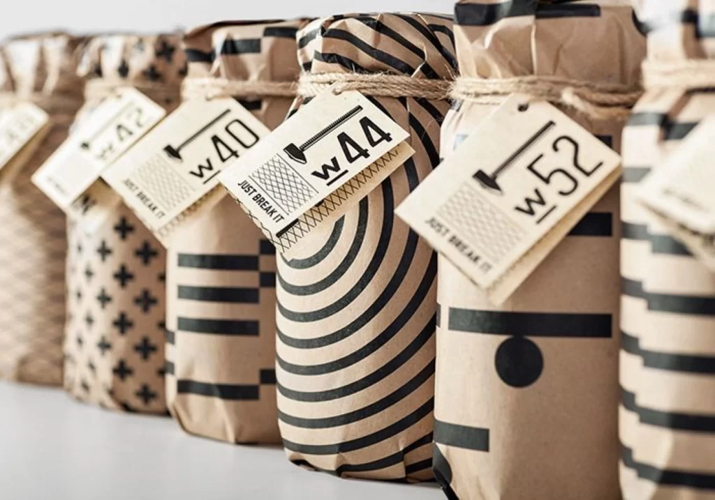
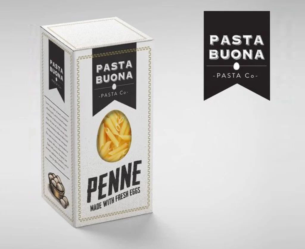
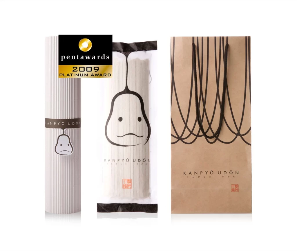
Three distinct packaging formats for Kanpyō Udon stand side by side, showcasing a cohesive visual system built on restrained geometry and a monochrome palette. The leftmost item features a vertically ribbed white cylinder wrapped with a dark band bearing the brand name above a small pear-shaped face icon. Centered is a transparent flat pouch containing pale noodles, dominated by a large minimalist line drawing of the same anthropomorphic pear character with dot eyes and a gentle frown. To the right sits a tall kraft paper shopping bag decorated with looping black cord graphics that echo the hanging theme, all photographed from a straight-on perspective under even studio lighting against a clean backdrop.
Visual interest arises from the clever integration of the product's namesake ingredient—the dried kanpyō gourd strip—into a playful yet sophisticated mascot that appears across every touchpoint. The contrast between the organic curves of the pear illustration and the rigid vertical striations of the cylindrical container creates a pleasing tension between softness and structure. A black and gold Pentawards 2009 Platinum Award badge in the upper corner confirms this packaging's recognized excellence in international design competition. Designers studying this set can grab the full-resolution file at no cost to examine how consistent branding elements adapt across different material substrates.
Brand identity specialists developing food packaging systems will find this trio particularly useful for analyzing how a single character motif scales from small labels to large carrier bags. Art directors working on Japanese culinary products might reference the typographic hierarchy and red seal placement when crafting their own premium noodle or gift packaging concepts. Students of package engineering could also study the structural differences between the tube, pouch, and bag formats while maintaining visual continuity throughout the line.