Pasta Cinque Terre Organic Black Orange
DownloadTopics
Details
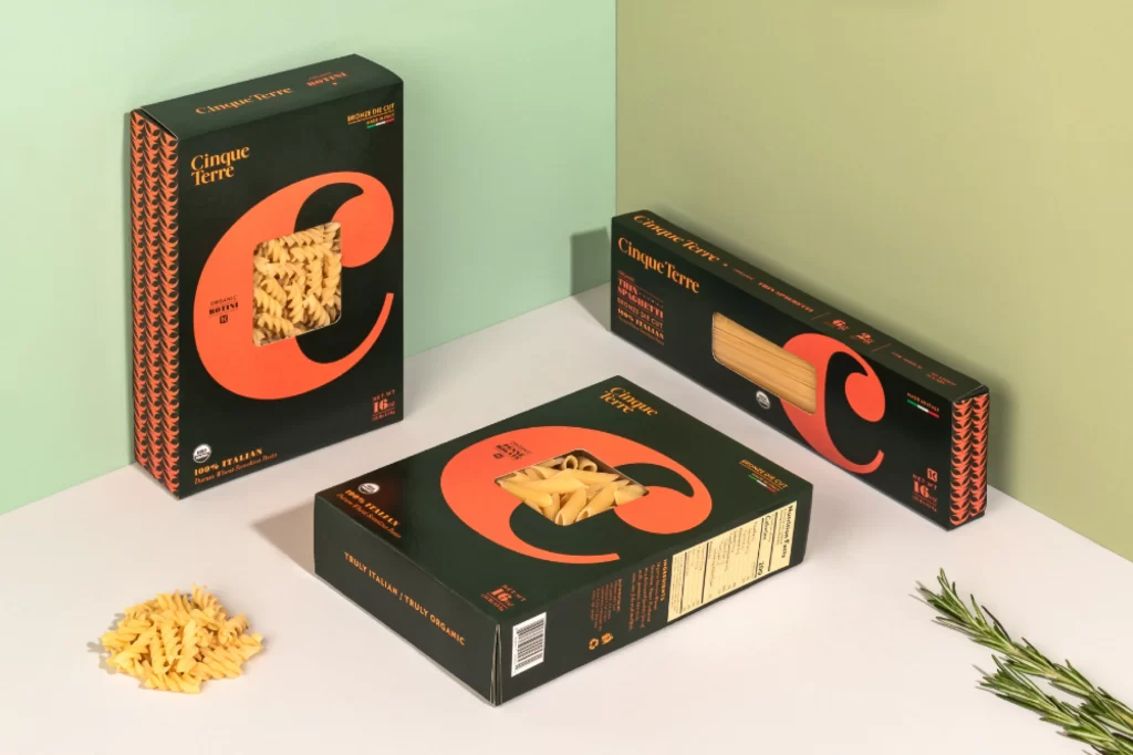
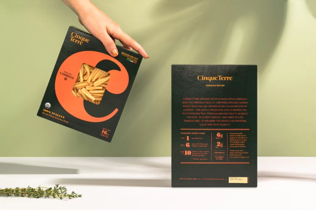
Matte black packaging dominates the frame, featuring a massive burnt-orange letter C that frames a clear window revealing pale, ridged pasta inside. A hand with manicured nails grips the upper corner of the front panel, which displays 'Cinque Terre' in gold serif type alongside a small Italian flag and '100% Italian' certification. The back panel sits flat on the surface to the right, presenting dense nutritional data and cooking instructions in the same orange and gold palette against the dark ground. Soft natural light casts gentle shadows across an olive-green backdrop, while fresh thyme sprigs rest in the lower-left foreground.
Bold typographic scale defines this identity system, where the oversized circular cutout functions as both a structural reveal and a graphic focal point. The restricted color scheme of charcoal, terracotta, and metallic gold creates immediate shelf presence while maintaining an artisanal, premium feel through tactile paper textures and precise alignment of informational blocks. Designers studying contemporary food branding will appreciate how the oversized letterform integrates product visibility with brand recognition without cluttering the layout.
Packaging art directors and freelance brand designers can mine this composition for studies in luxury organic positioning, particularly the balance between transparent product windows and opaque printed areas. Art students practicing still-life photography might replicate the lighting setup to understand how directional sources emphasize matte versus glossy surfaces on consumer goods. The complete high-fidelity asset is accessible at no cost for those needing detailed texture references or color-accurate mockup layers.