Pasta Organic Packaging Brown Black Red
DownloadTopics
Details
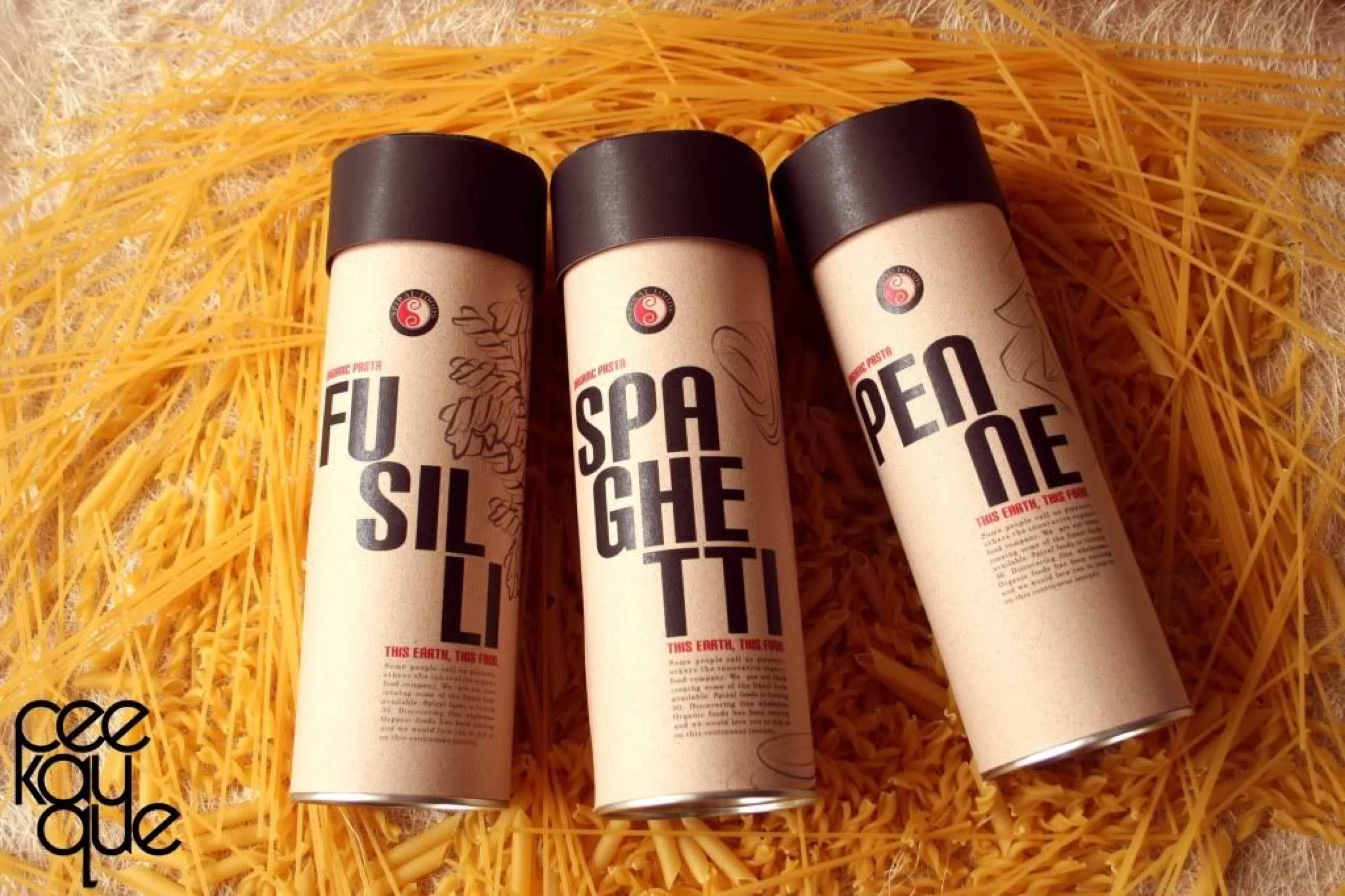
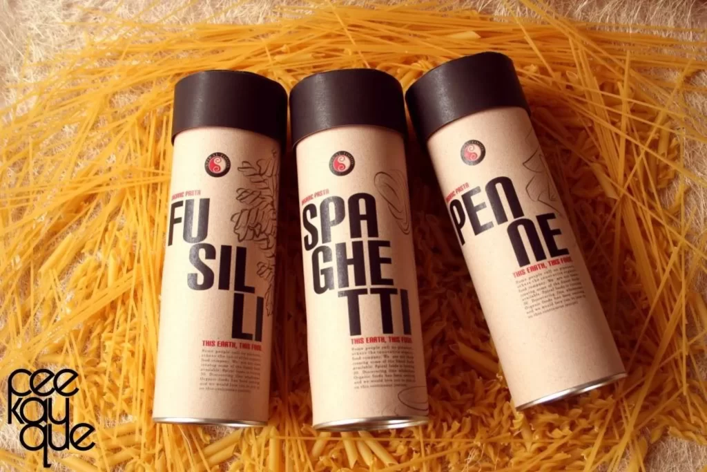
Three cylindrical pasta containers stand in a diagonal row, their bodies wrapped in unbleached kraft paper and topped with matte black caps. Bold, sans-serif typography spells out FUSILLI, SPAGHETTI, and PENNE in oversized black lettering, while smaller red text beneath each name reads 'THIS ENTRÉE. TRUE FOOD.' A circular red-and-black logo sits near the top of each tube, accompanied by delicate line-art illustrations of the respective pasta shapes. The entire arrangement rests upon a dense bed of golden-yellow dried spaghetti strands that fill the frame, illuminated by soft, diffused lighting from a slightly elevated camera angle.
The visual tension between the industrial cylindrical form and the organic paper texture creates a compelling tactile contrast that elevates standard grocery packaging into a design object. Typographic hierarchy dominates the composition through extreme scale variation, where the product names function as graphic elements rather than mere labels, while the restricted palette of kraft, black, and crimson reinforces an artisanal, eco-conscious brand identity. Designers studying this composition can access the full-resolution file at no cost to examine the precise interplay between material finishes and typographic weight.
Brand identity specialists developing sustainable food packaging will find this reference particularly valuable for understanding how limited color palettes can convey premium positioning without excessive printing costs. Packaging engineers might analyze the structural logic of the tube format versus traditional boxes, while typography enthusiasts can study how bold letterforms integrate with illustrative elements to create visual rhythm. Art directors planning e-commerce photography shoots could use this layout as a template for arranging multiple SKUs within a textured environment that complements the product's natural materials.