Pasta Privo White Black Green Brown Yellow
DownloadTopics
Details
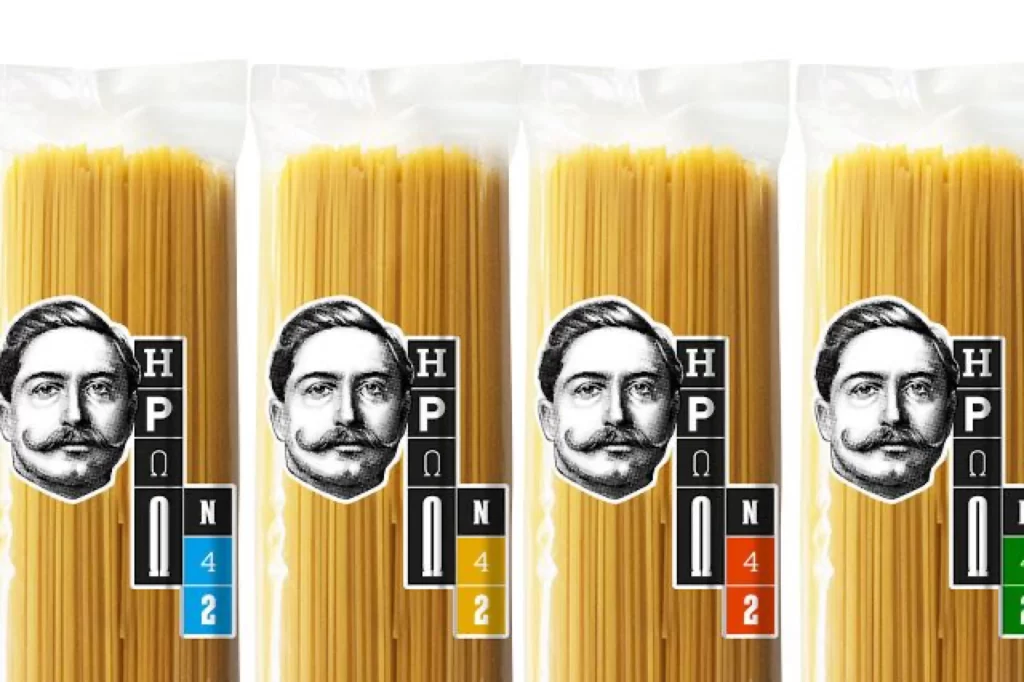
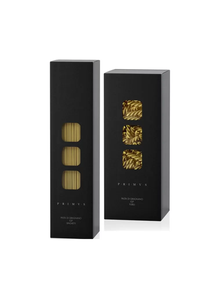
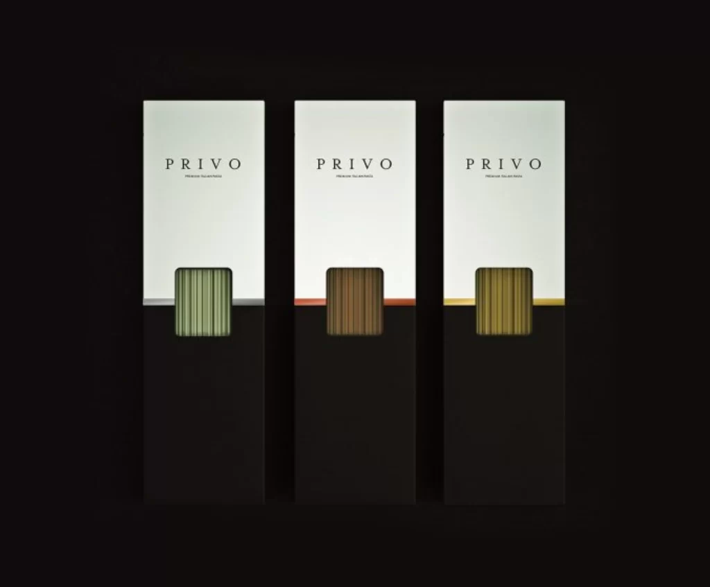
Three vertical rectangular boxes stand in a row, each divided into a white upper half and black lower half by a thin horizontal accent line. The brand name PRIVO appears in spaced capital letters above smaller subtext on the white portion of every package. Centered within each box is a rounded-square window revealing vertically ribbed material in sage green, dark brown, and golden yellow respectively, while the entire arrangement sits before an absolute black void under direct frontal lighting.
The visual system relies on strict geometric discipline and a restrained palette where the colored window becomes the sole differentiator between variants. That ribbed texture visible through the cutout introduces tactile dimensionality that contrasts with the flat matte surfaces surrounding it. Designers studying this composition will appreciate how minimal color shifts—silver, coral, and gold accent lines—complete the variant coding without cluttering the layout, and the full-resolution file is available for free download to examine these subtle distinctions closely.
Packaging architects developing premium food or cosmetic lines would reference this grid when structuring multi-SKU systems requiring elegant differentiation. Art directors overseeing luxury brand identity projects could analyze the typographic hierarchy and spatial relationships between the logo, descriptor text, and product reveal zone. Anyone building a mood board for minimalist retail presentation would find the controlled lighting and color blocking particularly useful for establishing visual standards across a product family.