Pasta Packaging Black White Colorful Modern
DownloadTopics
Details
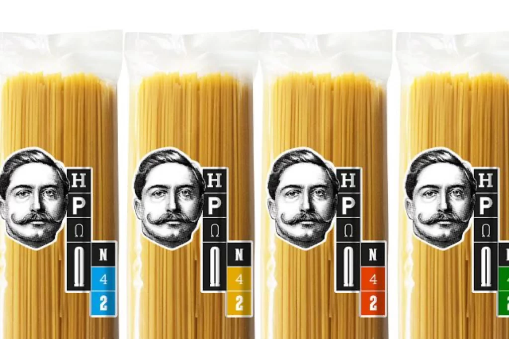
Four transparent plastic bags of uncooked spaghetti stand in a straight row, each containing a dense bundle of pale golden-yellow strands. A black-and-white engraved portrait of a mustached man anchors the left side of every package, accompanied by a vertical black block bearing the letters H, P, Ω, and U in white. To the right of this block, a small square displays the letter N above a two-digit number—42 in blue, 42 in yellow, 42 in red, and 42 in green across the four variants—with the entire arrangement photographed from a direct frontal perspective under even studio lighting.
The visual system relies on a rigid grid structure where the monochrome portrait and typographic block remain constant while only the terminal color code shifts between packages. This creates a systematic product family where hue becomes the sole differentiator, suggesting a coded classification system that could indicate cooking time, ingredient variation, or regional recipe distinctions. Designers can examine how minimal color intervention alters perception within an otherwise identical layout by accessing the full-resolution file at no cost.
Brand identity developers studying modular packaging systems will find this useful for analyzing how secondary color palettes function within fixed structural frameworks. Packaging engineers might reference the label placement relative to product visibility, while typography researchers can evaluate the legibility of mixed Latin and Greek characters at retail scale. Students of semiotics could also employ this to demonstrate how numerical and chromatic signifiers communicate product attributes without textual explanation.