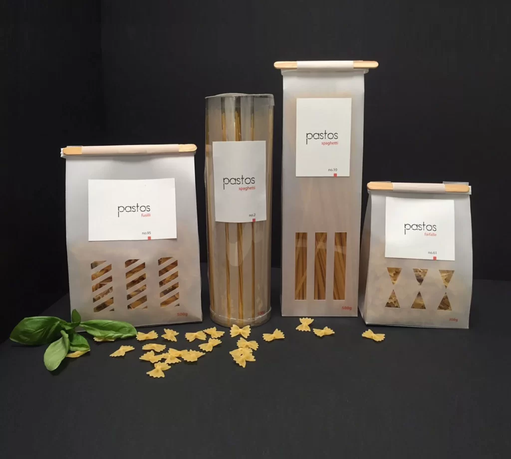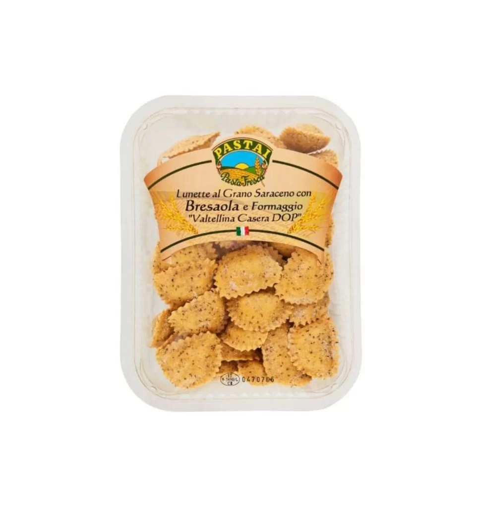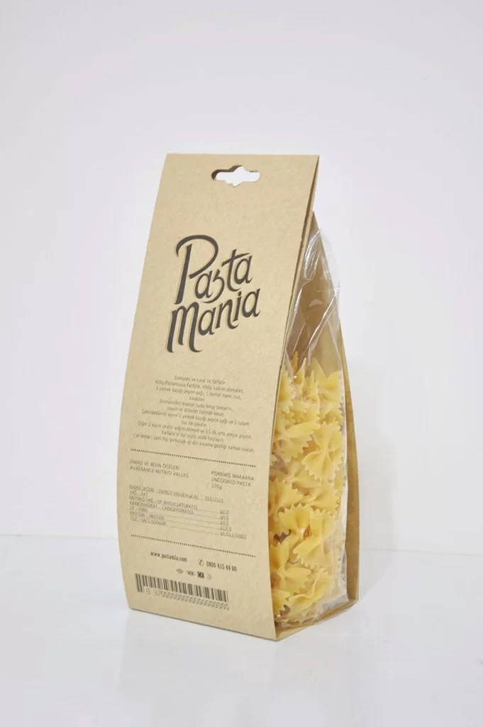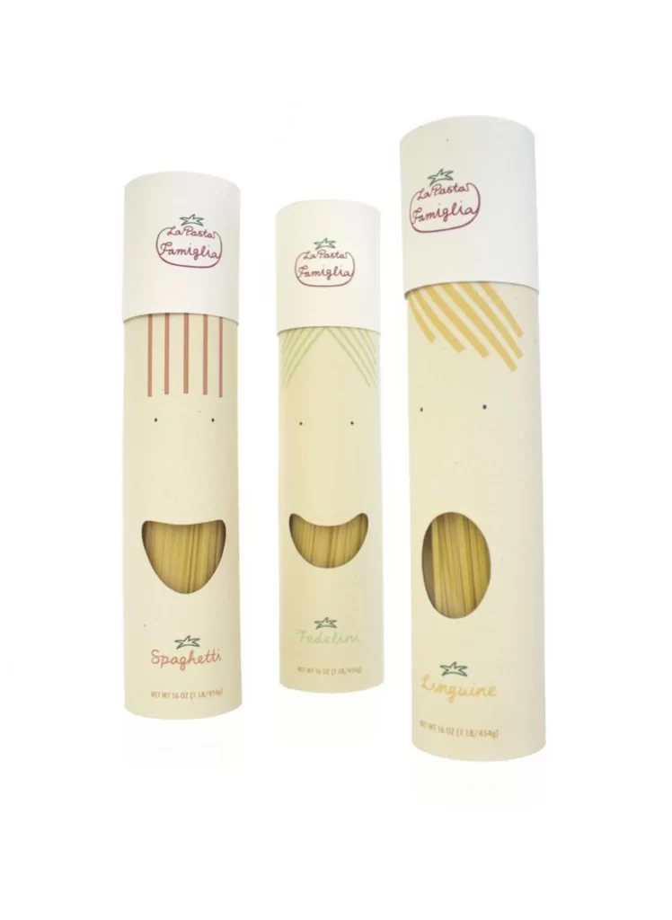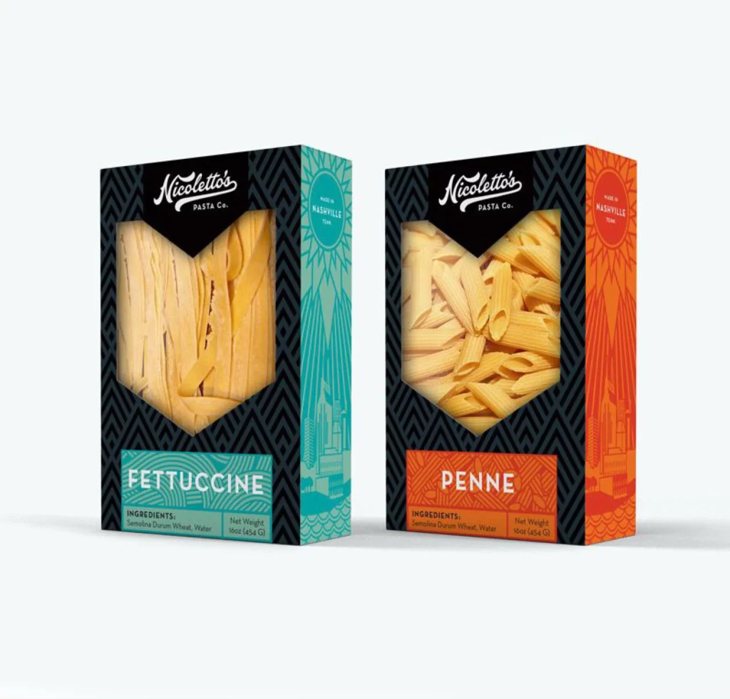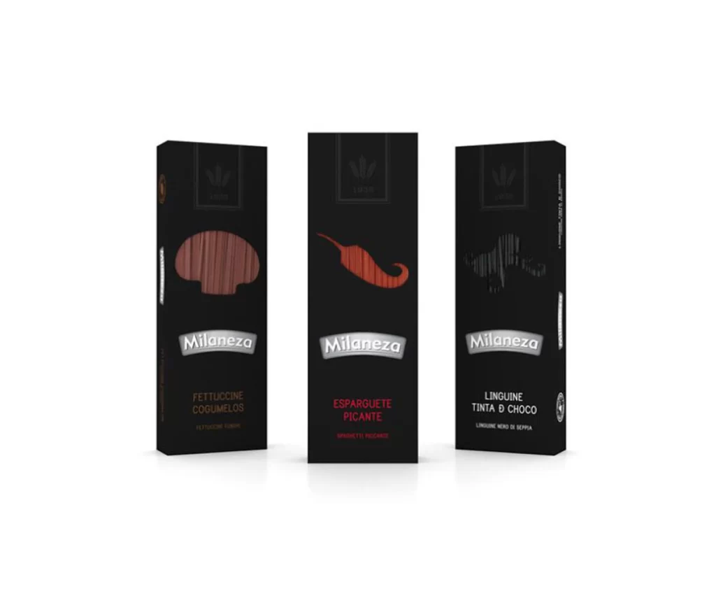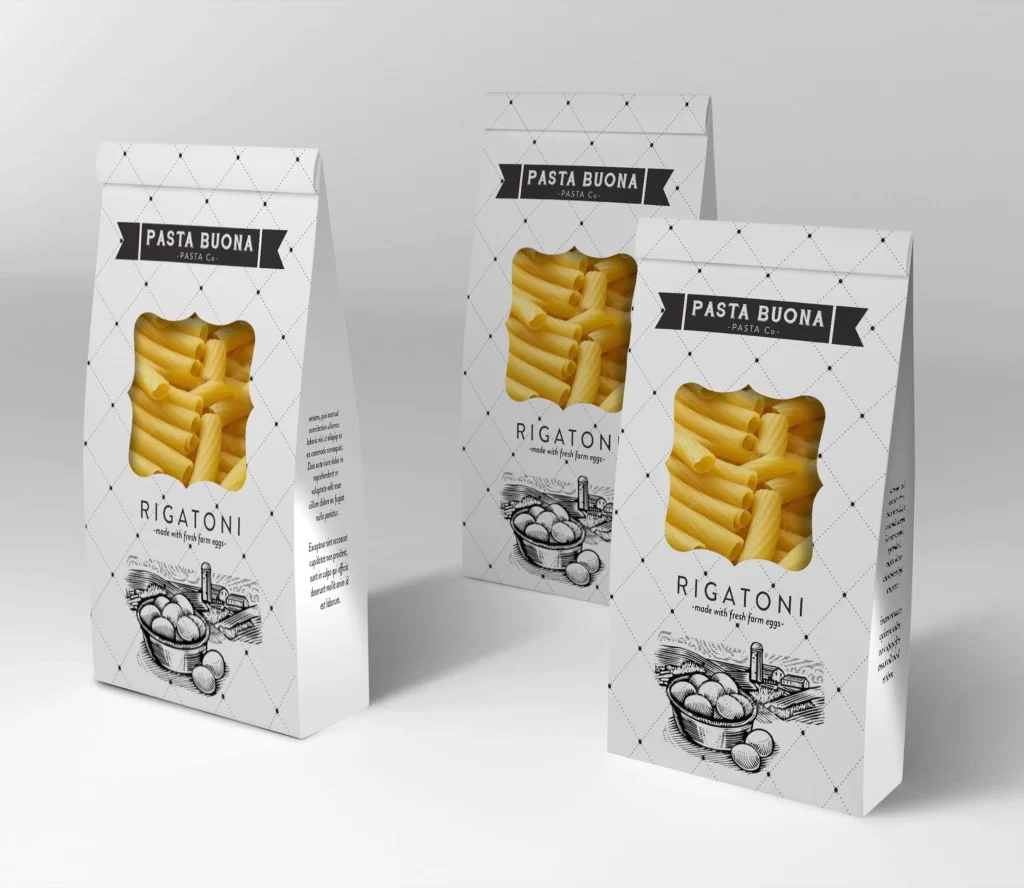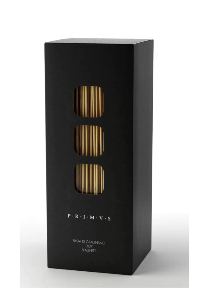
Pasta Minimalist White Beige Black
DownloadTopics
Details
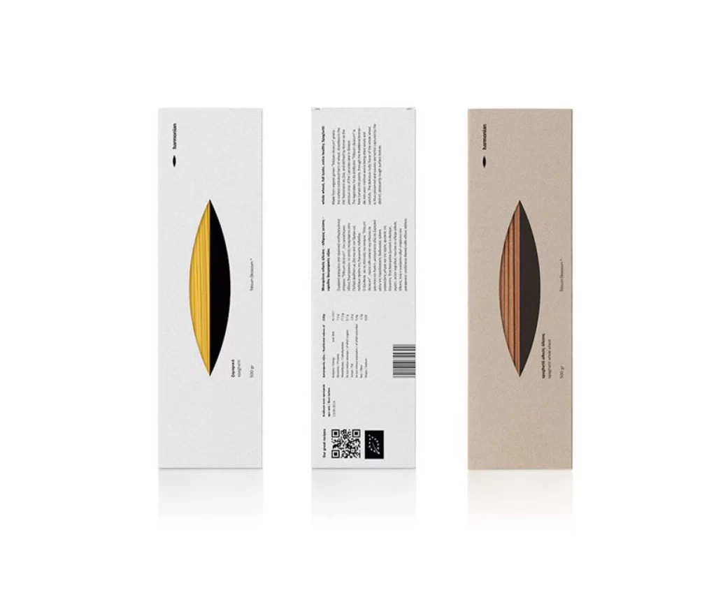
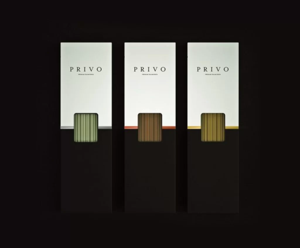
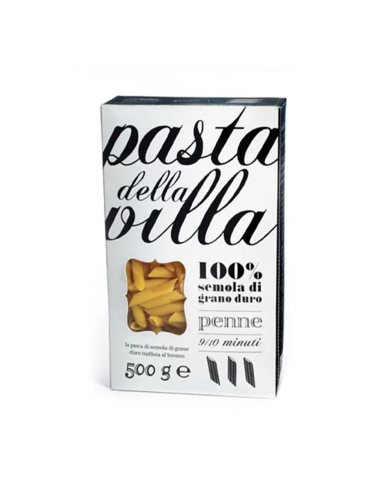
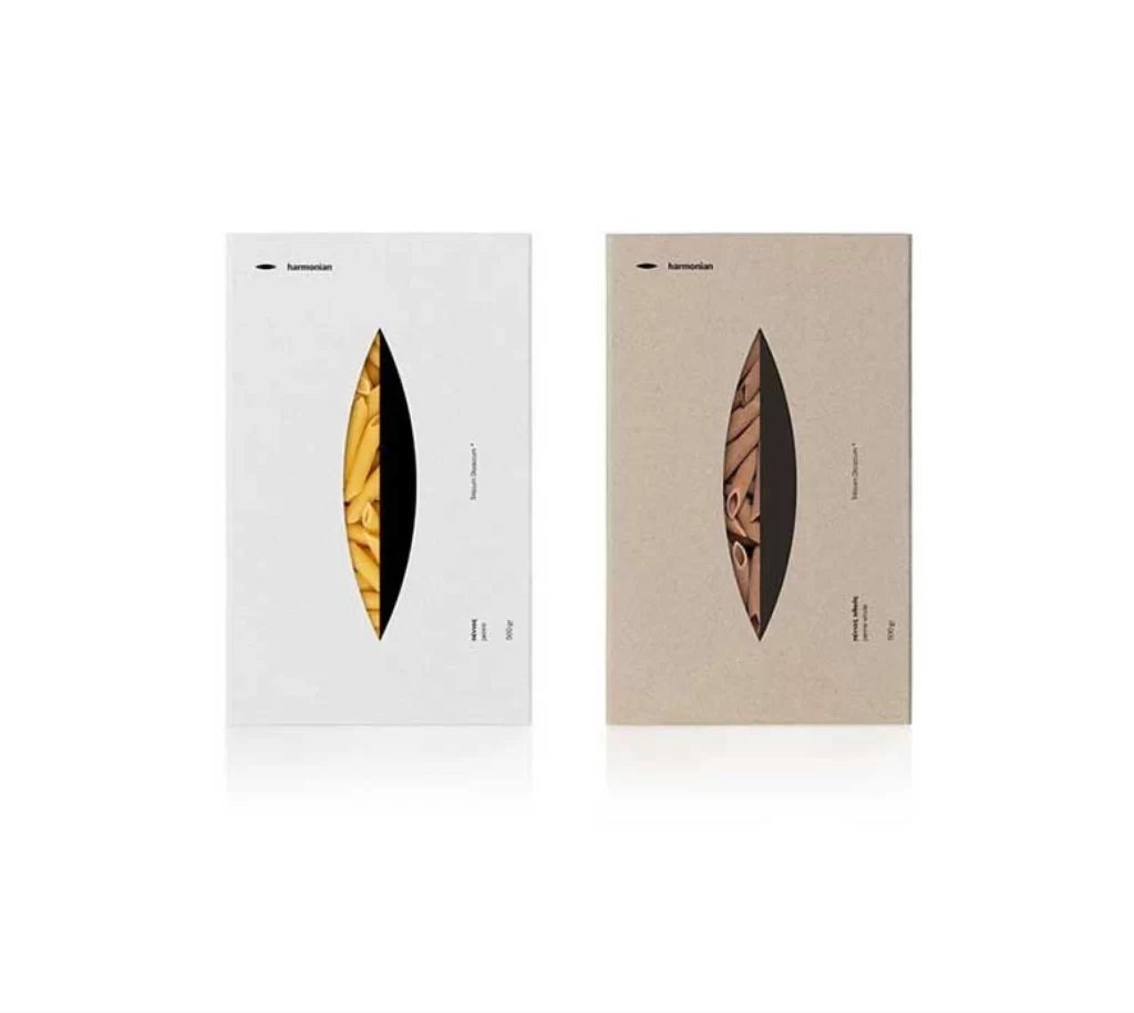
Two pasta packages stand side by side, the left rendered in cool white and the right in warm kraft brown, each featuring a central leaf-shaped die-cut that bisects into a photographic reveal of penne rigati on one side and solid black on the other. The brand name 'harmonian' appears in lowercase sans-serif at the upper left of both boxes, while product details run vertically along the right edge in a restrained typographic hierarchy. Soft studio lighting casts subtle shadows beneath the packaging, emphasizing the tactile contrast between the smooth white cardstock and the fibrous texture of the beige material.
Visual tension emerges from the asymmetric division within each aperture, where the organic curves of dried pasta meet the geometric finality of black negative space, creating a yin-yang dialogue between nourishment and void. The dual-tone presentation across the pair demonstrates how identical structural logic adapts to divergent material palettes, suggesting a modular system capable of expansion. Designers seeking to study this interplay of cut-out engineering and color theory can access the full-resolution file without cost directly from the resource archive.
Packaging architects examining windowing techniques for dry goods will find particular value in how the elliptical frame contains the product photography without overwhelming it. Brand identity specialists developing premium food lines might reference the vertical text orientation and the disciplined use of the black accent as a recurring motif across variants. Print production teams could also consult the image when specifying die-cut templates for specialty paper stocks that require precise registration between substrate layers.