Pasta Manicotti Sandro Desii White Black Circle Pattern
DownloadTopics
Details
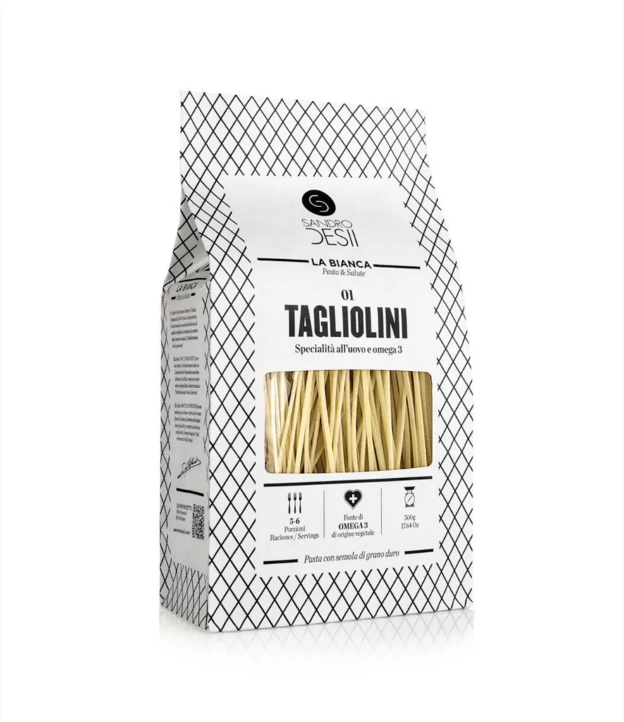
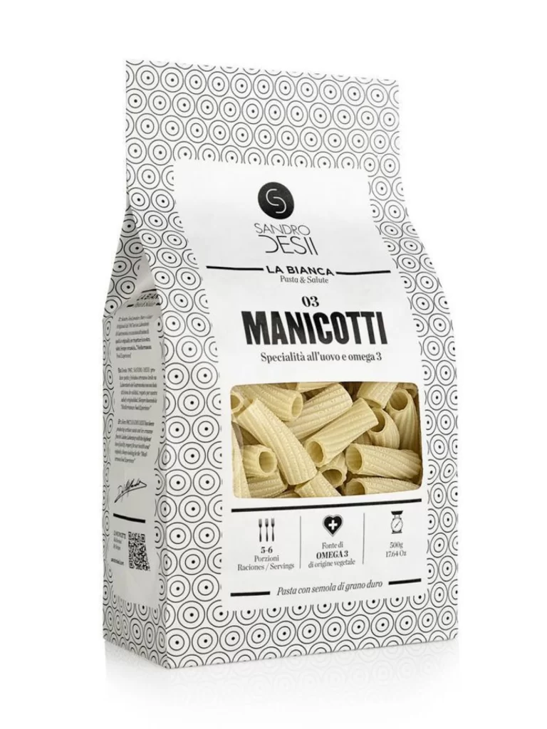
A matte-finished paper package of Manicotti pasta stands in a three-quarter view, its surface dominated by a dense, repeating pattern of black concentric circles on a white field. The central label panel breaks this geometric rhythm with a clean white rectangle containing the 'Sandro Desii' brand logo, the product line name 'La Bianca', and bold typography identifying the contents as '03 MANICOTTI'. A transparent window reveals the pale yellow, ridged cylindrical pasta inside, while the bottom of the label displays icons indicating five to six servings, Omega-3 content from vegetable sources, and a 500g net weight.
Visual interest derives primarily from the tension between the hypnotic, almost op-art quality of the circular border pattern and the stark typographic hierarchy of the central information block. The monochromatic palette creates a sophisticated, modernist aesthetic that distinguishes this health-focused pasta from traditional rustic packaging, while the transparent viewport adds a tactile, organic element that grounds the abstract graphics. Designers studying this composition will note how the repetitive motif frames the product without overwhelming the essential nutritional and branding data. The full-resolution asset is provided at no cost for those needing to examine the finer details of the print finish and layout proportions.
Packaging engineers and brand identity specialists might reference this when developing premium health-food lines that require clear communication of functional benefits like Omega-3 fortification. The specific arrangement of icons, weight specifications, and multilingual text offers a practical template for international product labeling that maintains visual elegance. Typography students could analyze the weight distribution between the delicate brand script and the heavy sans-serif product name to understand how hierarchy guides consumer attention. Anyone prototyping artisanal food packaging will find the balance between pattern and negative space particularly instructive for their own mockups.