Pasta Packaging Sandro Desii Colorful Modern
DownloadTopics
Details
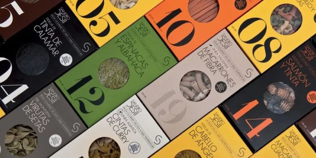
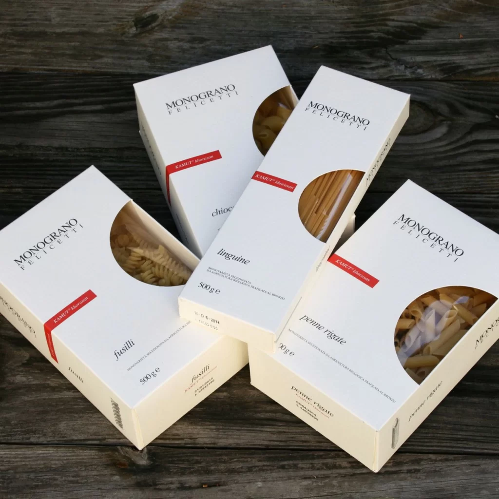
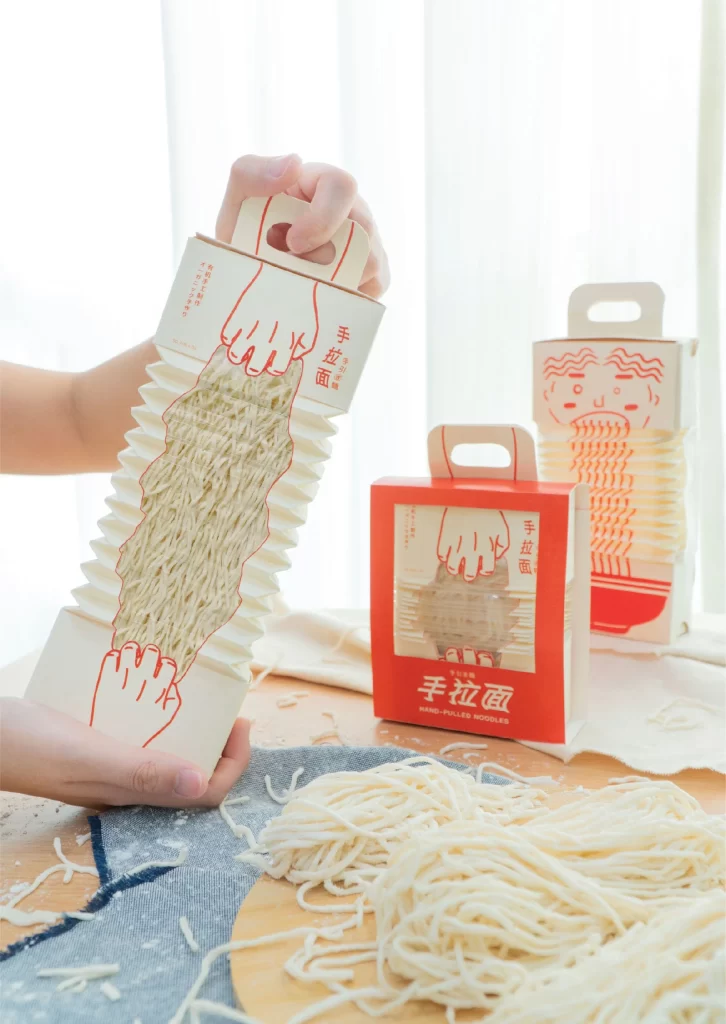
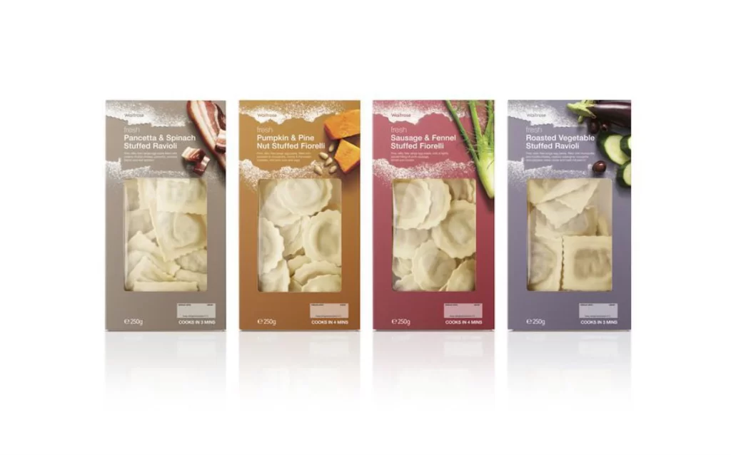
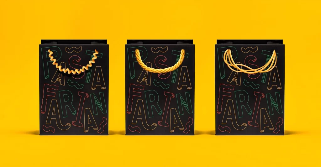
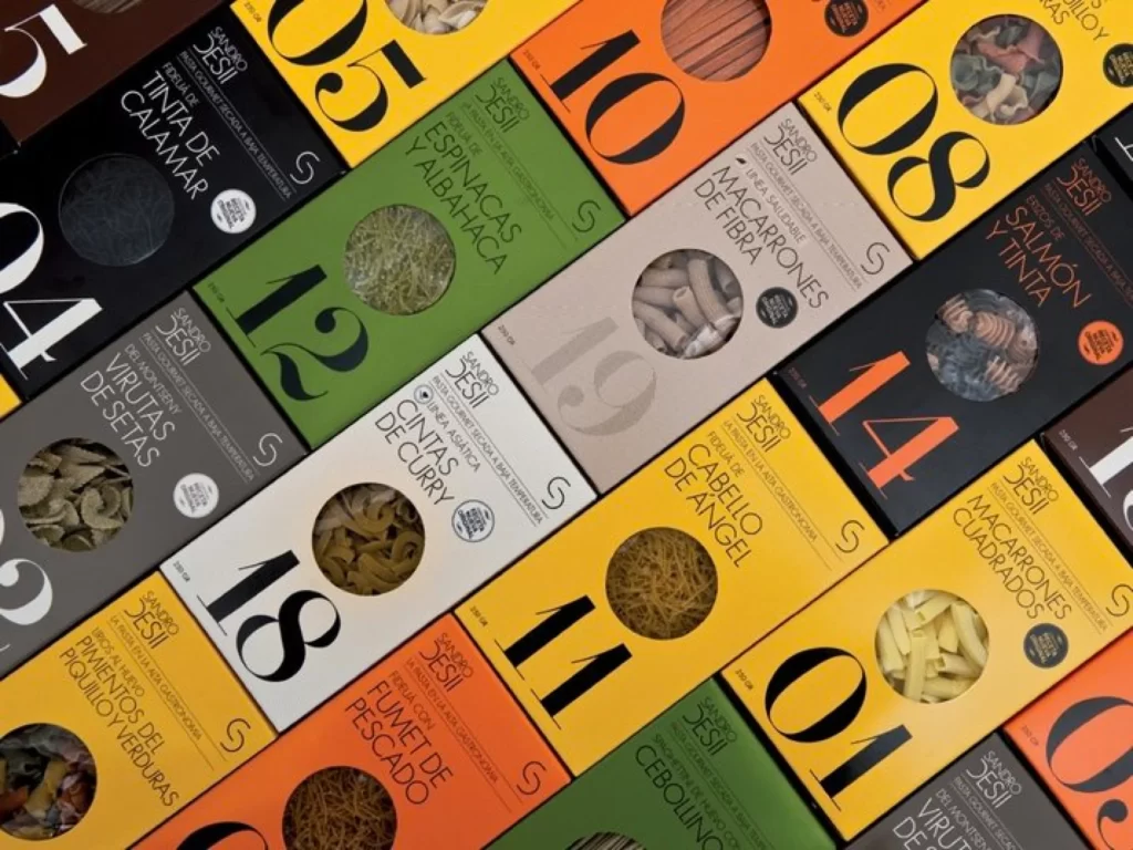
Vibrant rectangular boxes in mustard yellow, forest green, charcoal black, and burnt orange dominate the frame, each featuring oversized serif numerals like 05, 10, 12, and 14 alongside Spanish product names such as Espinacas y Albahaca and Macarrones de Fibra. Circular die-cut windows reveal the actual pasta contents—spirals, tubes, and ribbons—while the brand name Sandro Desii appears consistently in a clean sans-serif typeface. Shot from a slight diagonal overhead angle, the composition creates a rhythmic grid of overlapping packages with soft shadows that emphasize the matte cardboard textures.
The packaging system relies on bold typographic hierarchy, where massive numbers function as both identifiers and graphic elements against saturated color fields that differentiate flavors at a glance. This approach transforms utilitarian grocery items into collectible design objects through disciplined color blocking and transparent windows that celebrate the organic shapes of dried pasta within. Designers studying this layout can access the full-resolution file to examine how contrast between warm and cool tones guides the eye across the repeating pattern.
Brand strategists developing premium food lines will find this arrangement useful for analyzing how limited color palettes can organize extensive product ranges without visual clutter. Packaging engineers might reference the window placement relative to text blocks when planning structural designs for dry goods visibility. Art directors working on editorial spreads could study the diagonal grid formation as a template for photographing multiple SKUs while maintaining individual product legibility.