Pasta Tricolorrotini Conchiglie Farfalle Blackyellowgreen
DownloadTopics
Details
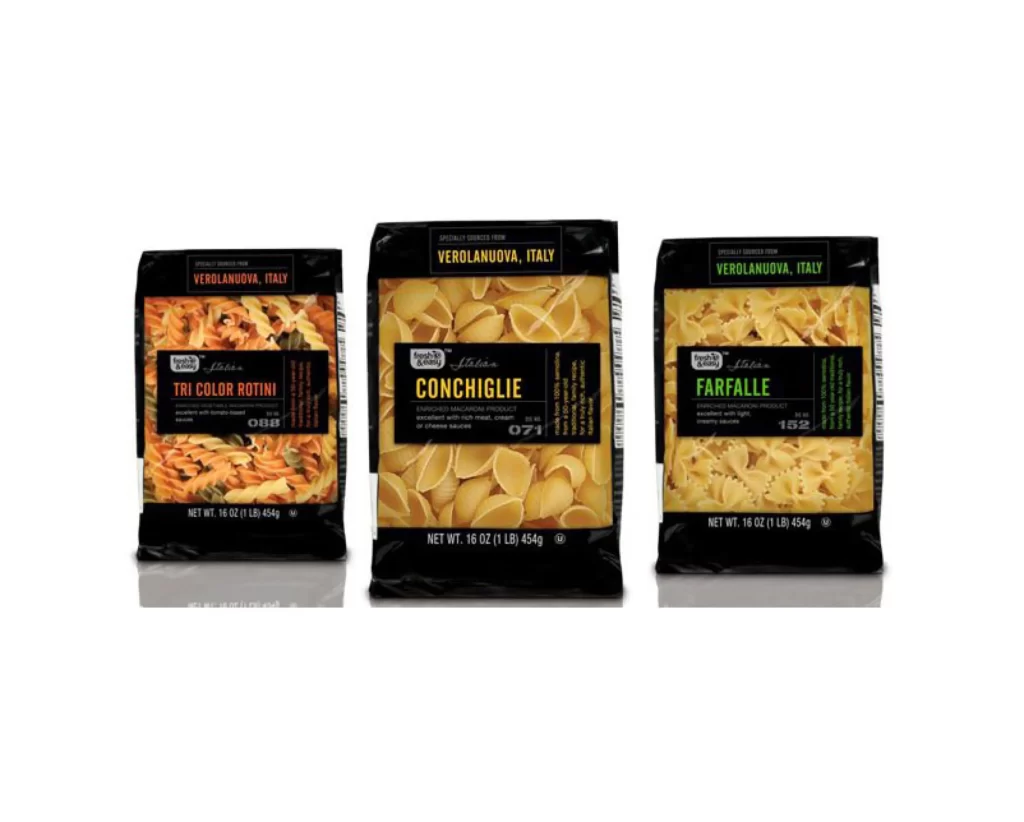
Three 16-ounce bags of Italian pasta stand in a neat row, each sealed in glossy black packaging that makes the contents pop. The left bag holds Tri Color Rotini with its distinctive orange and pale spirals, the center displays golden Conchiglie shells, and the right features yellow Farfalle bows. Bold typography spells out 'VEROLANUOVA, ITALY' across the top of each package, while product names appear in large colored letters—orange for rotini, yellow for conchiglie, green for farfalle—against a clean white studio backdrop with soft even lighting.
What catches the eye here is how the color-coded naming system creates instant visual categorization across the product line. The black packaging acts as a sophisticated frame that lets the pasta textures and hues become the heroes, while the consistent layout builds brand recognition through repetition. Designers studying this will notice how the limited palette of black, white, and three accent colors creates hierarchy without clutter. You can grab the full-resolution file at no cost if you need to examine the finer typographic details or texture work up close.
Packaging designers working on premium food brands would find this useful for studying how dark backgrounds elevate natural product photography. Art directors planning e-commerce shoots could reference the spacing and alignment choices that keep three variants looking cohesive yet distinct. Anyone building a mood board for artisanal Italian goods might pull this as an example of modern minimalist packaging that still feels traditional. The clear labeling hierarchy also serves as a solid case study for information architecture on vertical pouch formats.