Farfalle Pasta Yellow White Elegant
DownloadTopics
Details
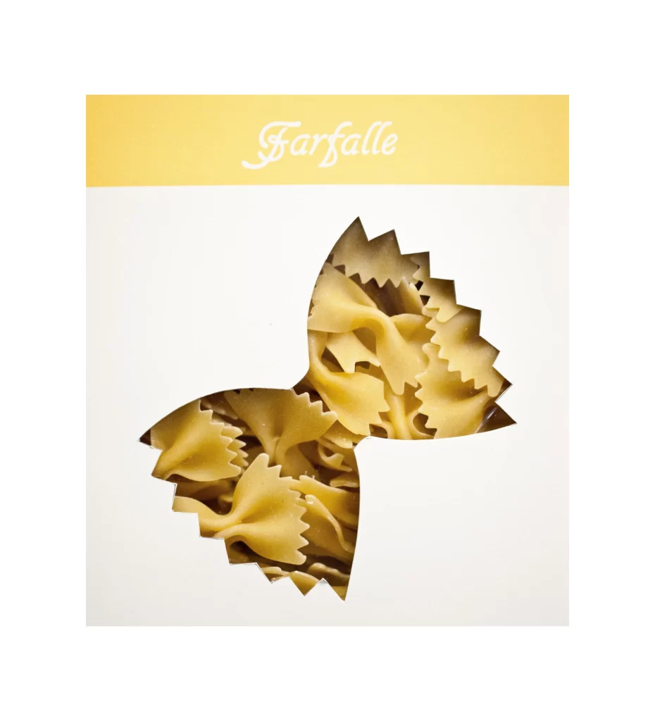
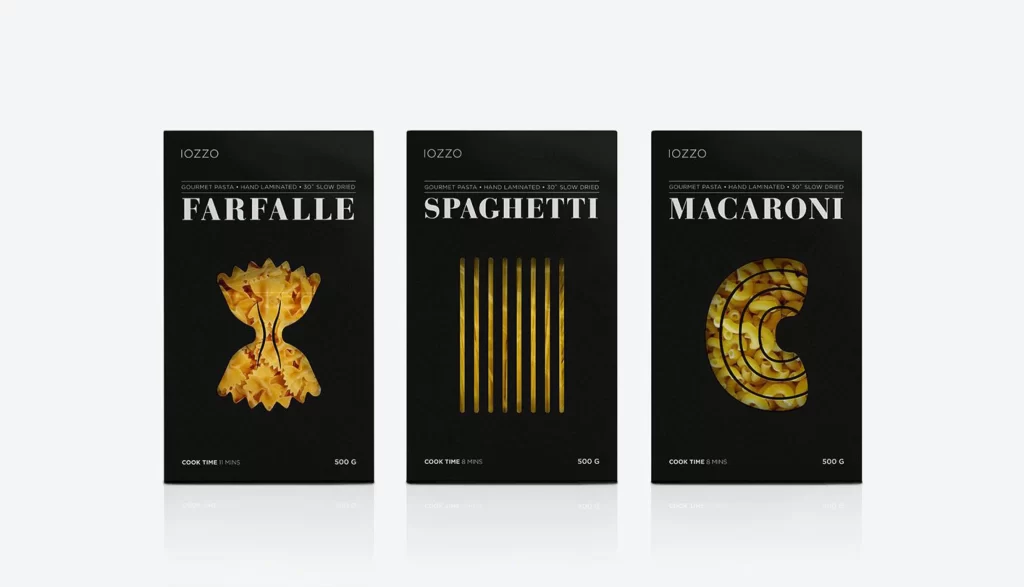
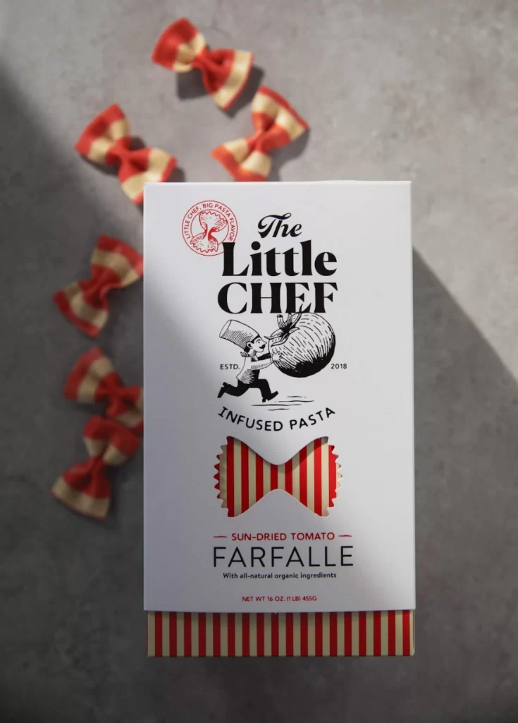
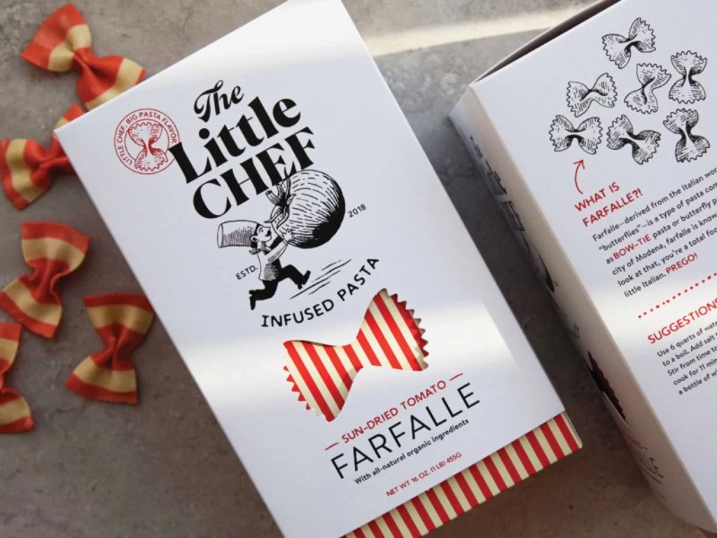
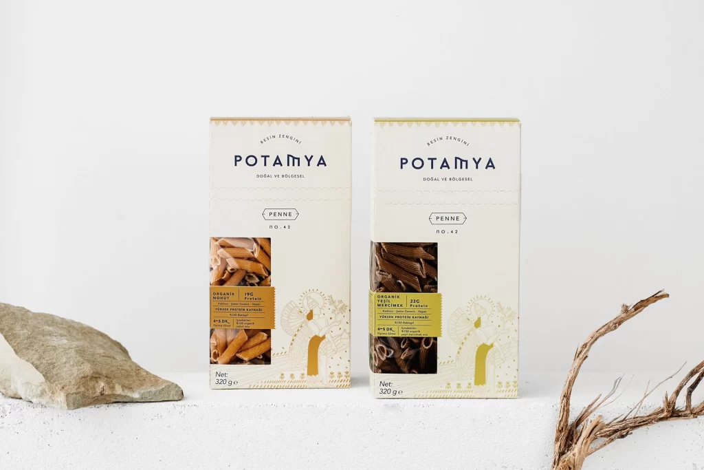
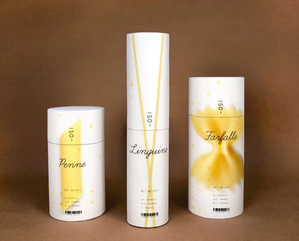
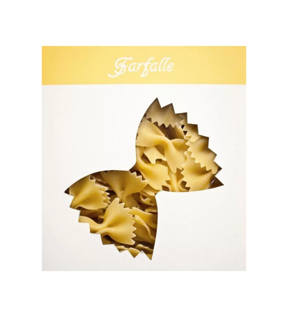
A rectangular package displays the word "Farfalle" in white cursive script across a pale yellow header band, while the lower off-white field contains a die-cut window shaped like a single bow-tie pasta piece. Through this jagged-edged aperture, actual dried farfalle noodles appear in warm golden-beige tones with visible ridged textures and crinkled edges. The composition presents the product from a direct frontal perspective under even lighting that eliminates harsh shadows and emphasizes the contrast between matte paper surfaces and the glossy pasta within.
The packaging concept derives its visual impact from the literal translation of form into function, where the transparent window mimics the exact silhouette of the contents it reveals. This clever alignment between cutout shape and product identity creates immediate recognition without requiring additional iconography or photography. Designers seeking to study innovative food packaging solutions can access the complete high-resolution file at no cost from our resource library.
Brand strategists developing artisanal Italian food lines would employ this reference when brainstorming structural packaging that communicates product type through physical form rather than printed graphics. Print production specialists might analyze the die-cut specifications and material interactions between the paper substrate and the visible interior contents. Packaging engineering teams could also utilize this example when prototyping windows that double as brand identifiers for dry goods.