Pasta De Cecco Yellow Blue Minimalist Typography
DownloadTopics
Details
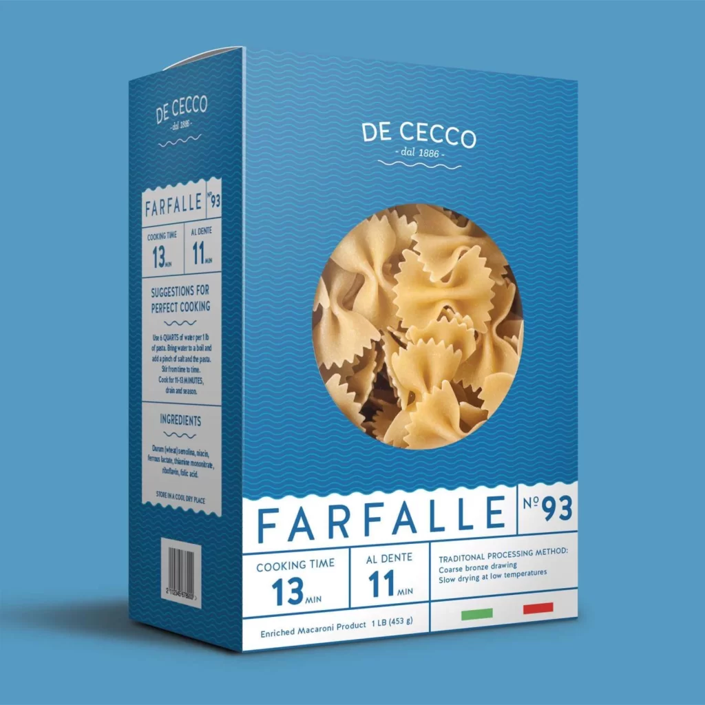
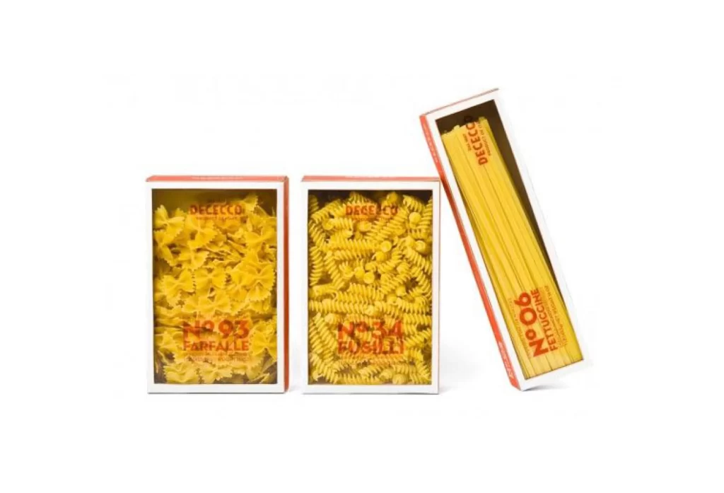
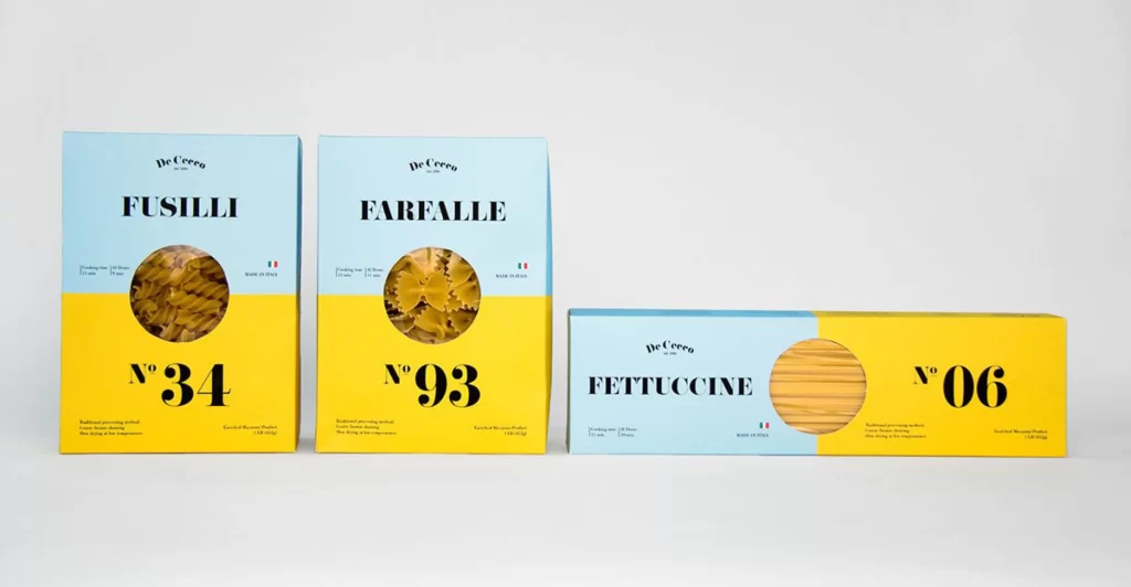
Three De Cecco pasta boxes stand in a row, each split horizontally between a pale cyan upper half and a vibrant yellow lower section. The leftmost box displays 'FUSILLI' in bold black serif above a circular window revealing spiral noodles and the large number 'N° 34', while the center package shows 'FARFALLE' with bow-tie pasta visible through its window marked 'N° 93'. To the right lies a wider, flatter box labeled 'FETTUCCINE' with long strands visible in its oval cutout and 'N° 06' printed at the far right edge, all photographed from a straight-on perspective under even studio lighting against a neutral light-gray surface.
The visual language relies on a strict two-tone color blocking strategy that creates immediate shelf impact through high-contrast complementary hues. Circular and oval die-cut windows break the flat geometric planes with organic texture, while oversized numerical identifiers establish a systematic, almost archival cataloging aesthetic. Typography balances elegant brand script with authoritative sans-serif product names, resulting in a packaging system that feels both contemporary and rooted in Italian culinary tradition.
Brand identity designers studying color-block packaging systems or typographic hierarchy will find concrete value in analyzing how these boxes balance information density with negative space. Packaging engineers can examine the structural differences between the upright cartons and the horizontal fettuccine format to understand form-factor variations within a unified visual family. Anyone needing detailed visuals of this specific design implementation can access the full-resolution file at no cost directly from the resource library.