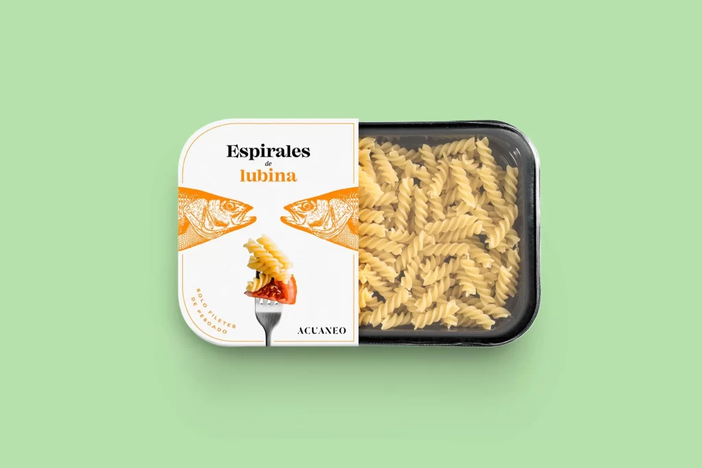
Pasta Esprales Lubina Yellow Orange Illustration Modern
DownloadTopics
Details
A black plastic food tray containing uncooked spiral pasta sits on a solid mint-green surface, partially wrapped by a white paper label with rounded corners. The packaging displays the text "Espirales de lubina" in bold black and orange typography, flanked by two symmetrical orange fish head illustrations facing inward toward a central fork graphic holding pasta and red sauce. The brand name "ACUANEO" appears at the bottom right of the label, while curved text reading "SIN FILETES DE MERLUZA" arcs along the lower left edge, all photographed from a straight-on overhead perspective with soft, even lighting.
The visual identity relies on a striking contrast between the warm orange marine illustrations and the cool mint backdrop, creating immediate shelf appeal through color theory rather than photographic food styling. Symmetrical composition anchors the fish graphics as framing devices around the central product hero shot, establishing a cohesive seafood-pasta category signal that feels both artisanal and contemporary. Designers studying this layout will note how the limited palette—black, white, orange, and mint—achieves maximum legibility without clutter, and the complete high-resolution asset can be accessed without cost for closer inspection of the typographic hierarchy and illustration technique.
Packaging professionals developing ready-meal or fresh pasta ranges could reference this mockup to test how split-panel designs perform when revealing actual product through transparent windows versus full-wrap labels. Brand identity teams working on seafood or Mediterranean food lines might extract the dual-fish motif as a starting point for their own icon systems or mascot development. Art directors planning e-commerce photography shoots could adopt the mint background strategy to make neutral-toned food products pop in digital catalogs while maintaining a clean, modern aesthetic that translates well across mobile and desktop viewports.