Pasta Pietrogala Yellow Creative Packaging
DownloadTopics
Details
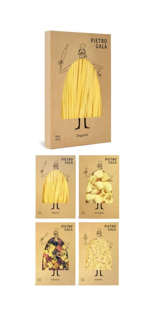
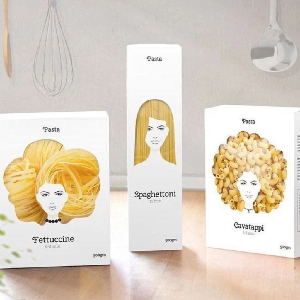
Kraft cardboard boxes display the brand name PIETRO GALA in clean sans-serif type, each featuring a minimalist line-drawn chef whose torso is replaced by actual pasta shapes. The primary box stands upright showing linguini strands as a yellow garment, while four flat-laid variants below reveal conchiglie, radiatori, and farfalle filling the same anthropomorphic silhouette. Soft studio lighting eliminates harsh shadows across the natural brown paper texture and the pale golden pasta visible through precise die-cut windows.
Anthropomorphizing dry goods through consistent character illustration creates immediate shelf recognition while the transparent window technique bridges illustration with product reality. Each variety maintains identical structural branding yet differentiates purely through the organic texture and color of the enclosed noodles. Designers studying this composition can access the complete high-fidelity asset pack at no cost to examine typographic hierarchy and material interactions closely.
Packaging art directors might reference these layouts when developing artisanal food lines that require handcrafted visual language without photographic clutter. Brand identity specialists could analyze how repetitive character usage builds equity across multiple SKUs while allowing product variation to remain the focal point. Students of structural design will find value in studying how die-cut shapes integrate with printed graphics to create three-dimensional depth on flat substrates.