Pasta Pietrogala Yellow Simple Creative
DownloadTopics
Details
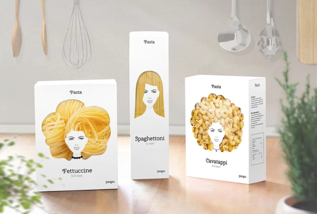
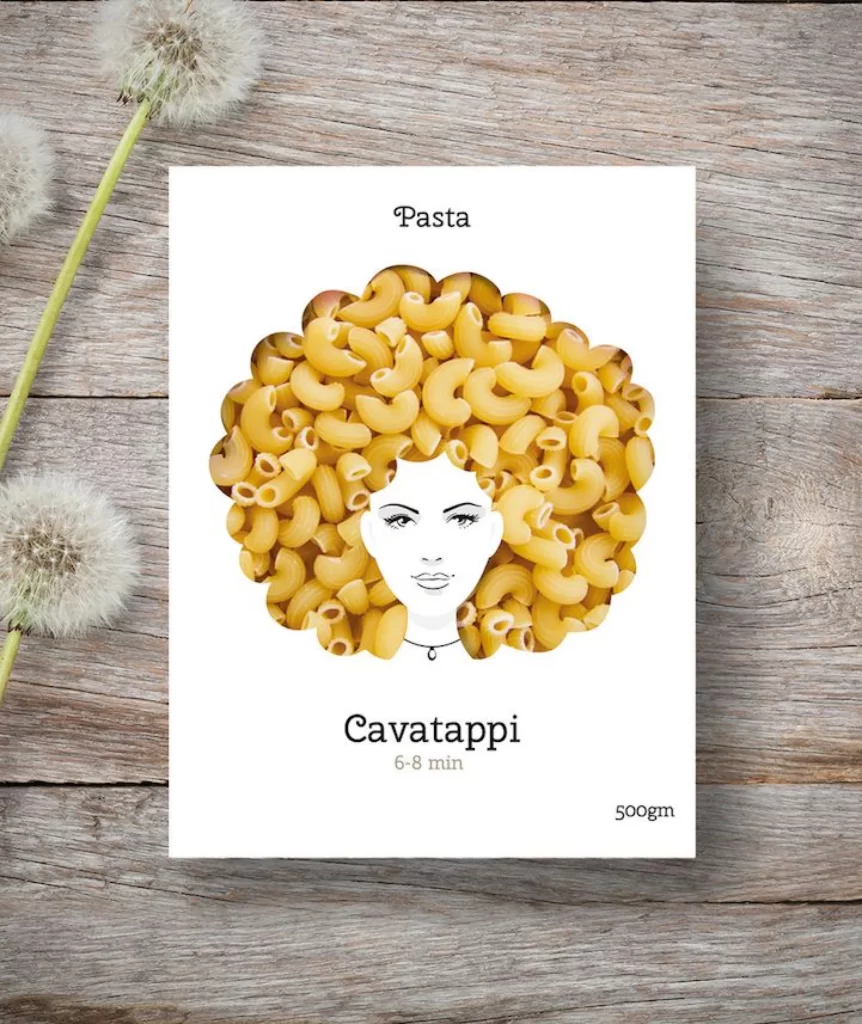
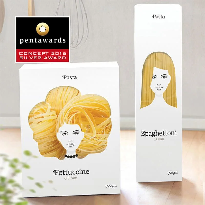
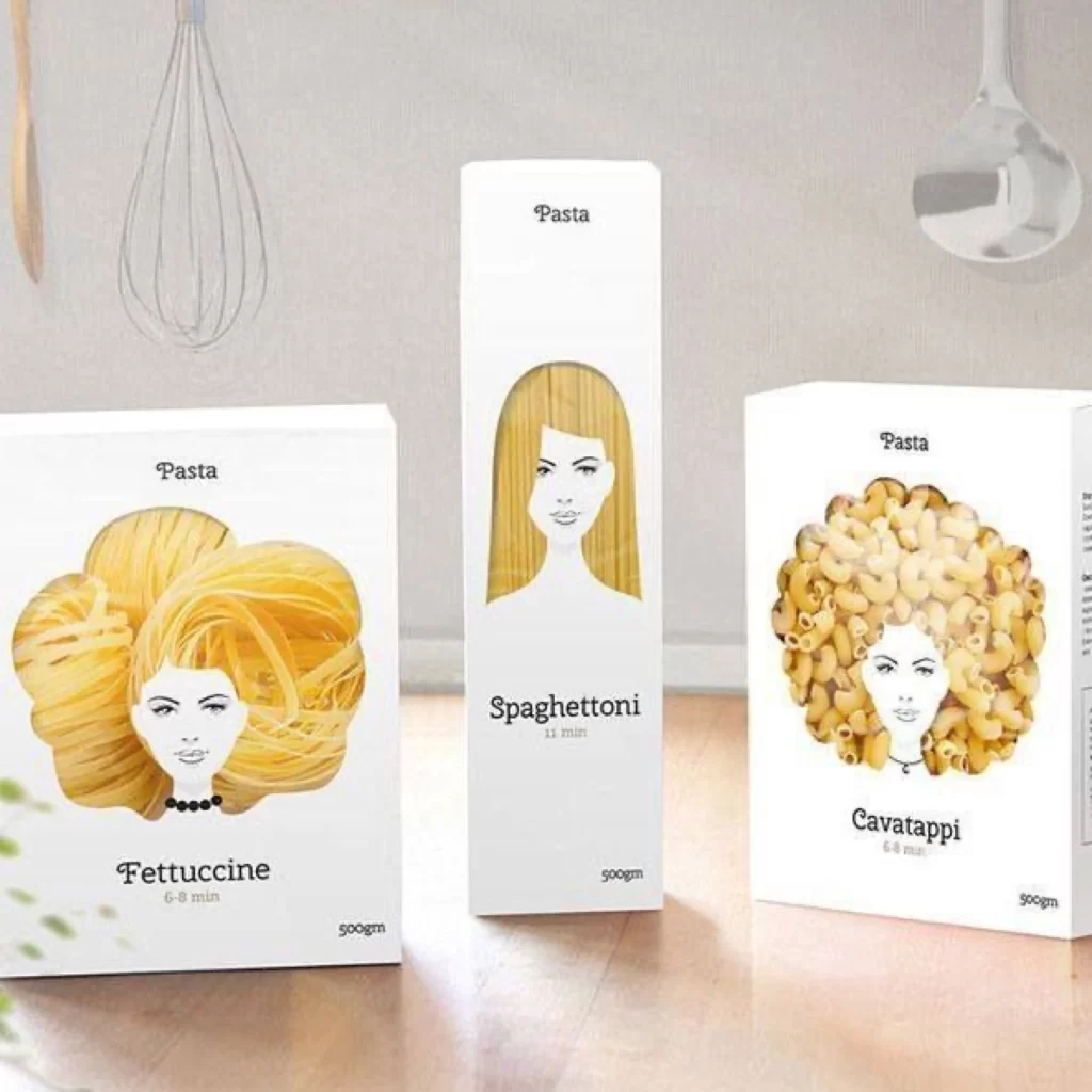
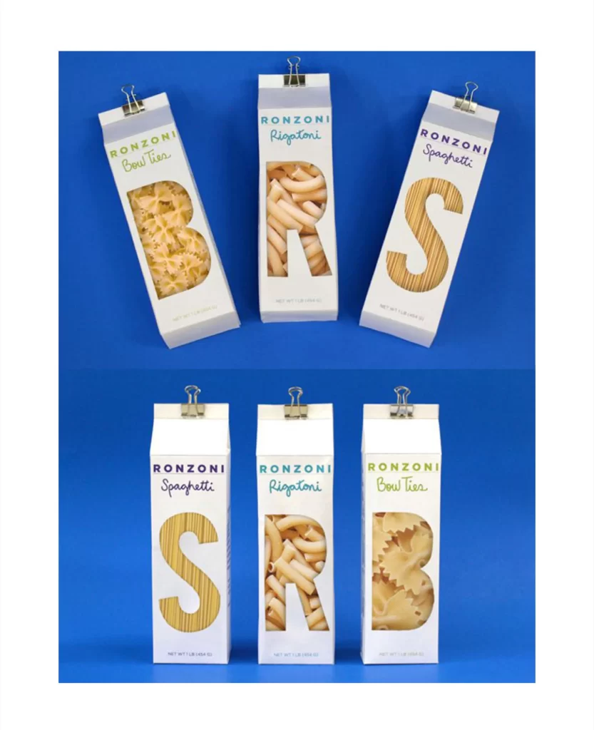
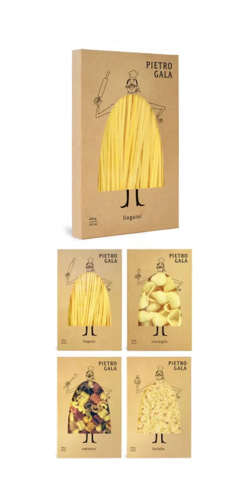
Kraft cardboard boxes display the brand name PIETRO GALA in black sans-serif capitals above a whimsical line-drawn chef figure whose torso is replaced by actual pasta shapes visible through a die-cut window. The primary package features long yellow linguini strands forming a skirt-like silhouette, while the four smaller variants below showcase conchiglie, radiatori, and farfalle in their respective apertures. Weight markings of 400g and 14.1oz appear in small type near the bottom left, with the pasta variety labeled beneath the chef's stick legs, all photographed from a straight-on perspective under even studio lighting.
Anthropomorphizing the product through a consistent character template creates immediate visual recognition across the entire line while allowing each pasta shape to define its own unique silhouette. The contrast between the utilitarian brown paper material and the vibrant golden-yellow contents draws attention to the food itself, making the packaging feel both artisanal and playful. Designers studying this layout can access the full-resolution file at no cost to examine how the die-cut engineering integrates with the illustration.
Brand identity developers working on food packaging projects would reference these examples to understand how character systems can scale across multiple SKUs without losing coherence. Packaging engineers might analyze the window placement relative to the chef's anatomy to plan similar structural designs for their own clients. Art directors could also pull specific color values from the kraft-and-black palette to build complementary visual systems for related marketing materials.