Pasta Packaging Ronzoni Colorful Creative
DownloadTopics
Details
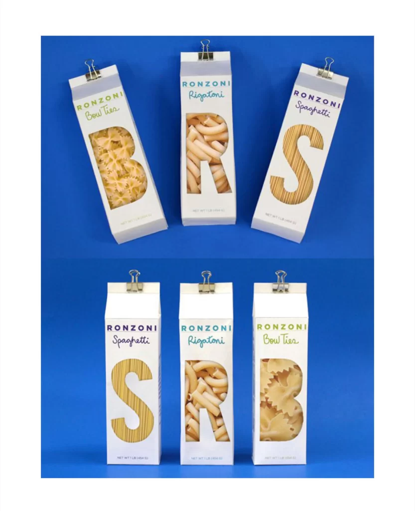
Three tall, slender white cartons stand against a saturated cobalt blue surface, each secured at the top with a silver binder clip. The packaging features the Ronzoni brand name in bold sans-serif capitals above a cursive script identifying the pasta variety—Bow Tie, Rigatoni, or Spaghetti—rendered in lime green, teal, and purple respectively. Large die-cut windows shaped like the letters B, R, and S reveal the actual dried pasta inside, while a second arrangement below reorders the sequence to spell SRB, all captured from a straight-on camera perspective under even studio lighting.
Typography becomes structural architecture here, as the oversized letterforms serve dual purposes: they function as transparent viewing portals while simultaneously spelling out an acronym when arranged sequentially. The clever interplay between two-dimensional graphic elements and three-dimensional product visibility creates immediate visual interest, distinguishing this concept from conventional opaque boxes. Designers studying this composition will note how the color-coded text hierarchy guides the eye from brand to specific product type without cluttering the minimalist aesthetic.
Package design students might analyze these mockups to understand how negative space and cutout mechanics can transform standard retail containers into interactive branding tools. Art directors developing food photography campaigns could reference the lighting ratios and clip props for similar stylized product shoots. Anyone needing detailed visual specifications for their own pasta packaging concepts can access the full-resolution source file at no cost directly from the resource library.