Pasta Garofalo Black Yellow Italian
DownloadTopics
Details
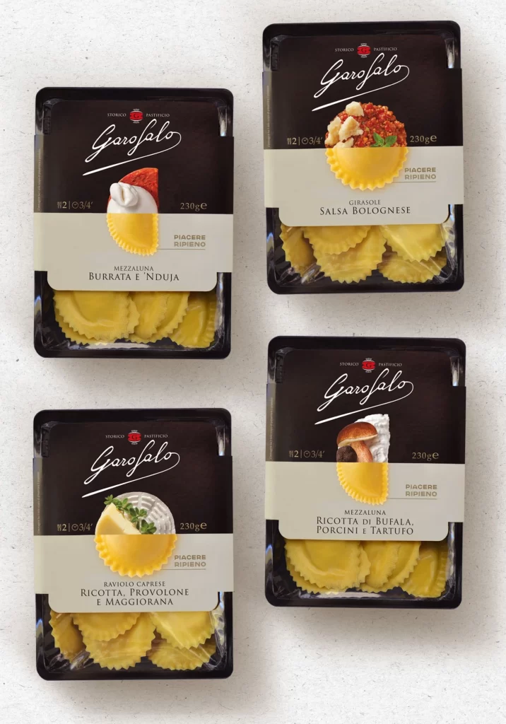
Four black plastic trays of Garofalo fresh pasta sit in a two-by-two grid on a light, subtly textured surface. Each container features a dark upper label with the brand name in white cursive script above a photographic illustration of a single ravioli topped with its specific filling. A cream-colored band across the middle displays the product variety in clean sans-serif type, while the lower portion reveals the actual yellow pasta through clear packaging. Soft, even lighting eliminates harsh shadows and highlights the glossy finish of the plastic and the matte texture of the paper labels.
The visual identity relies on a sophisticated contrast between the deep black of the primary packaging and the warm golden hue of the pasta itself. Photographic food styling serves as the central design element, with each variety showing distinct ingredients like burrata cream, bolognese ragù, shaved cheese, or porcini mushrooms atop a single dumpling. This approach creates immediate appetite appeal while maintaining an upscale, artisanal aesthetic that distinguishes these products from standard supermarket offerings. Designers can access the full-resolution source file at no cost to study the precise typographic hierarchy and color balance.
Packaging professionals developing premium Italian food lines will find this composition valuable for analyzing label architecture and ingredient photography placement. Brand strategists working on luxury grocery items can reference how the monochromatic scheme elevates a mass-market product into a specialty category. Food photographers might examine the lighting setup used to make the fillings appear fresh and texturally rich without glare. Art directors planning e-commerce product grids could adopt this symmetrical layout to ensure visual consistency across multiple SKUs.