Pasta Panzani Red Yellow Green
DownloadTopics
Details
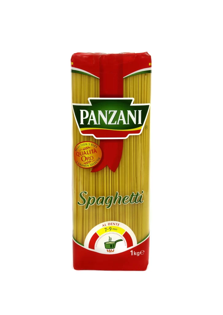
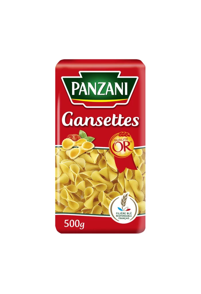
A rectangular red cardboard package dominates the frame, featuring the Panzani brand name in white serif lettering inside a green shield with a yellow underline. Below the logo, 'Gansettes' appears in a flowing white script, while a photographic window reveals pale yellow bow-tie pasta shapes filling the lower two-thirds of the packaging. The composition includes a golden quality seal marked 'OR', a small tomato and basil illustration, and a circular wheat emblem indicating French wheat sourcing, all set against a clean light backdrop with soft even lighting from a straight-on camera angle.
The visual hierarchy relies on bold primary colors—crimson, forest green, and golden yellow—creating immediate shelf presence through high contrast and traditional European packaging aesthetics. Typography choices distinguish between the authoritative brand mark and the elegant product name, while the transparent pasta window adds textural depth that breaks up the solid color blocks. Designers studying this layout will notice how the rounded corners soften the geometric form and how the placement of certification badges balances the asymmetrical food photography.
Food packaging students can analyze the color psychology behind this classic Italian-French branding approach, while 3D artists might use the lighting setup as a guide for rendering grocery products. Brand strategists examining regional variations will appreciate the specific typographic treatment of 'Gansettes' compared to international Farfalle labeling. Anyone needing crisp source material for texture studies or color matching can grab the full-resolution file without cost from our library.