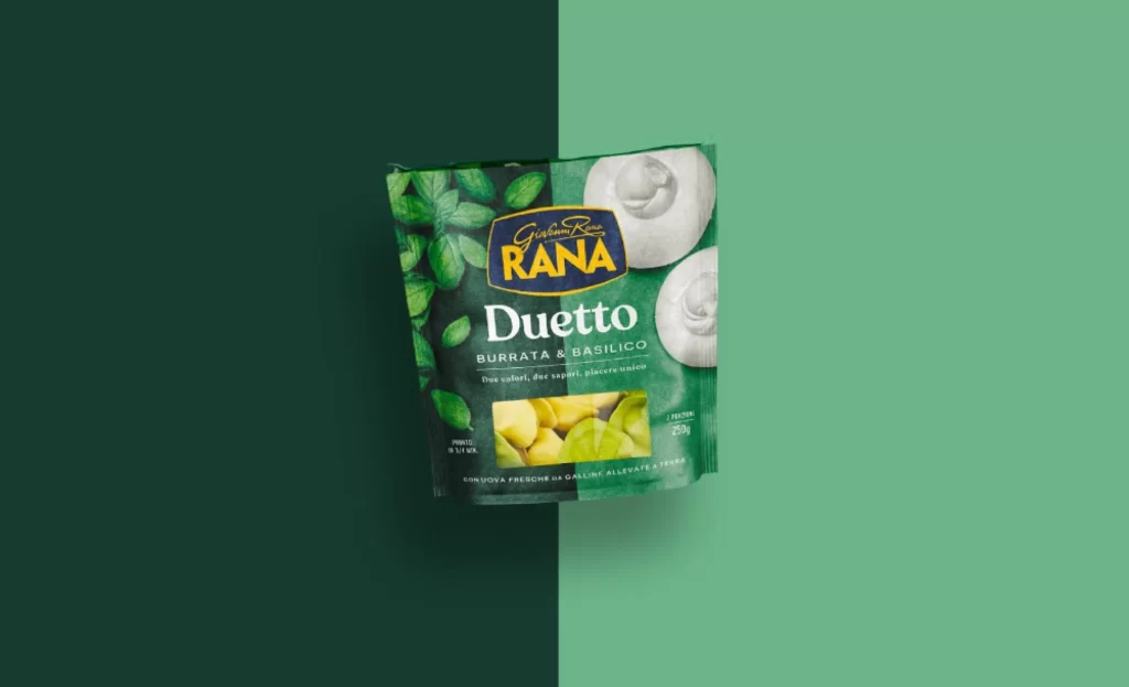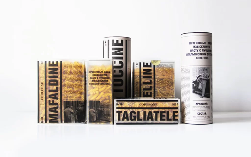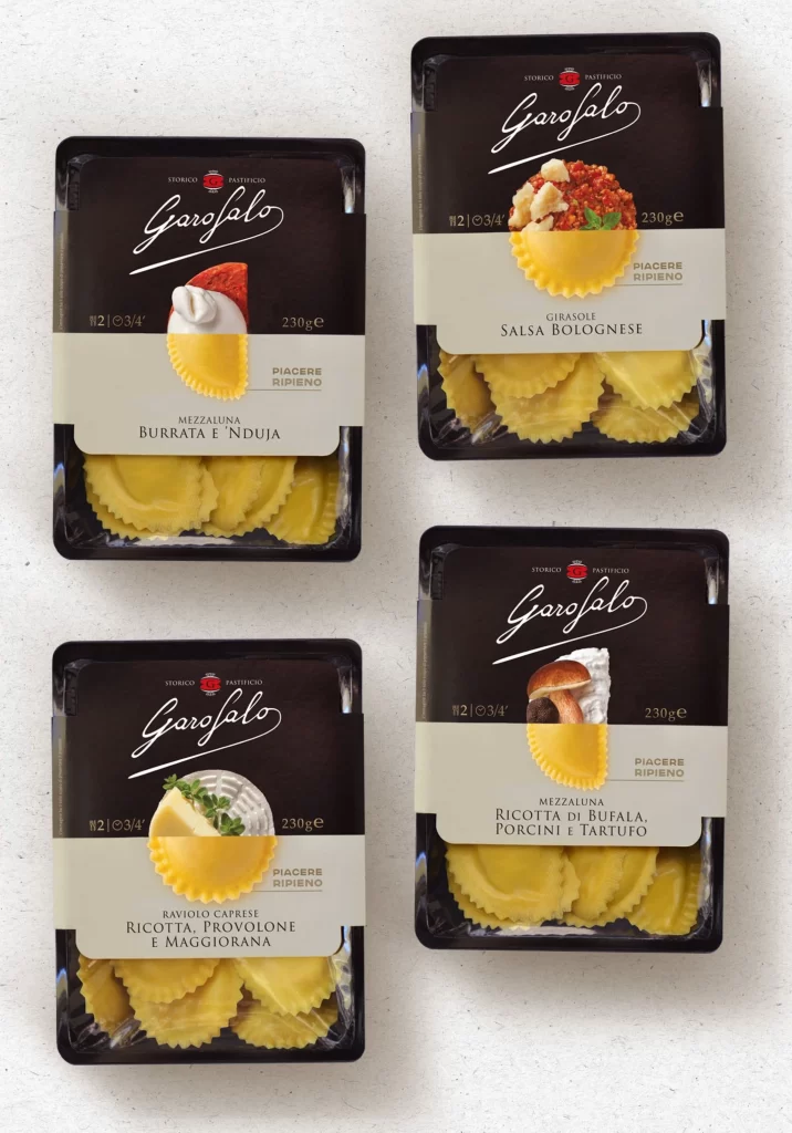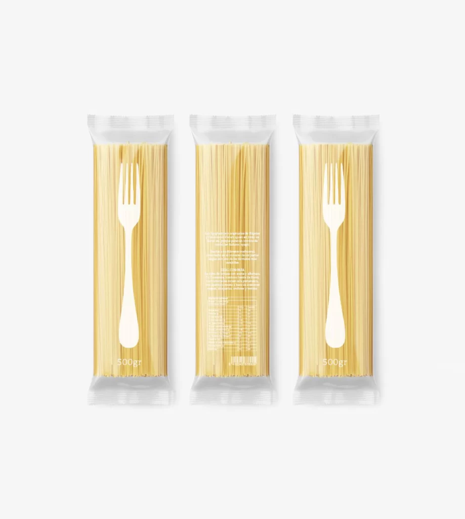
Pasta Farfalle Yellow White Minimalist Typography
DownloadTopics
Details
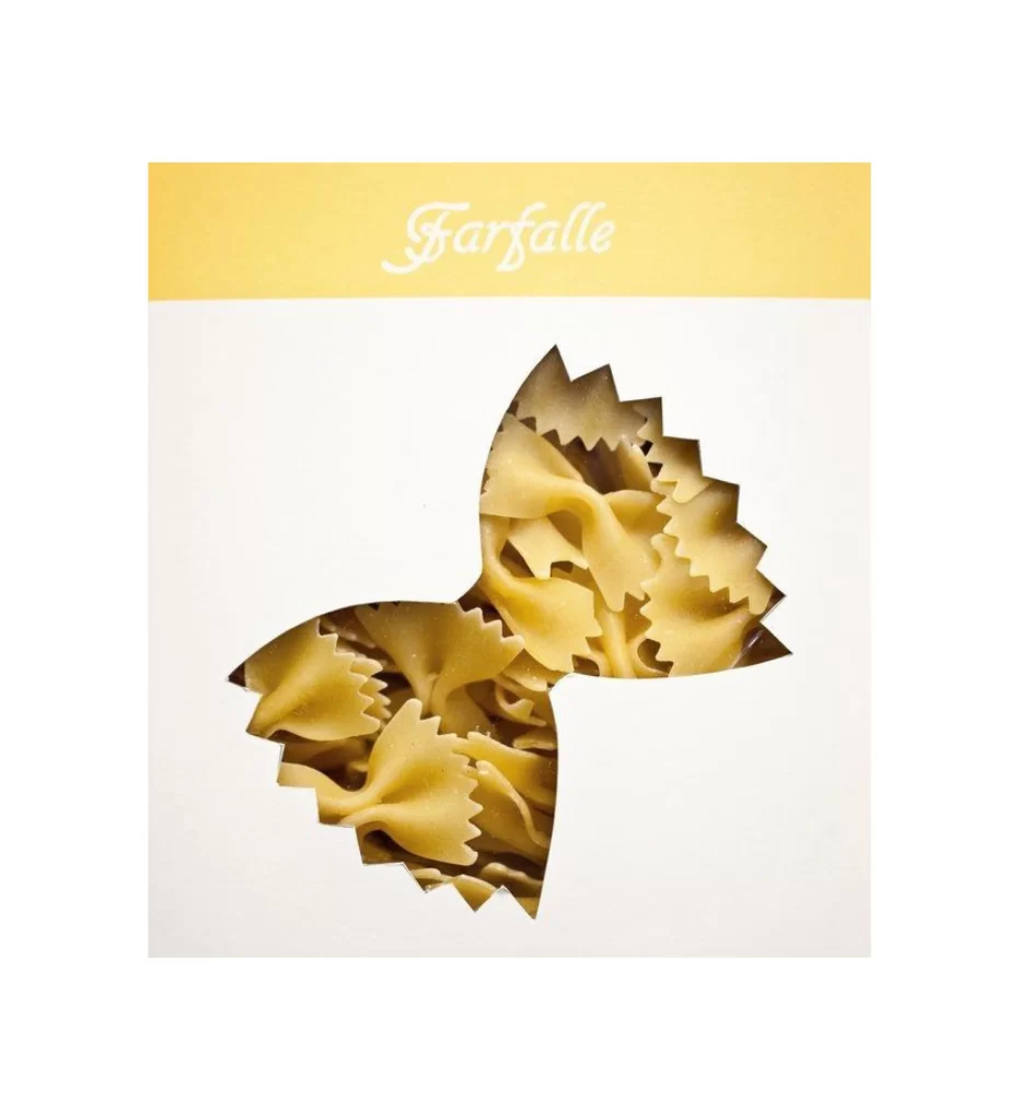
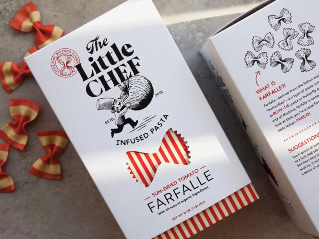
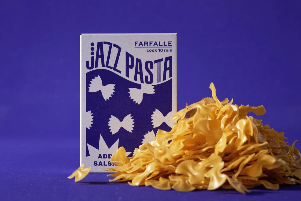
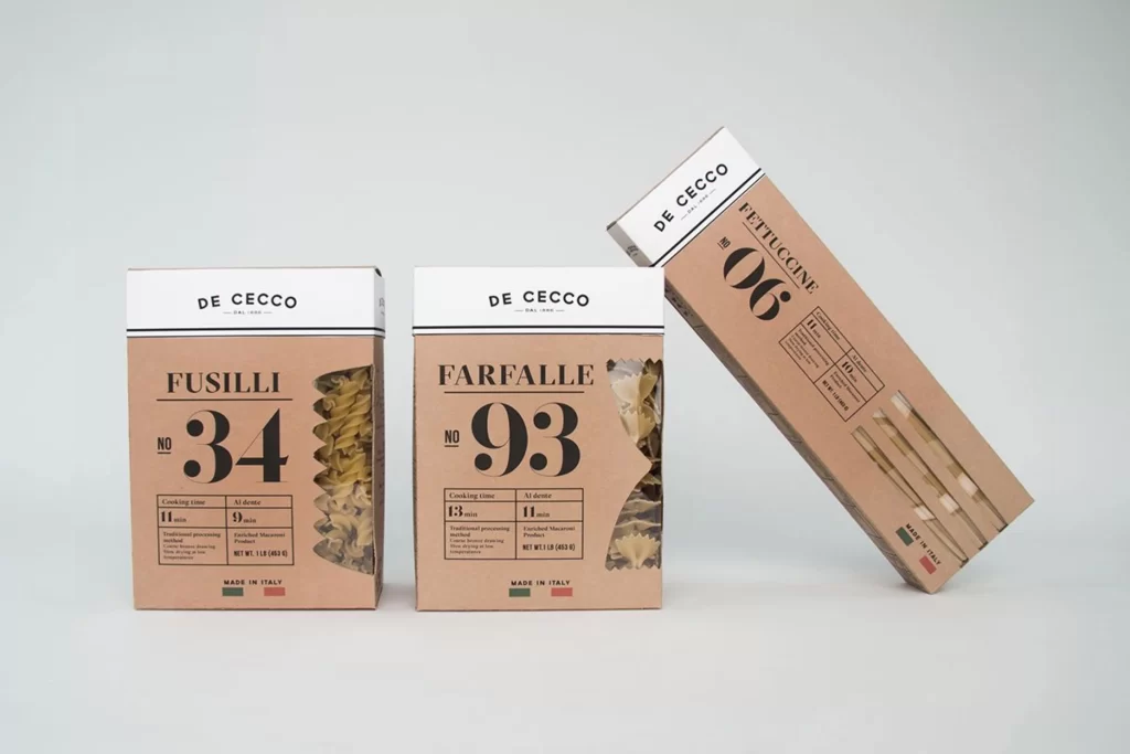
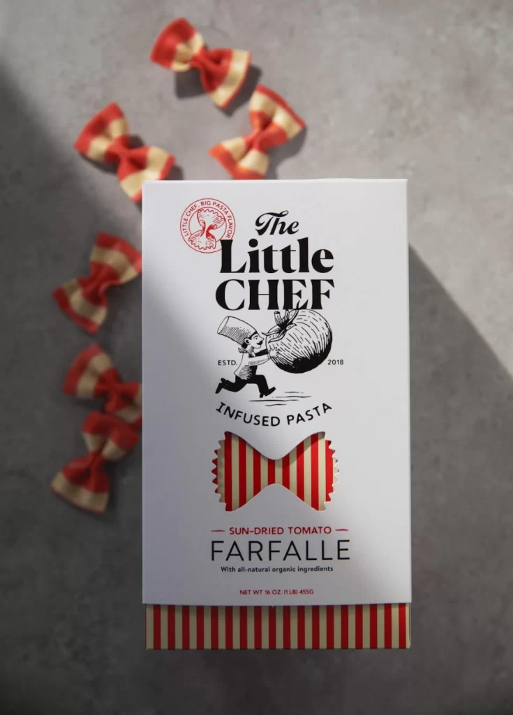
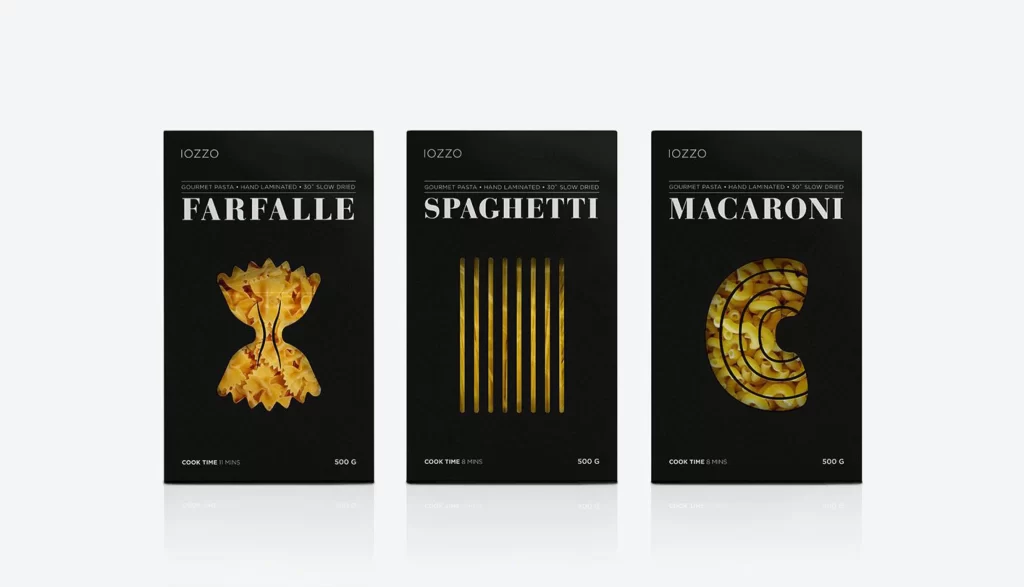
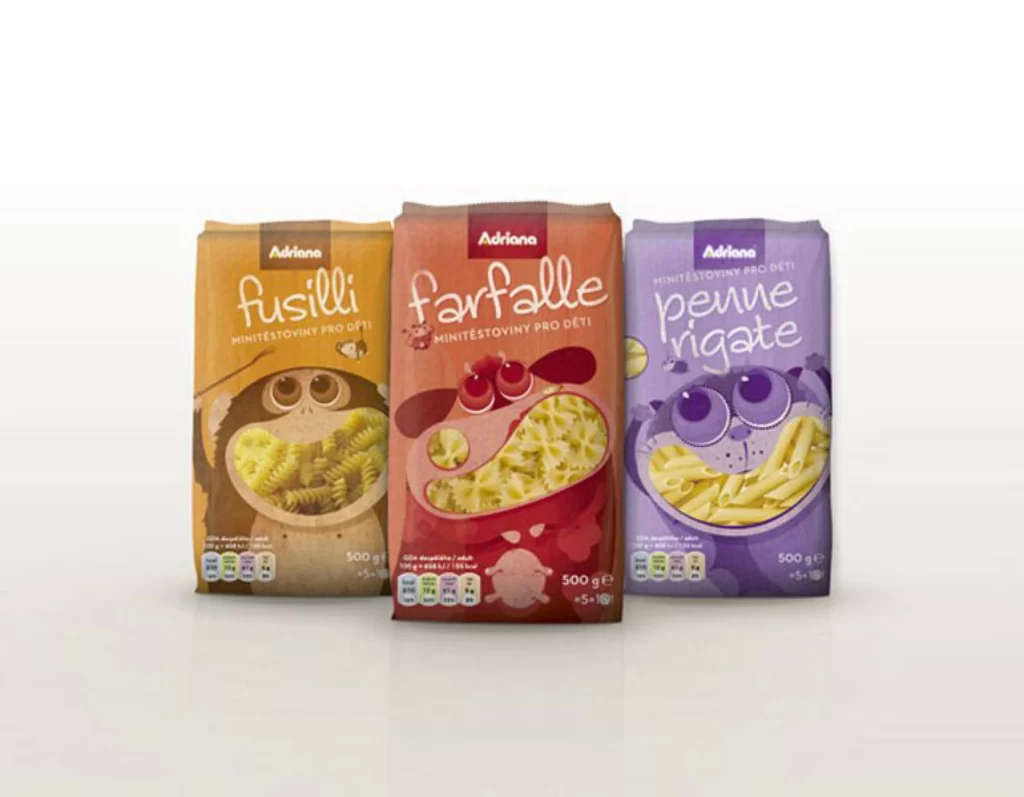
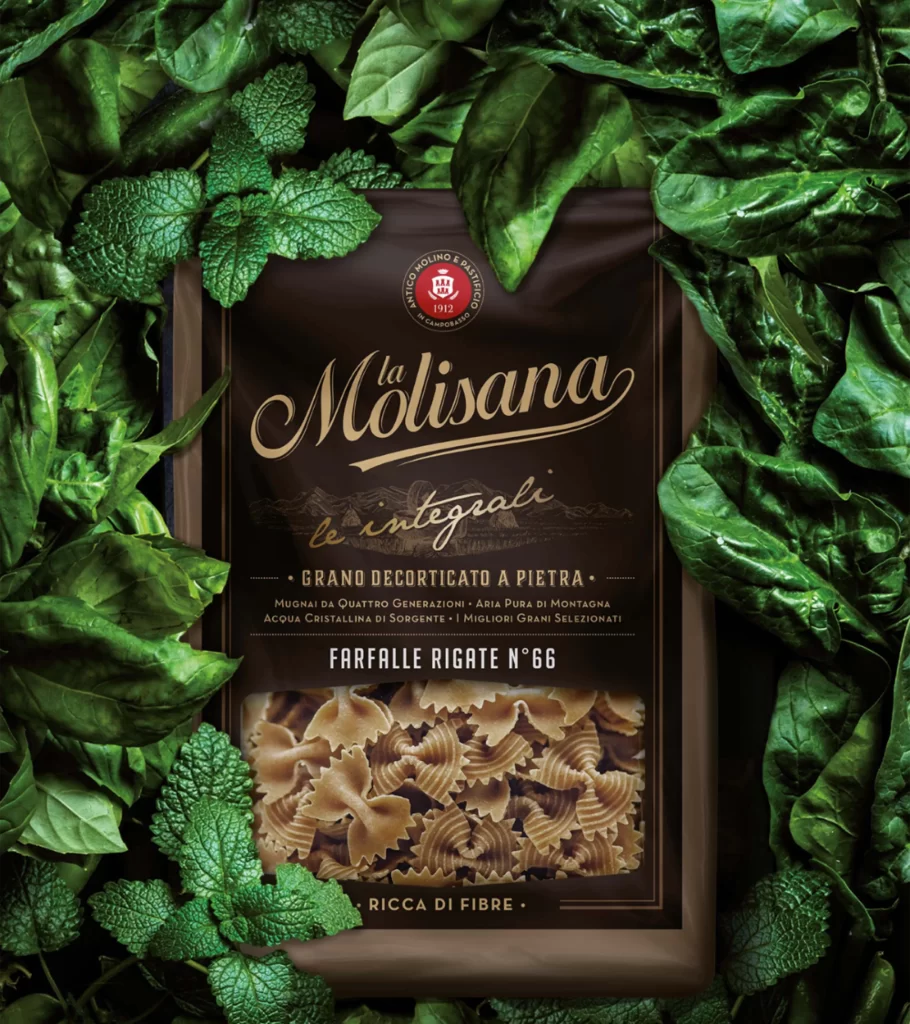
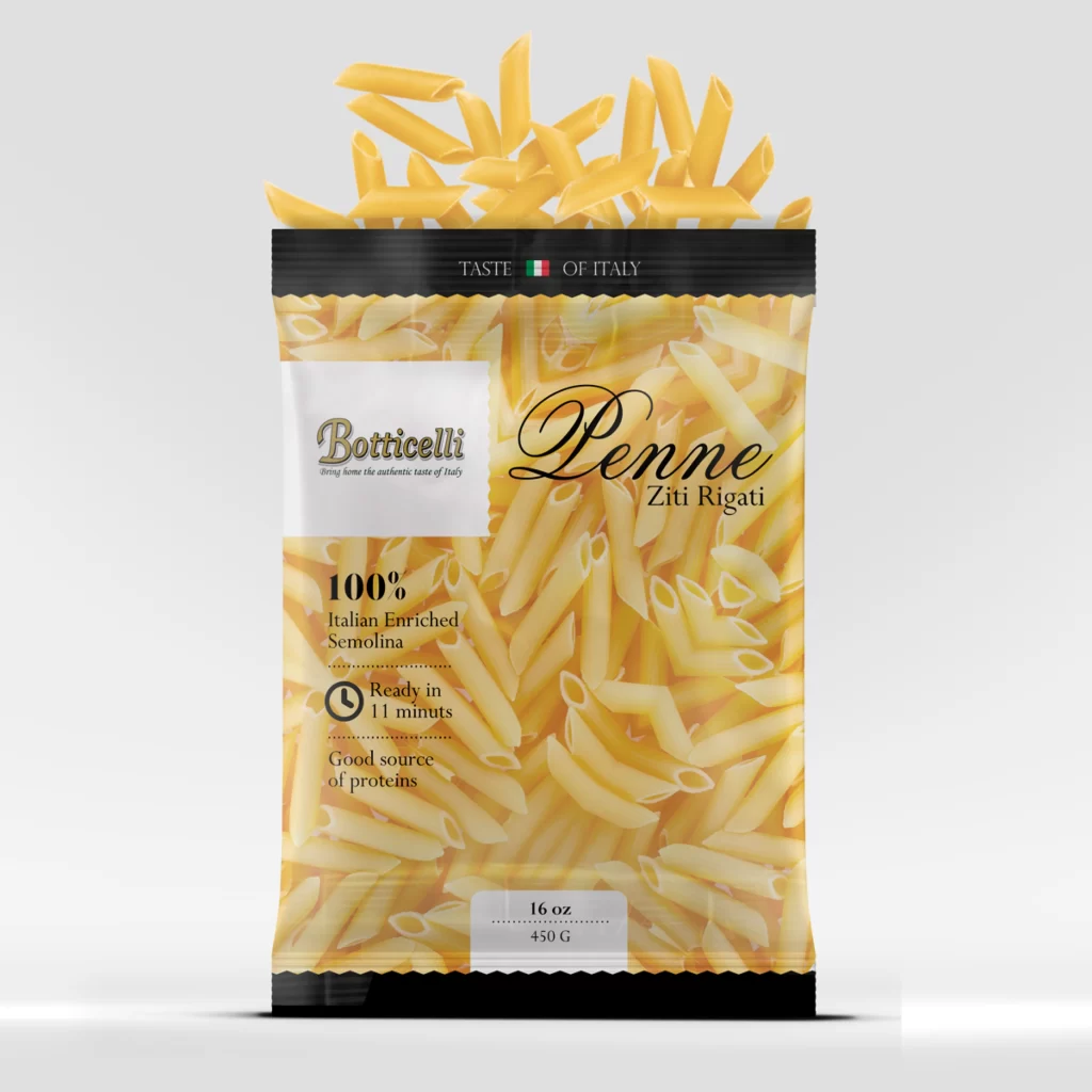
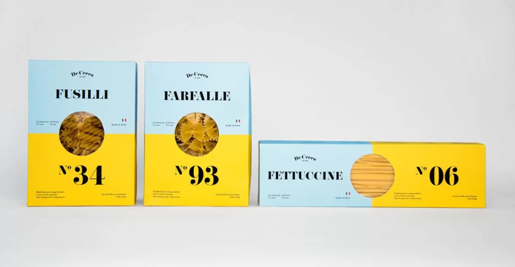
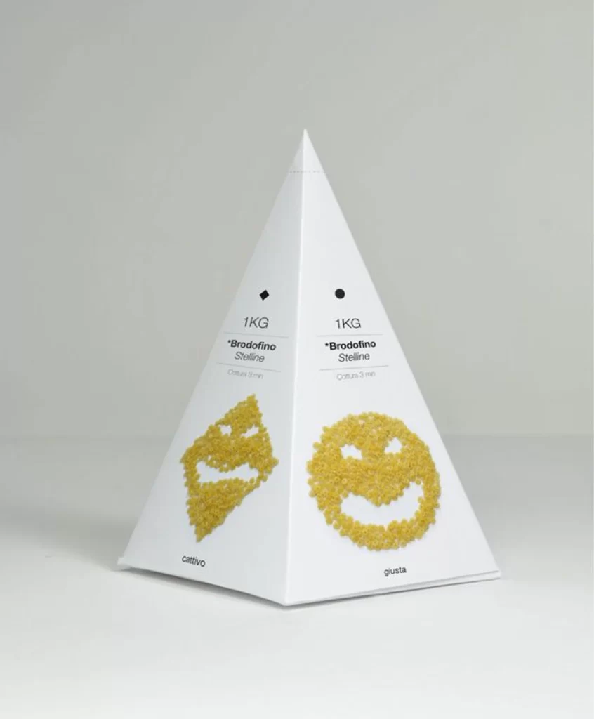
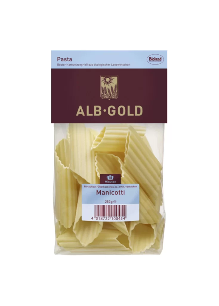
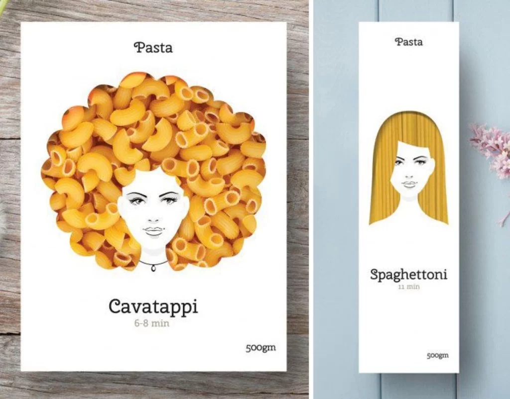
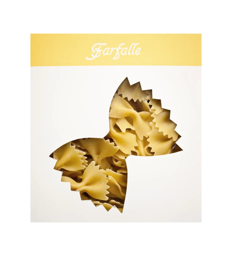
A rectangular package features a pale golden-yellow header band bearing the word "Farfalle" in an elegant white cursive script, while the lower white field contains a die-cut window shaped precisely like a bow-tie pasta piece. Through this jagged-edged aperture, dried farfalle noodles in a warm buttery tone appear densely packed, their crimped edges and pinched centers catching soft, even light from a straight-on camera perspective. The composition balances the typographic elegance above with the tactile, three-dimensional reality of the product visible below, creating a clever visual pun between the container's negative space and its contents.
What distinguishes this packaging concept is the witty integration of form and function, where the cutout silhouette acts as both a viewing portal and a brand identifier without requiring additional illustration. The restrained two-tone palette of creamy yellow and off-white allows the organic texture of the pasta to provide the primary visual interest, while the sophisticated serif lettering lends an artisanal, premium quality to the overall presentation. Designers can access the complete high-resolution file at no cost to study how negative space can reinforce product identity.
Brand strategists developing gourmet food lines would find this reference particularly valuable when brainstorming window-pane packaging that reveals texture while maintaining structural integrity. Print production teams might utilize the specific measurements of that irregular bow-tie cutout to calculate die-line specifications for similar custom-shaped apertures on cardboard substrates. Typography enthusiasts could also analyze the kerning and weight of that flowing script to inform their own label treatments for artisanal Italian goods.