Giovanni Rana Duettos Pasta Packaging
DownloadTopics
Details
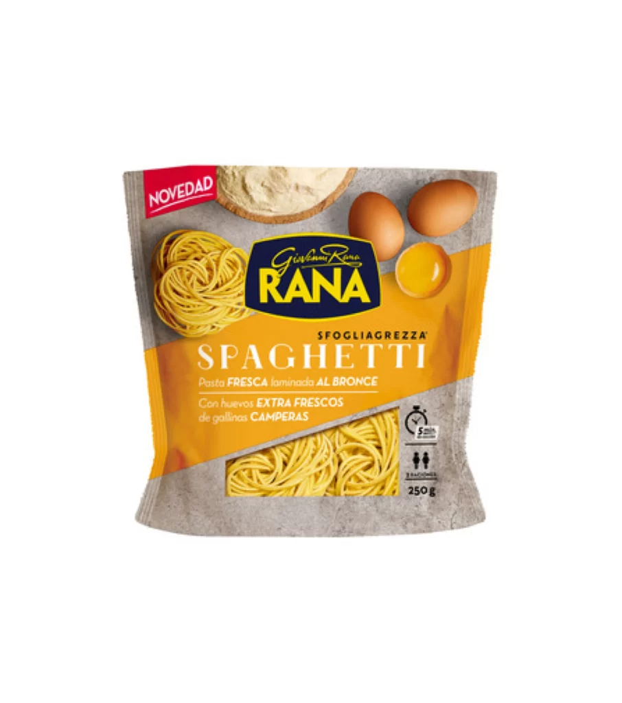
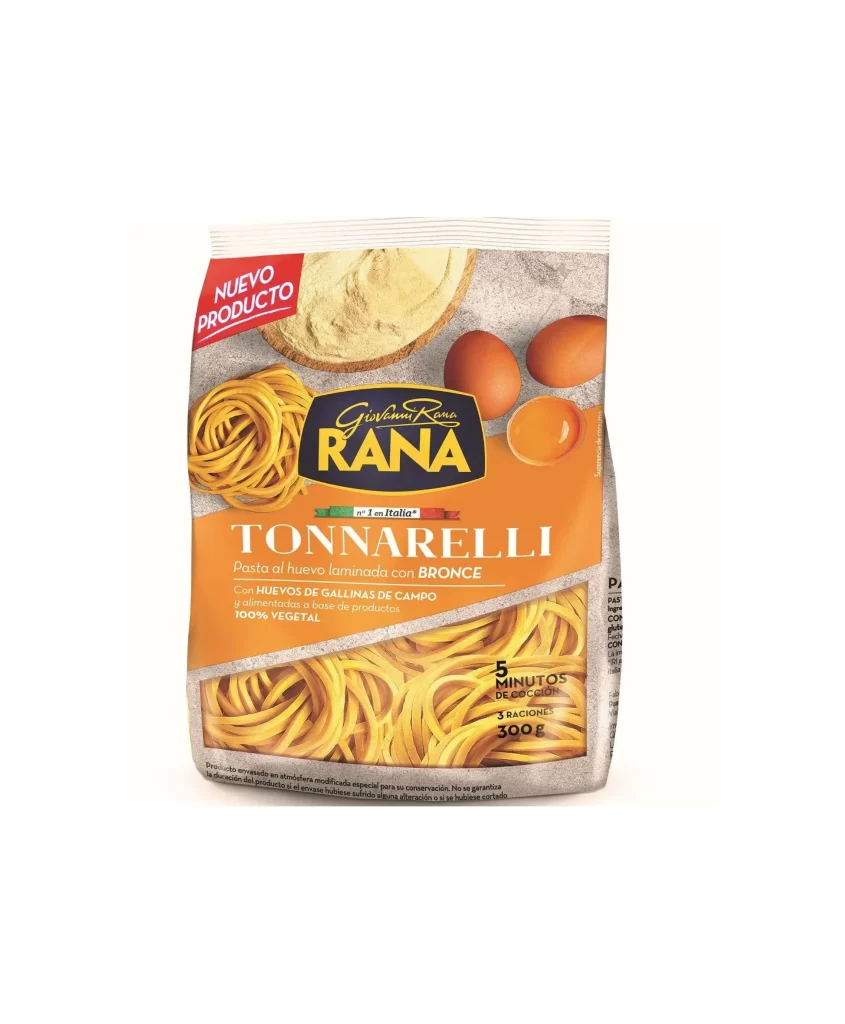
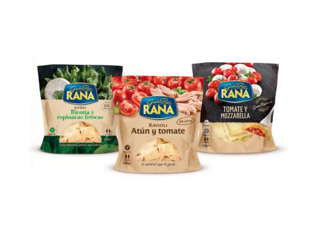
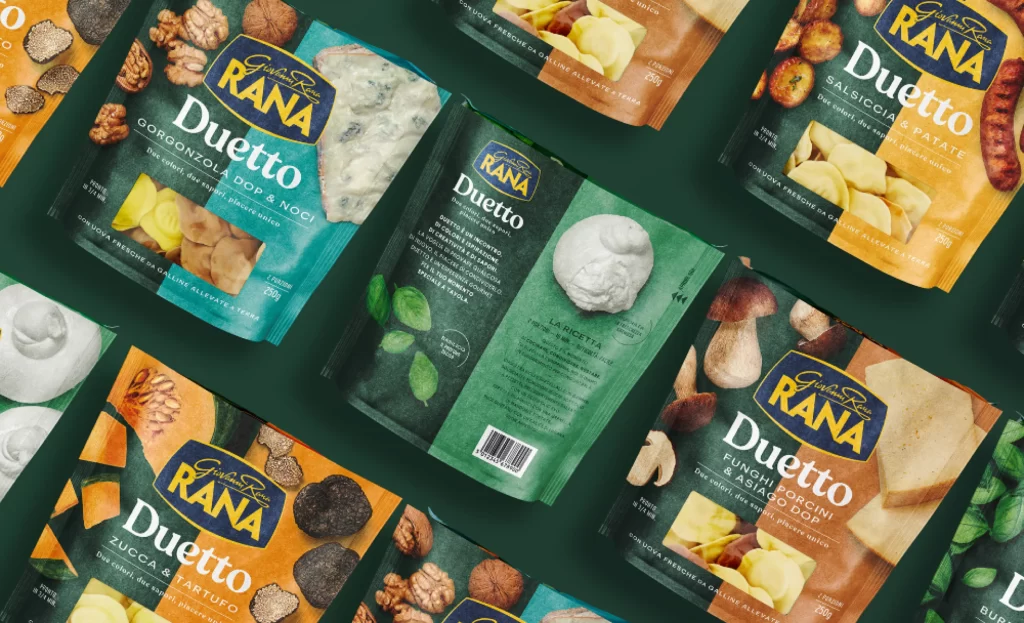
Multiple pouches of Giovanni Rana Duetto pasta lie scattered across a deep forest-green surface, each package displaying a distinct flavor variant through its color-coded design. The packaging features a split-composition layout with a dark teal or orange upper section containing the brand's gold and navy logo, while the lower half showcases high-resolution photography of ingredients like gorgonzola, walnuts, truffles, sausage, pumpkin, and porcini mushrooms. Soft directional lighting creates gentle shadows beneath the flexible film material, and the camera maintains a slight isometric perspective that reveals both the front branding and partial back-panel text for several units.
Visual hierarchy relies on the bold contrast between the sophisticated dark backgrounds and the vibrant ingredient photography, which immediately communicates the premium filling contents without requiring text literacy. The typographic system balances the elegant serif 'Giovanni Rana' wordmark against a heavy sans-serif 'Duetto' product name, creating a refined yet accessible aesthetic that bridges traditional Italian craftsmanship with modern retail visibility. Designers studying this composition will note how the consistent grid structure accommodates varying ingredient imagery while maintaining brand cohesion across the entire product line.
Food photographers can analyze the lighting setup used to make the translucent pasta windows appear appetizing without glare, while packaging engineers might reference the material folds and seam placement visible on the crinkled pouch surfaces. Brand identity specialists could extract the specific color values assigned to each flavor profile to understand how visual coding aids consumer navigation in refrigerated aisle environments. Anyone needing to examine these typographic details or texture qualities closely can access the full-resolution file at no cost through the download portal.