Giovanni Rana Ravioli Pasta Packaging
DownloadTopics
Details
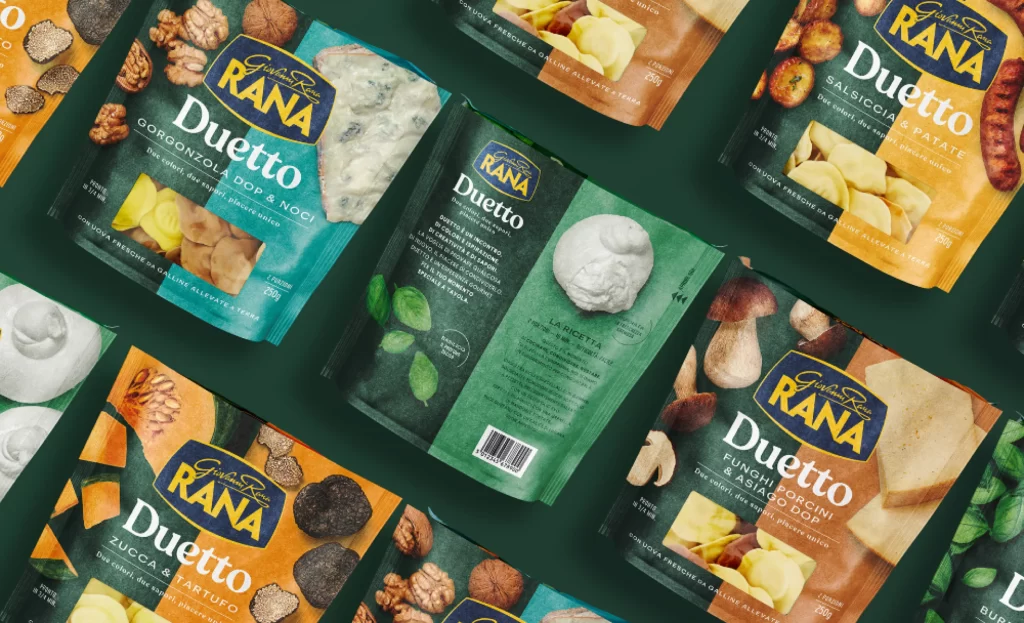
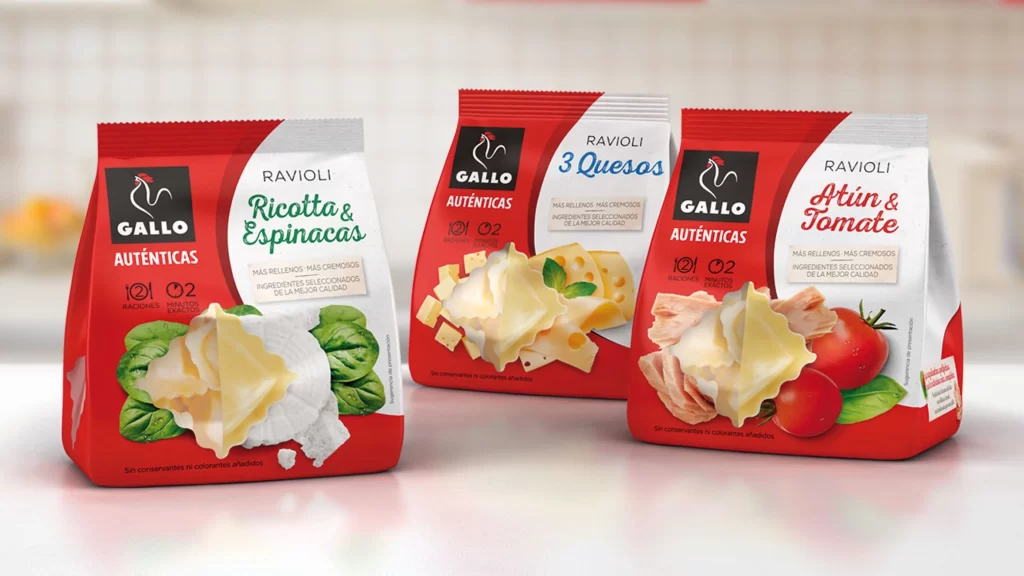
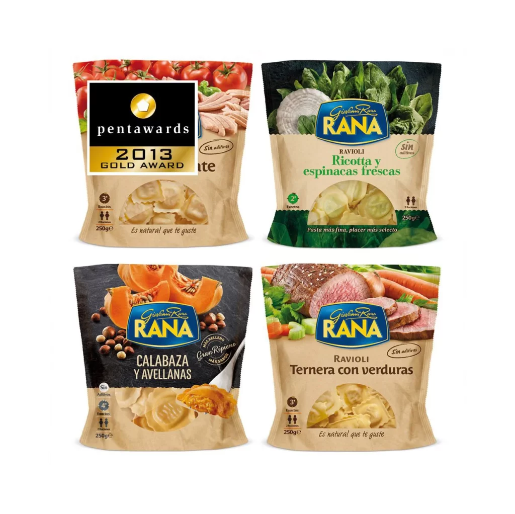
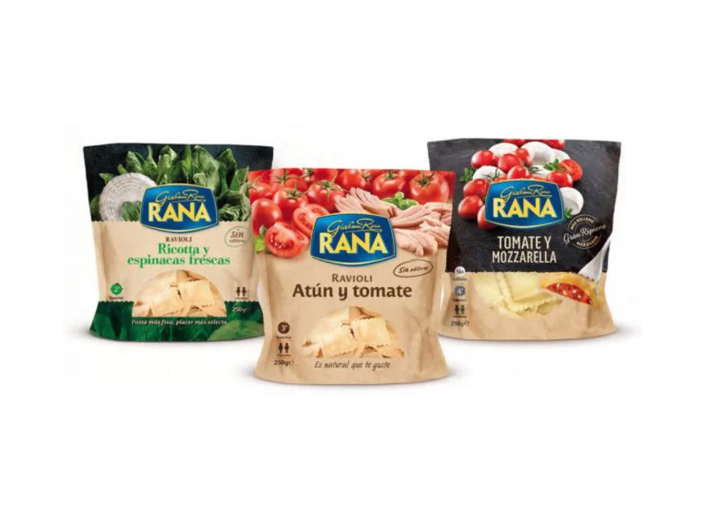
Three stand-up pouches of Giovanni Rana ravioli sit in a slight arc, each displaying a distinct flavor variant against a neutral off-white surface. The left package features a dark green lower band with fresh spinach leaves and white ricotta cheese, while the center pouch showcases ripe red tomatoes and pink tuna slices above a warm tan base. On the right, bright red cherry tomatoes and mozzarella balls appear against a charcoal gray upper section, with all three bags bearing the signature blue RANA oval logo and 250g weight markings.
Visual differentiation between the three SKUs relies heavily on color-coded header zones that immediately signal the primary ingredients to shoppers. The photography emphasizes freshness through glossy tomato skins, crisp leaf textures, and the natural folds of the pasta visible through the transparent lower windows. Designers studying this layout will appreciate how the consistent brand lockup anchors the composition while allowing each variant to maintain its own chromatic identity, and the full-resolution source file can be accessed without cost for closer inspection.
Food packaging professionals might consult this arrangement when planning multi-SKU product line photography or evaluating how flexible pouch materials render under studio lighting. Illustrators requiring accurate depictions of Italian pasta brands could trace the typographic hierarchy or color values present across the trio. Anyone building a commercial mockup library would find the straight-on camera angle particularly useful for overlaying custom label designs onto realistic packaging forms.