Pasta Fresh Ravioli Black White Modern
DownloadTopics
Details
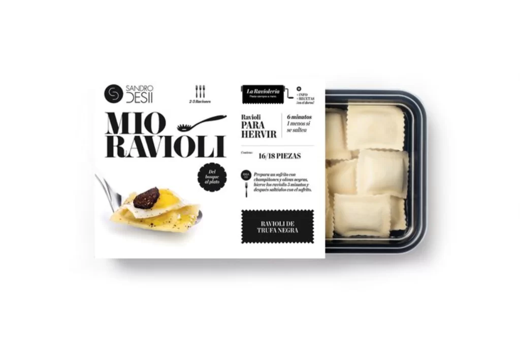
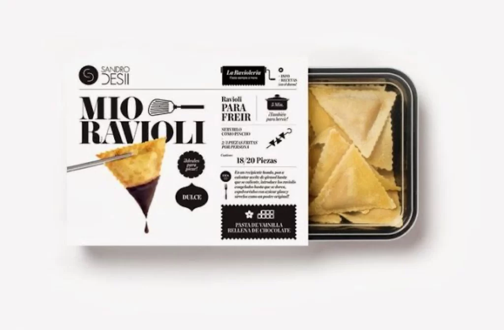
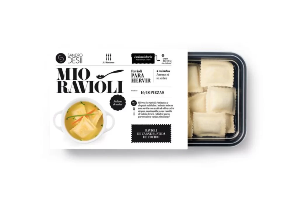
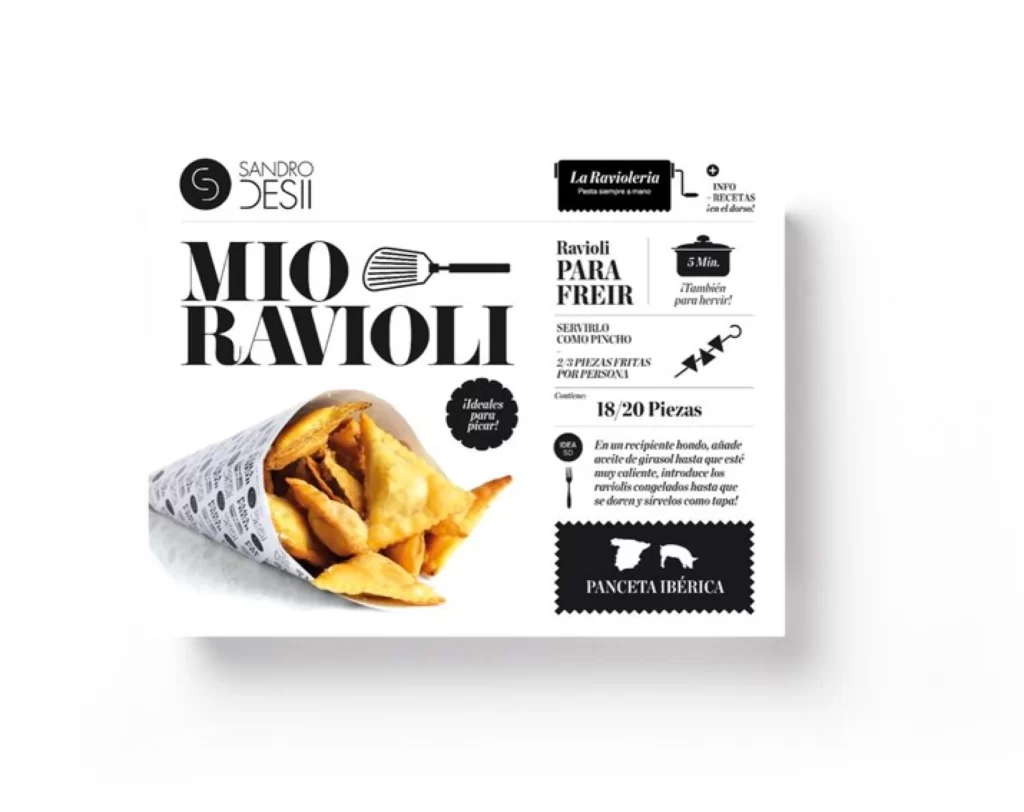
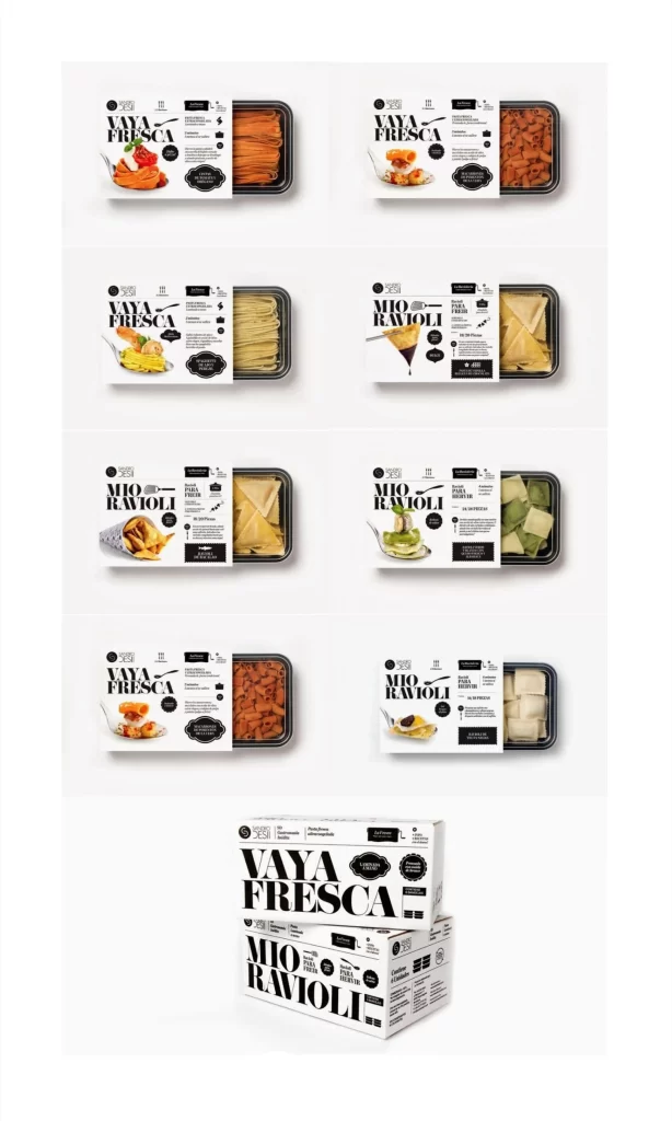
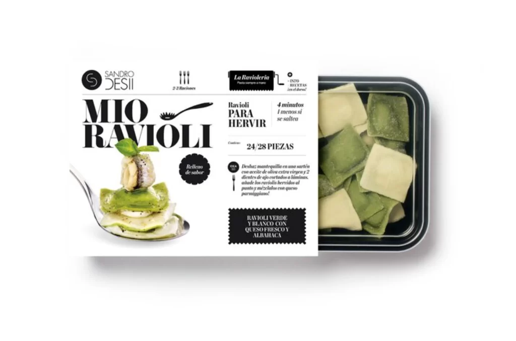
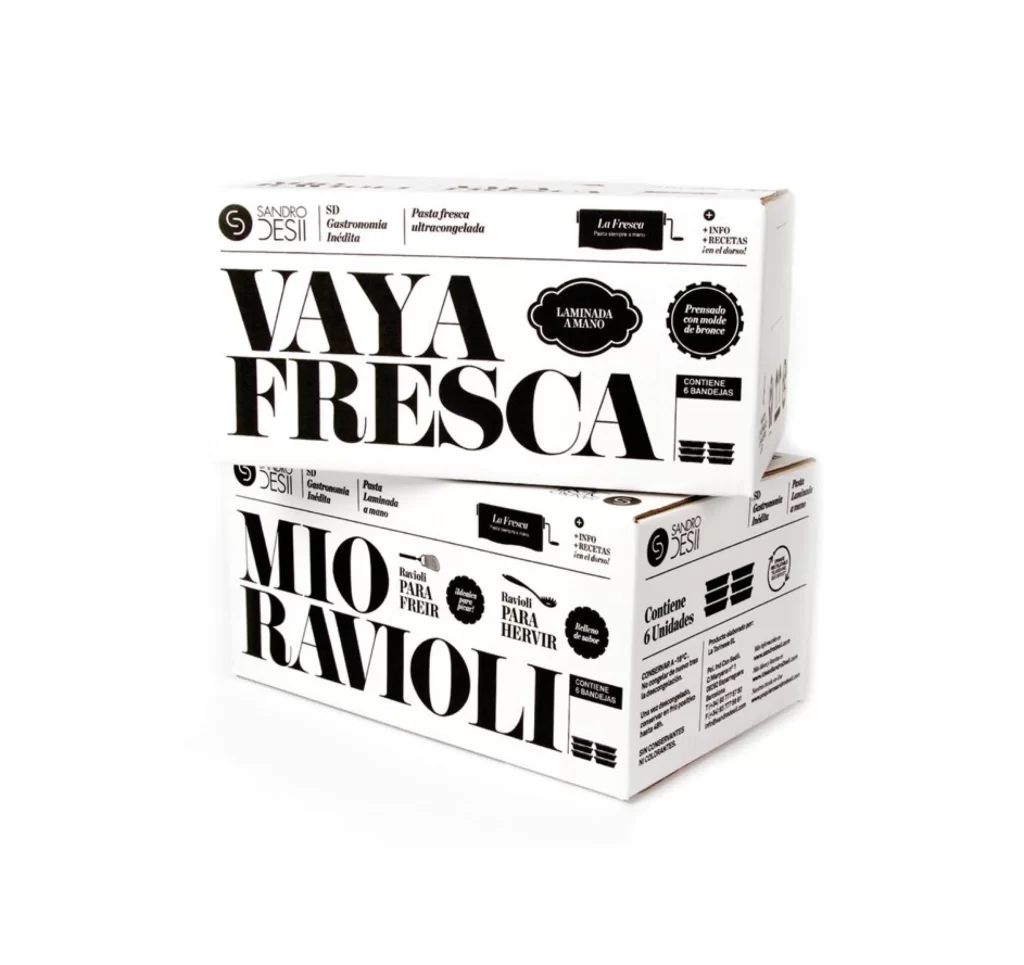
Two rectangular cardboard boxes stack at a slight angle, their surfaces covered in bold black typography against an unprinted white substrate. The upper carton displays 'VAYA FRESCA' in massive serif capitals, while the lower one reads 'MIO RAVIOLI' in the same heavy typeface. Smaller text elements include the brand name 'SANDRO DESII', product descriptors like 'Pasta fresca ultracongelada', and circular badges noting 'LAMINADA A MANO' and 'Premsada amb motlle de bronze'. The composition sits on a clean white surface with soft overhead lighting that casts minimal shadows beneath the packaging.
Visual hierarchy dominates through extreme scale contrast between the oversized product names and the supporting technical details scattered around them. The monochrome palette forces attention onto typographic weight and spatial arrangement rather than color, creating a stark editorial aesthetic that feels both industrial and artisanal. Graphic designers studying packaging systems will appreciate how the layout balances dense information with generous negative space across multiple faces of the three-dimensional form.
Brand identity developers working on premium food products can analyze how traditional Italian pasta terminology integrates with modernist layout principles here. Print production specialists might reference the specific badge shapes, icon placements, and text block configurations when planning similar retail packaging projects. Anyone needing to examine the precise typographic treatment or structural details can access the full-resolution file for free download directly from this resource page.