Pasta Ravioli Gallo Red White
DownloadTopics
Details
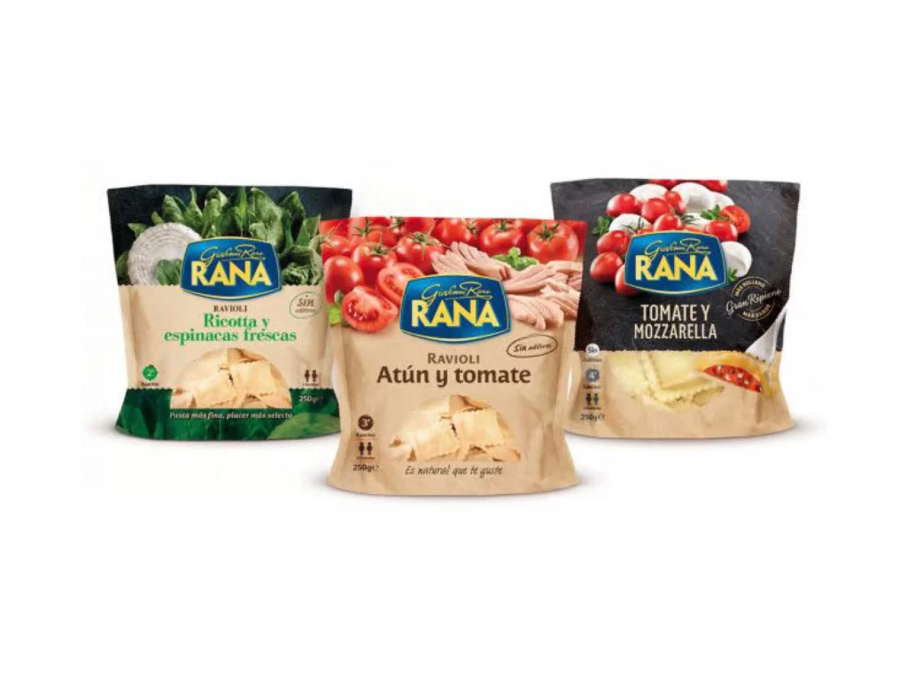
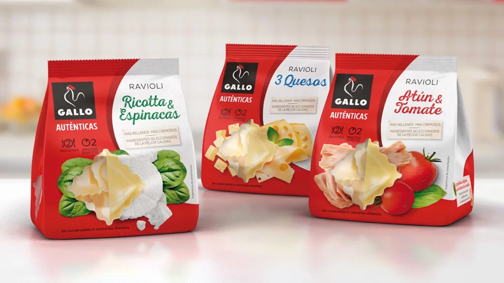
Three stand-up pouches of Gallo brand ravioli sit in a gentle arc across a pale, softly blurred surface, each bag displaying a bold red-and-white color scheme with a black square logo featuring a white rooster silhouette. The left package advertises Ricotta & Espinacas (spinach) in green script above a photo of a ravioli nestled among fresh leaves and cheese; the center bag promotes 3 Quesos (three cheeses) with yellow typography and images of cubed cheese and basil; while the right variant highlights Atún & Tomate (tuna and tomato) in red cursive lettering beside slices of fish and ripe tomatoes. Soft studio lighting casts subtle shadows beneath the glossy plastic material, and the camera maintains a straight-on perspective that keeps all three flavor variants clearly legible against the neutral kitchen backdrop.
Visual hierarchy on these packages relies heavily on typographic contrast between the blocky black logo, the clean sans-serif product category, and the flowing script used for each specific filling, creating immediate flavor differentiation at a glance. The consistent placement of the 'Auténticas' badge and the 12-minute/2-step cooking icons establishes a reliable visual system that consumers can recognize instantly across the entire product line. Anyone studying commercial food packaging layouts can grab the full-resolution file for free to examine how photography integrates with color-coded text zones without cluttering the overall composition.
Food photographers might study this shot to understand how soft directional lighting enhances the appetizing textures of both the pasta dough and the fresh ingredient props arranged around the central product. Brand designers working on frozen goods could analyze the red-white palette balance and the strategic use of green, yellow, and red accents to signal taste profiles before reading a single word. Marketing teams developing SKU variations for retail shelves would benefit from dissecting how the three distinct designs maintain family resemblance while standing apart from one another on crowded freezer aisles.