Japanese Snack Food Packaging
DownloadTopics
Details
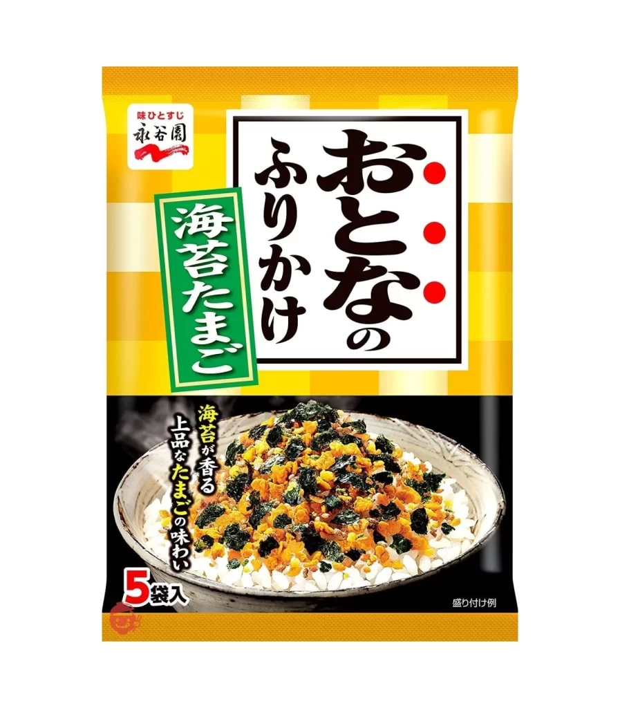
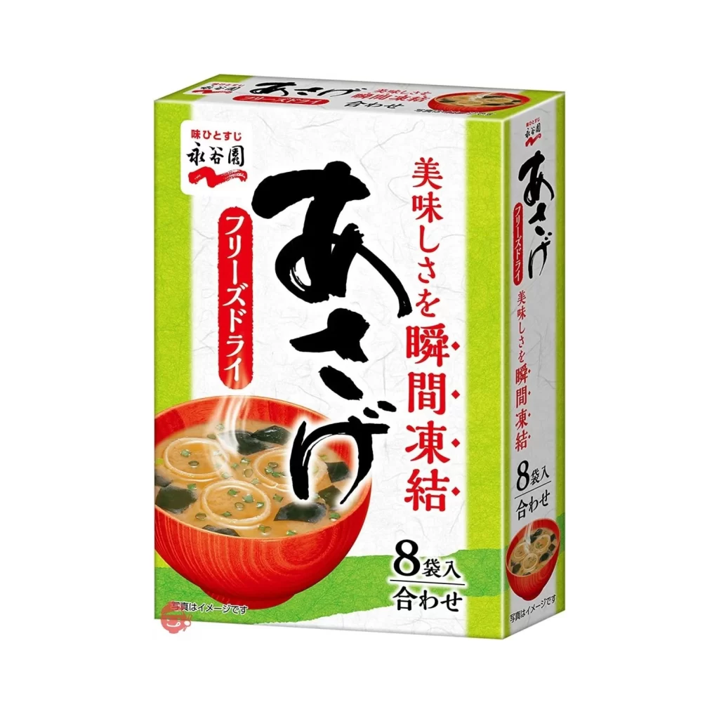
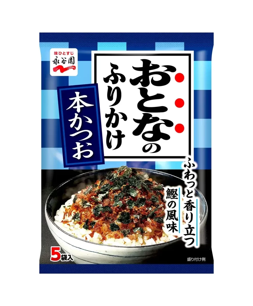
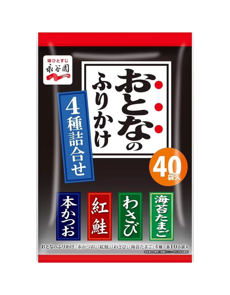
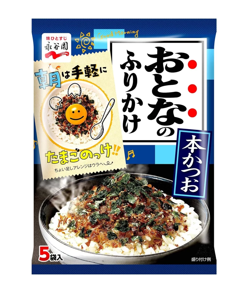
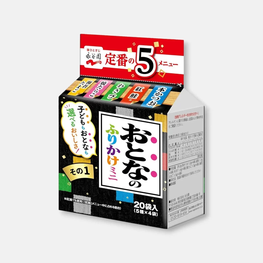
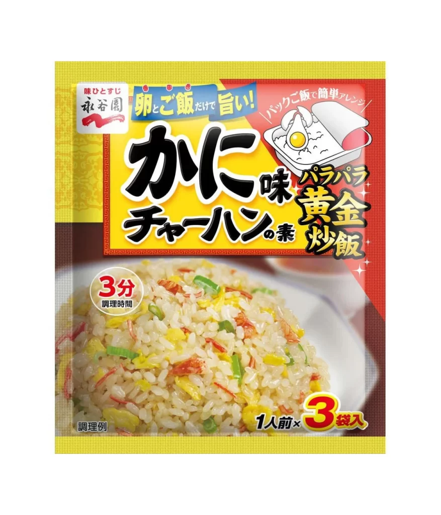
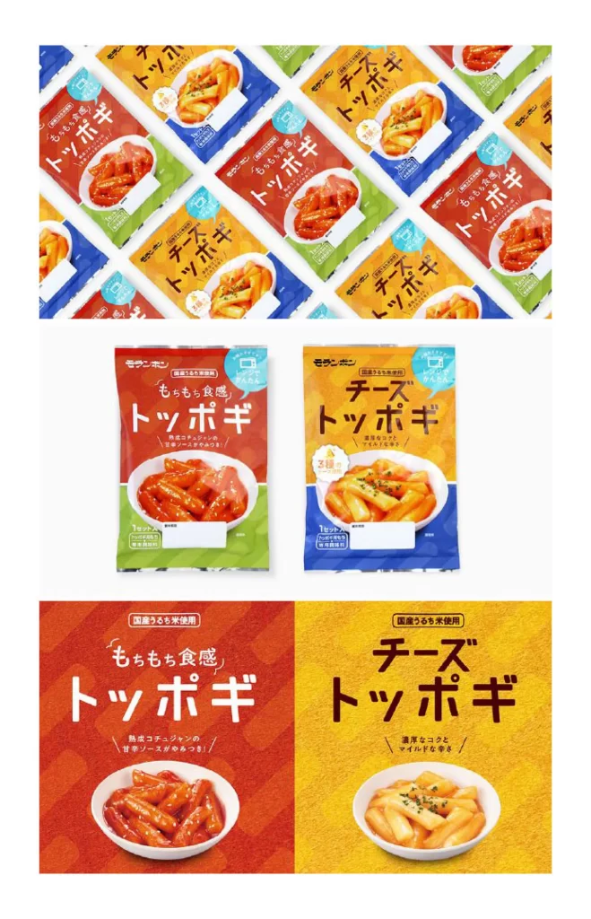
Vibrant red and orange packaging dominates the upper register, featuring diagonal rows of glossy rice cake snacks against blue, green, and yellow backdrops. Bold Japanese katakana characters for "Toppogi" anchor the upper half of each bag, while the lower section displays a white bowl filled with glistening, sauce-coated cylinders. The middle tier isolates two distinct flavor variants—spicy red and creamy cheese—against a neutral gray field, emphasizing the product photography without distraction. A final pair of compositions expands the color fields to full-bleed intensity, positioning the food imagery as the focal point within saturated environments.
Color coding functions as the primary navigational tool here, with warm reds signaling heat and cool blues indicating dairy-based flavors. Typography scales dynamically between the large main product name and smaller descriptive text regarding texture and preparation method. Designers can access the complete high-fidelity asset pack to study how these contrasting palettes create immediate flavor recognition at retail distances.
Brand strategists developing Asian snack lines for international markets will find the bilingual layout structure particularly instructive for balancing local authenticity with global accessibility. Packaging engineers might reference the material fold patterns visible along the bag edges when prototyping stand-up pouches for moist contents. Food photographers could analyze the lighting setup used to achieve that specific sheen on the starch surfaces without creating distracting glare.