Nagatanien Freeze Dried Miso Soup Snack Packaging
Topics
Details
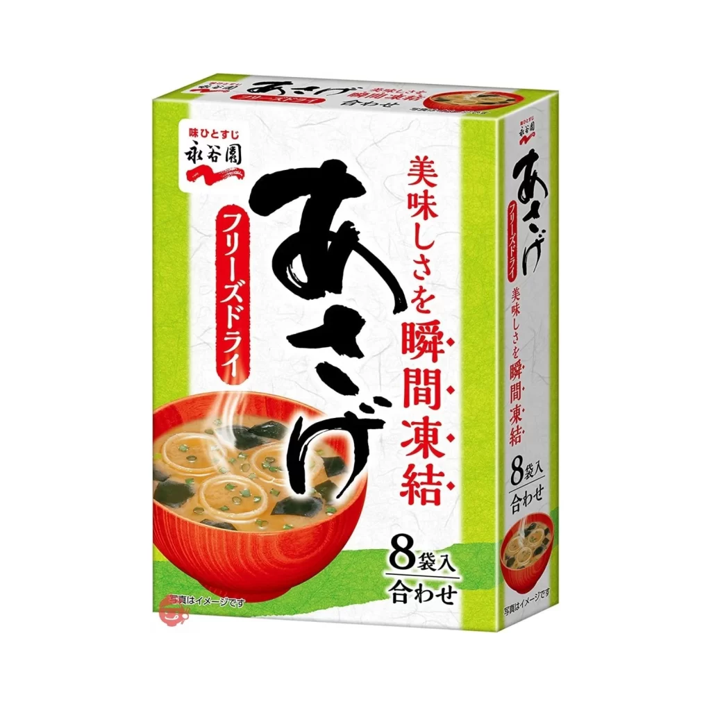
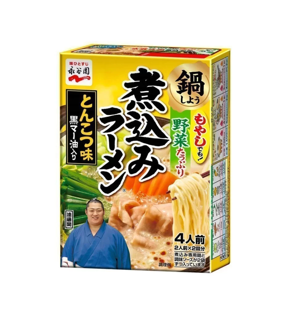
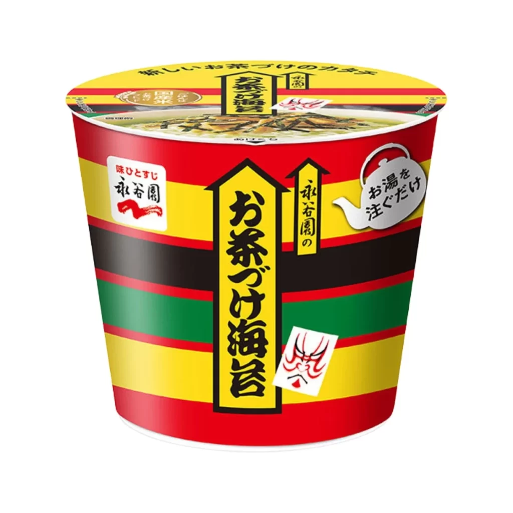
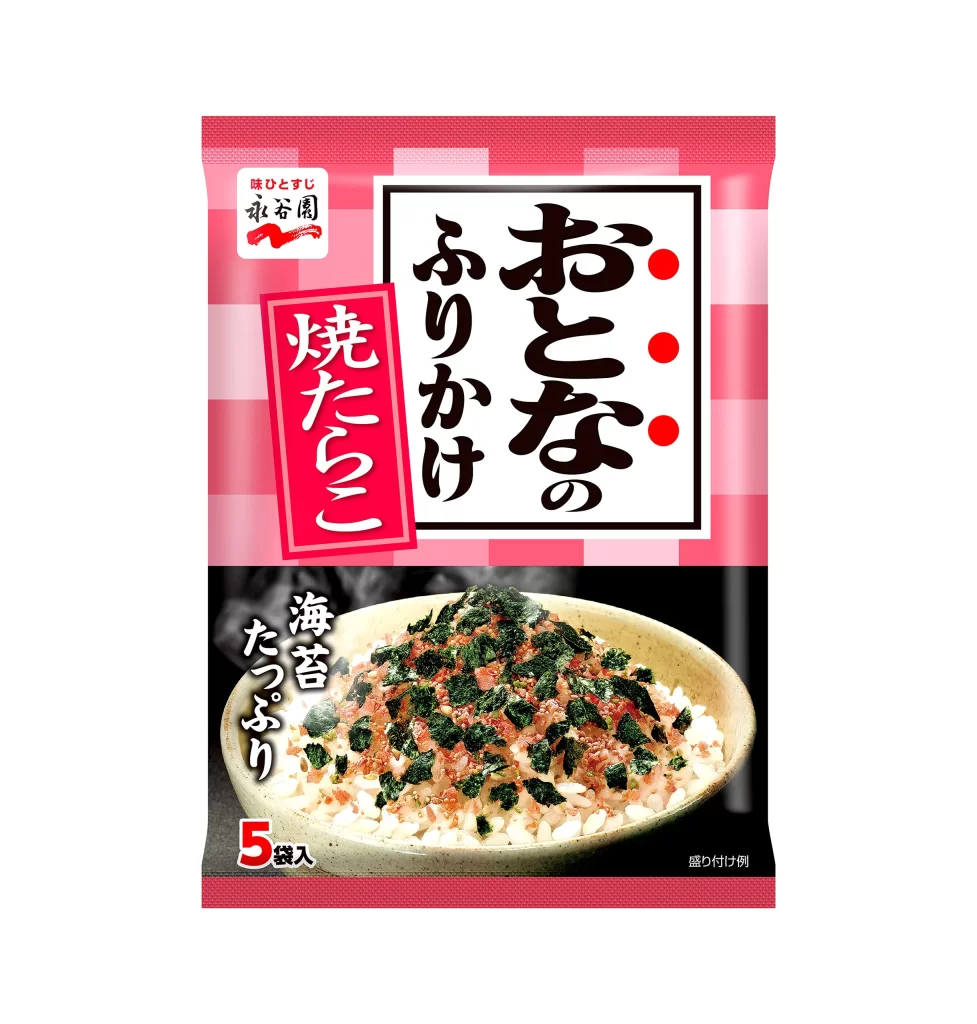
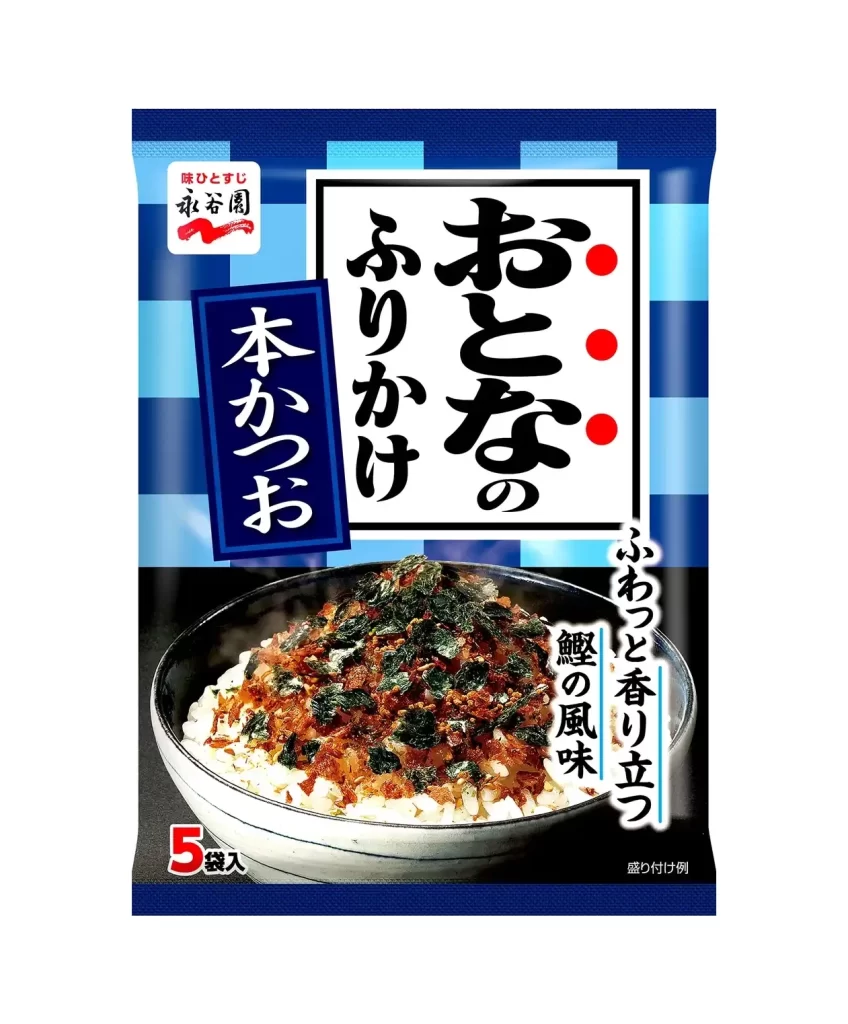
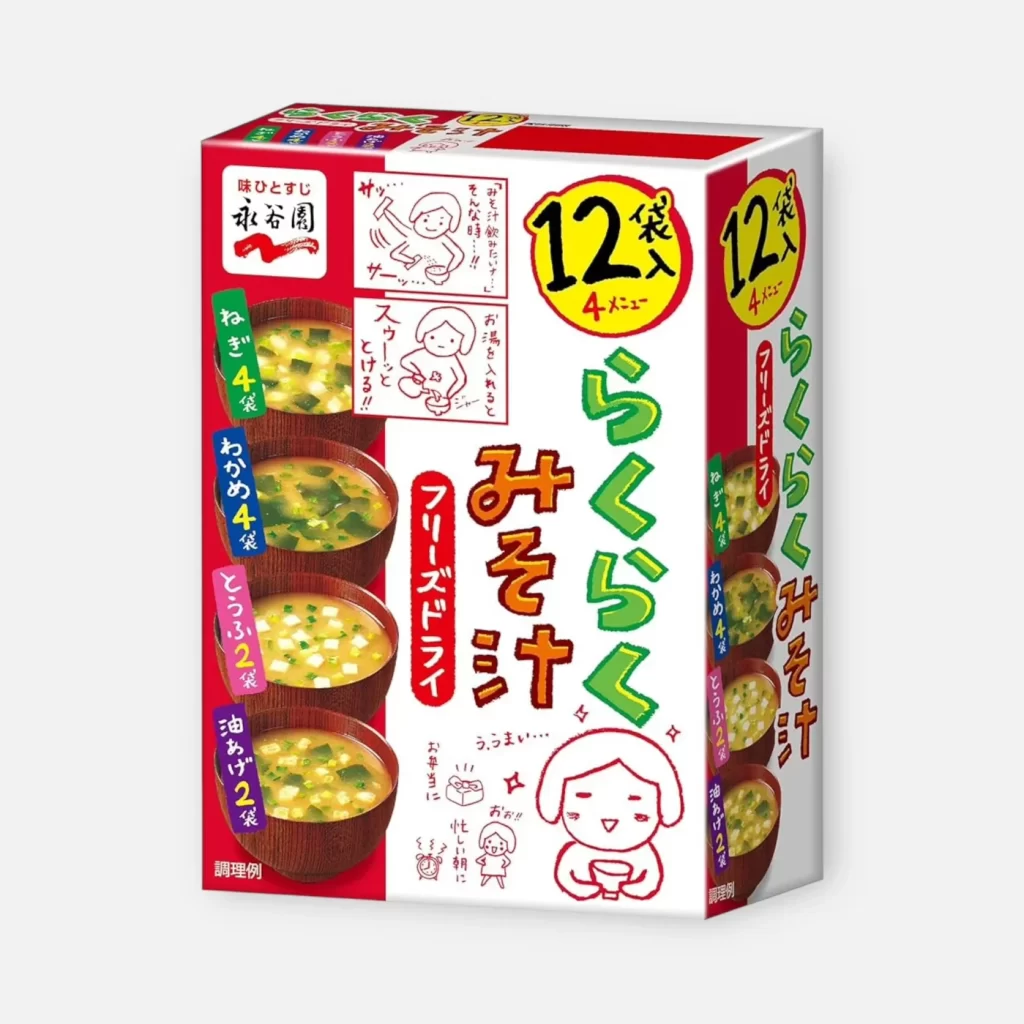
Vibrant lime green side panels frame a central white field, creating a high-contrast backdrop for the bold black calligraphy of the main product name. A vivid red lacquer bowl sits in the lower quadrant, filled with steaming miso soup that reveals tofu and wakame details through its amber broth. The composition balances the heavy vertical brushstrokes on the right against the photographic realism of the food imagery and the structured red typography indicating 'Freeze Dried' and '8 packets included'.

Visual tension arises from the deliberate juxtaposition of traditional Japanese aesthetics with modern industrial packaging requirements. The oversized, gestural script commands immediate attention while the clean geometric layout of the informational text ensures legibility at retail distances. This specific iteration utilizes a fresh color palette that distinguishes it from standard earth-toned soup packaging, signaling a lighter or more accessible flavor profile to the consumer.
Brand strategists might analyze this layout to understand how cultural motifs can be scaled for mass-market grocery distribution without losing authenticity. Packaging engineers could study the integration of photography with graphic elements to optimize shelf presence in crowded aisles. Illustrators seeking to emulate commercial Japanese food styling would find the interplay between the brushwork and the photographic texture particularly instructive.