Nagatanien Adult Furikake 4 Flavor Assortment Packaging
Topics
Details
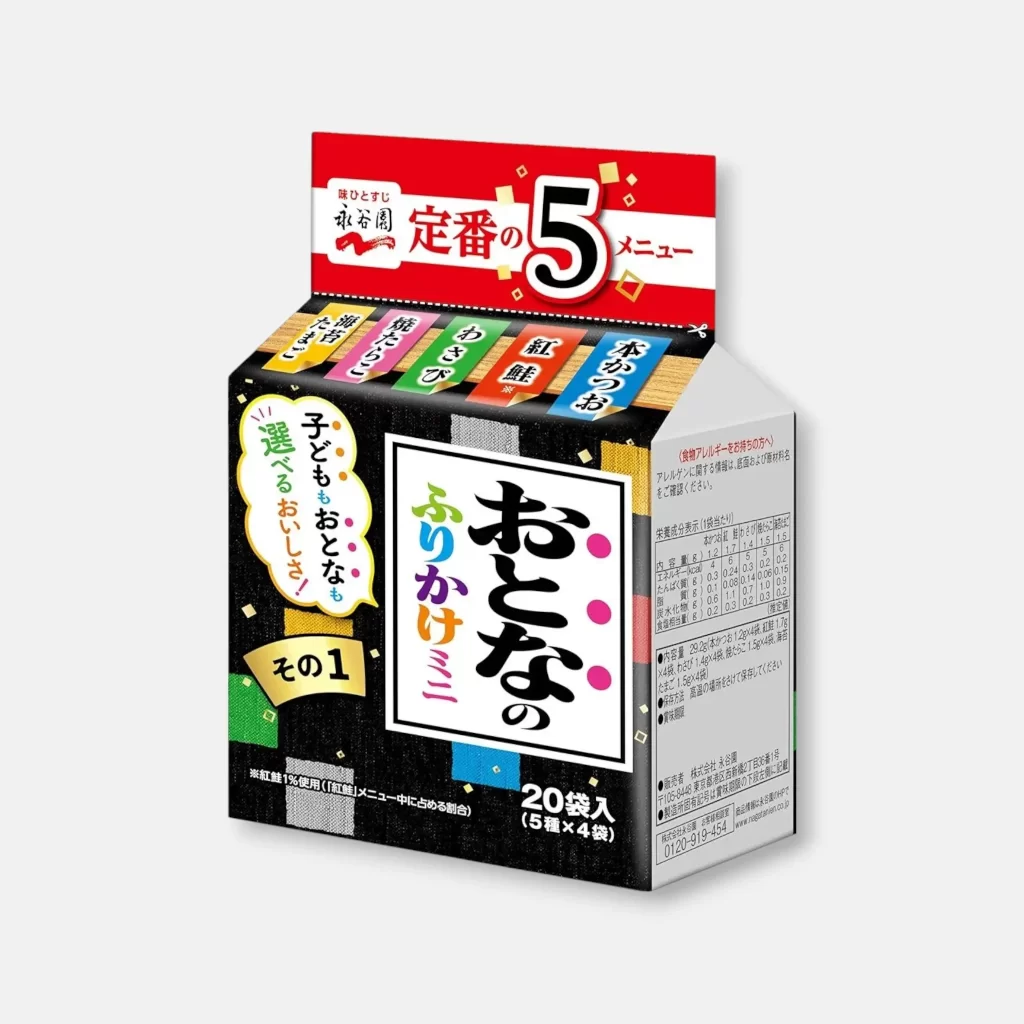
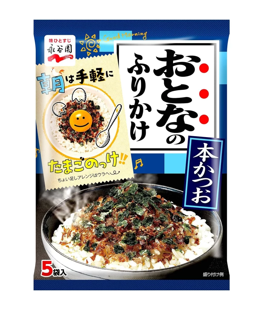
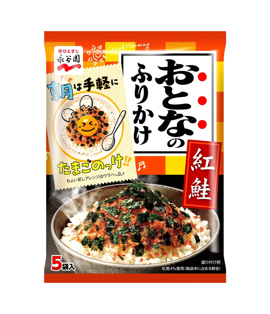
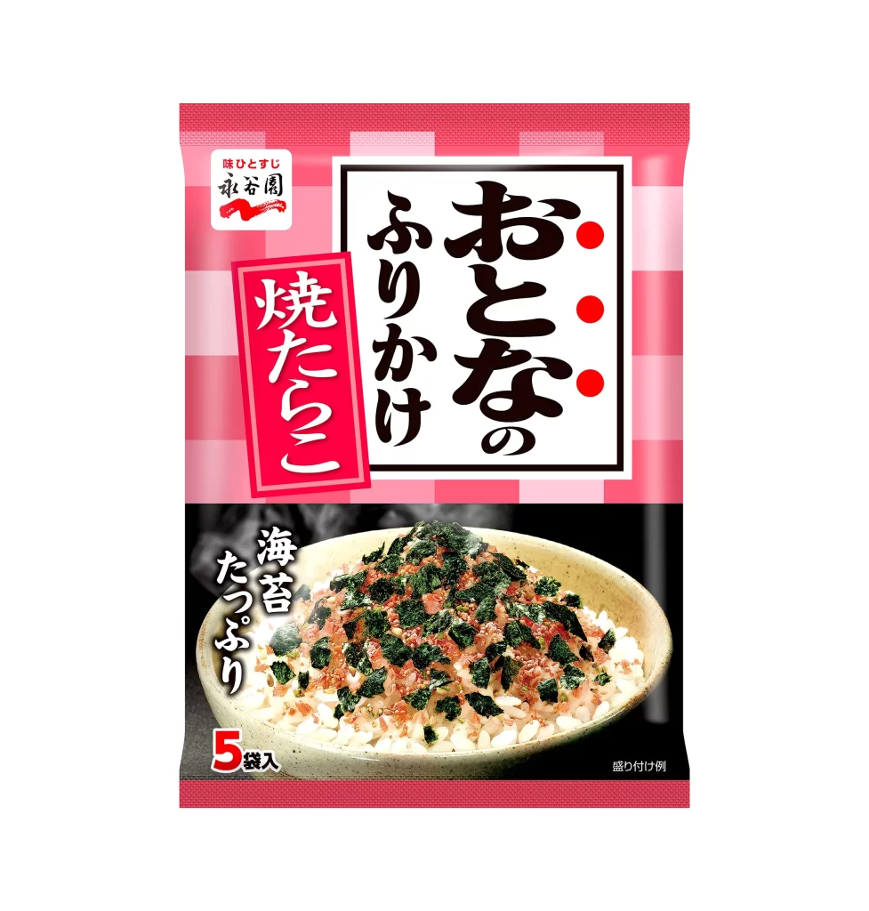
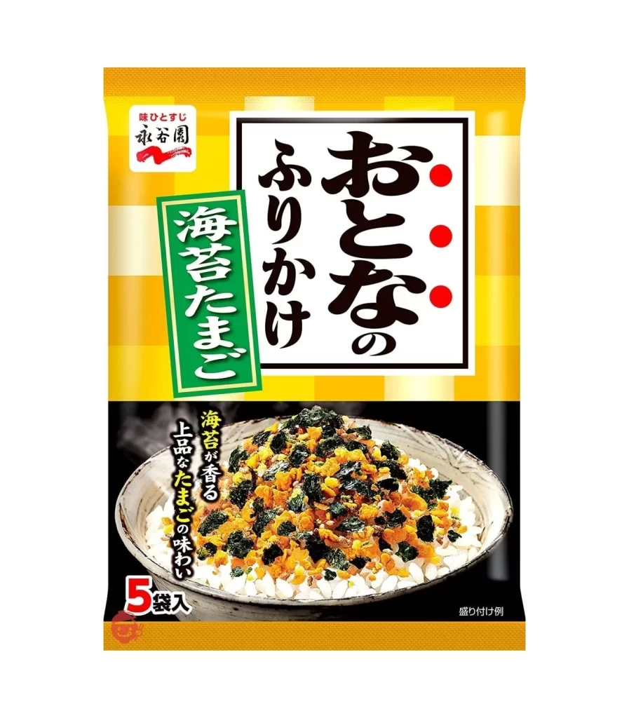
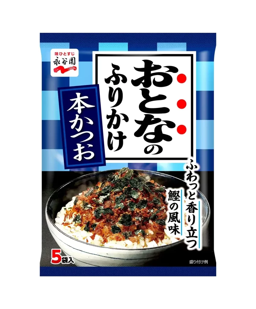
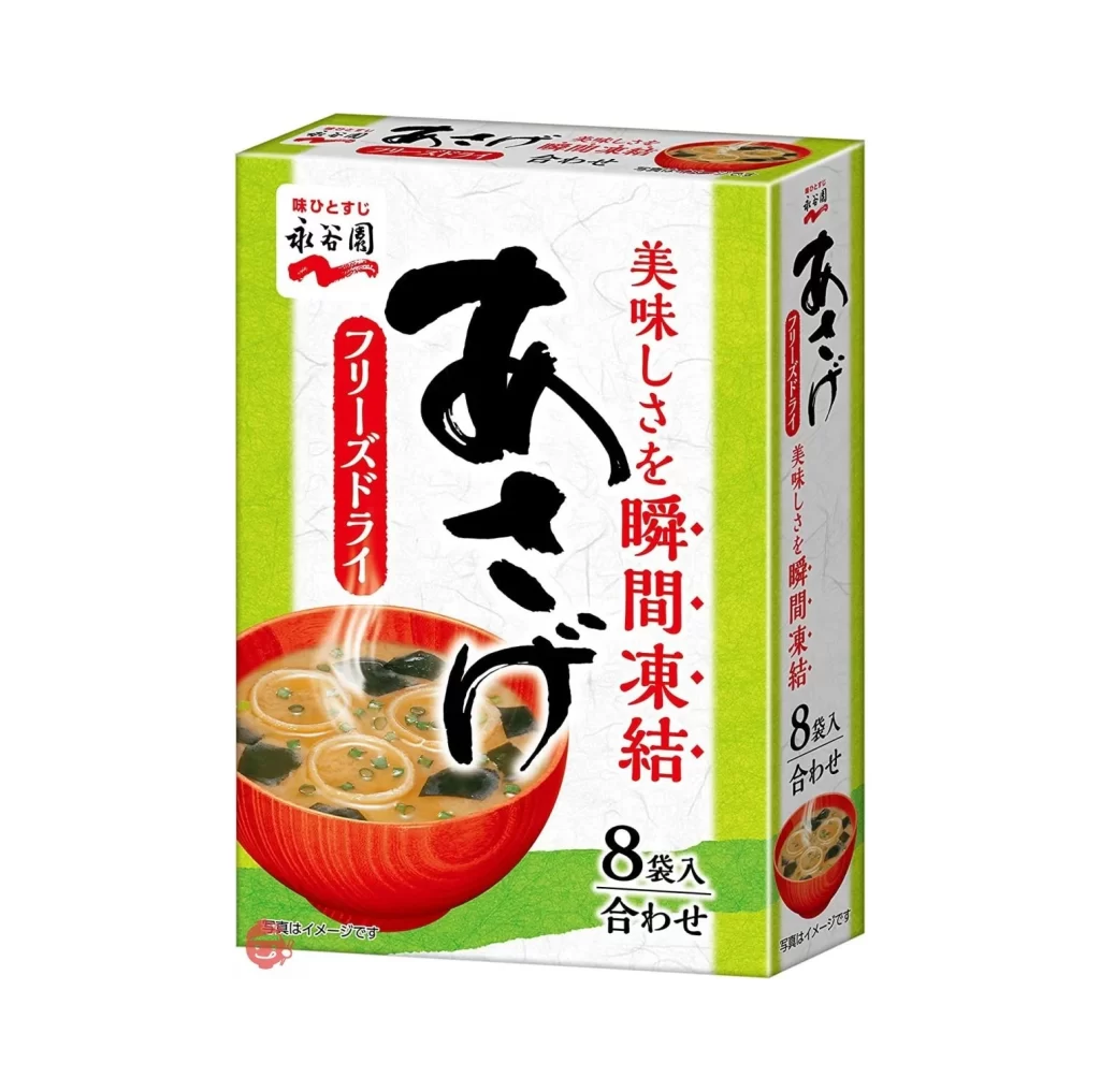
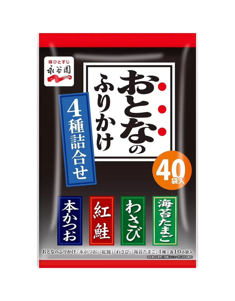
A deep black field anchors the design, bounded by thick red horizontal bands at the top and bottom edges. Large, bold calligraphy for 'Otona no Furikake' occupies a central white rectangle, punctuated by three red dots on the right, while a blue vertical banner reading '4 Shu Gousei' (4 Flavor Assortment) angles in from the left.

The visual hierarchy relies heavily on high-contrast color blocking to distinguish between product information and branding elements. Four distinct vertical color blocks—blue, red, green, and light green—line the bottom edge to represent the specific flavors: Honkatsuo (Bonito), Benikei (Salmon Roe), Wasabi, and Noritama (Seaweed & Egg). This systematic use of color coding allows for immediate flavor identification while maintaining a cohesive, traditional Japanese aesthetic through the combination of brush-stroke lettering and clean geometric shapes.
Brand strategists analyzing Japanese consumer goods would find value in how this layout balances traditional calligraphy with modern informational density. Packaging designers studying Asian market trends could utilize this as a case study for organizing multi-flavor assortments without creating visual clutter. Furthermore, typographers interested in the interplay between serif, sans-serif, and hand-drawn scripts within a confined commercial space would benefit from examining the spatial relationships between the logo, the main title, and the descriptive footer text.