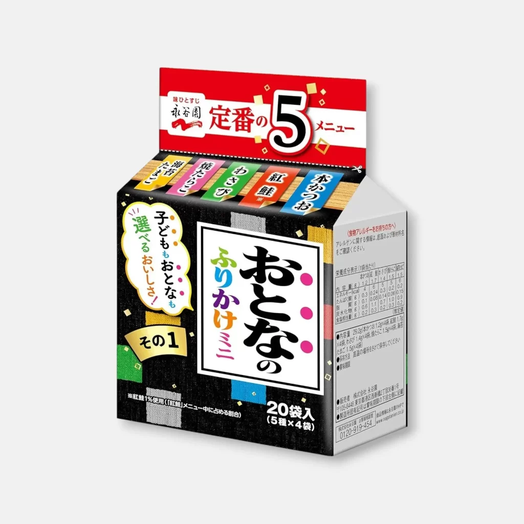
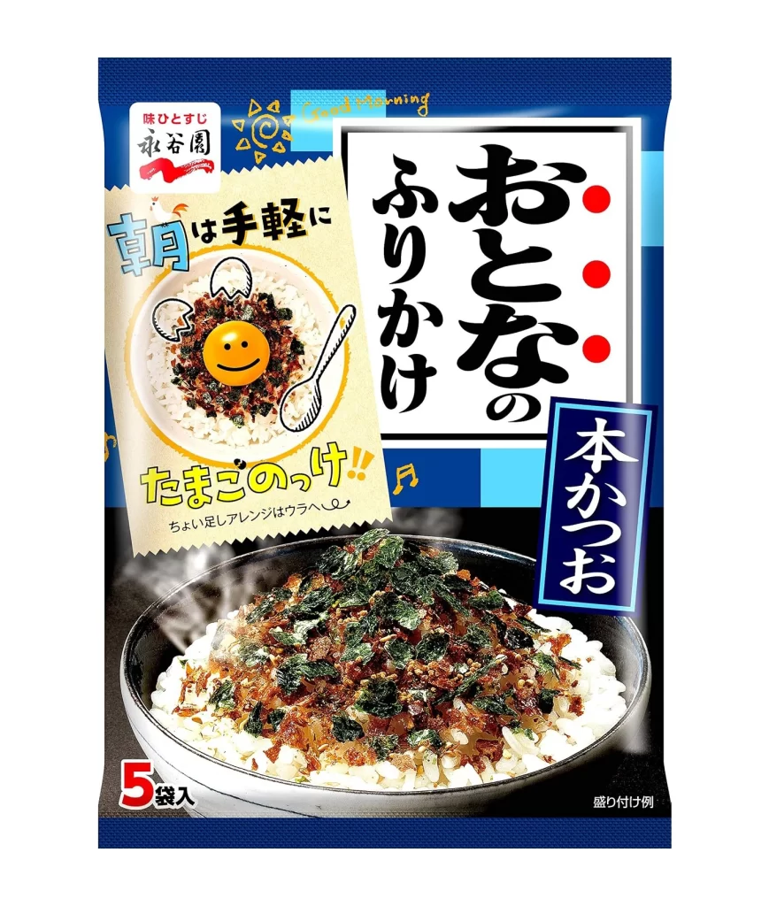
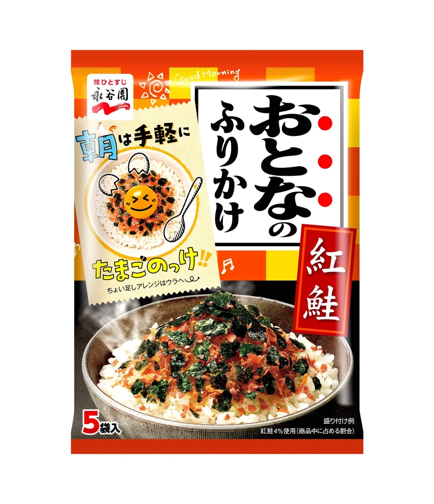
Nagatanien Adult Furikake Bonito Flavor Packaging
Topics
Details
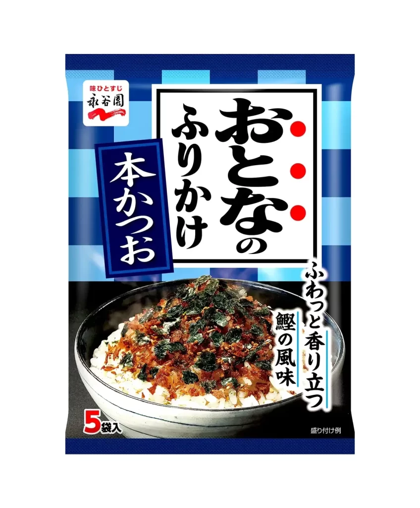
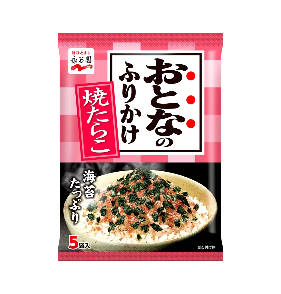
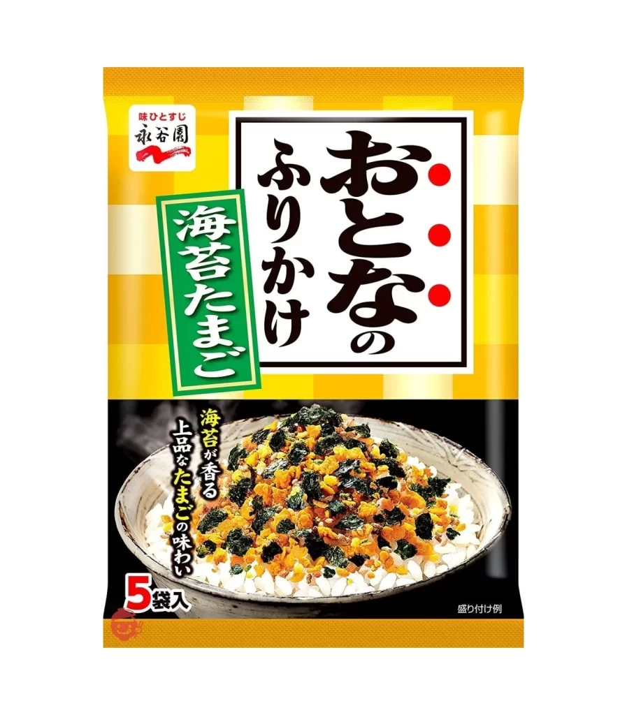
A striking blue and white checkered pattern dominates the upper half of this Nagatanien package, creating a bold geometric backdrop for the central typography. The main product name appears in large, black brush-stroke kanji characters within a white rectangular frame, accented by three red dots on the right side. Below the text, a photographic image of steamed rice topped with dark green seaweed flakes sits in a ceramic bowl against a solid black background, while a vertical blue banner to the left displays white text reading 'Honkatsuo'.
The visual tension between the rigid grid of the background and the organic, calligraphic quality of the Japanese lettering creates immediate graphic interest. This specific 'Adult' variant distinguishes itself through its sophisticated navy palette and the prominent display of bonito flavor, signaling a more mature taste profile compared to standard children's furikake. The composition balances traditional elements like the seal logo in the top corner with modern packaging aesthetics, making it a compelling study in contemporary Japanese food branding.

Brand strategists analyzing Asian market trends would find value in examining how color psychology is applied here to differentiate product lines within the same company. Illustrators working on food-related projects could study the interplay between photography and typography to understand how appetite appeal is maintained alongside informational hierarchy. Cultural researchers documenting modern Japanese culinary packaging might reference this as an example of how traditional ingredients are repositioned for adult consumers through deliberate design choices.