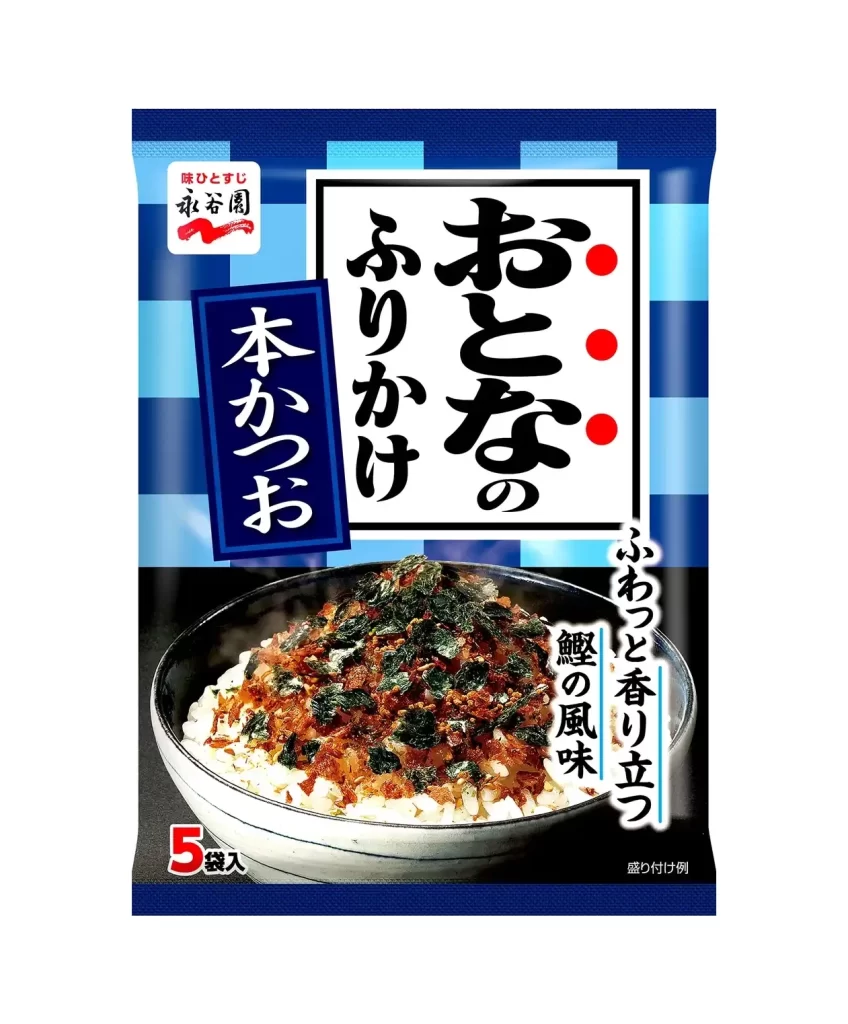
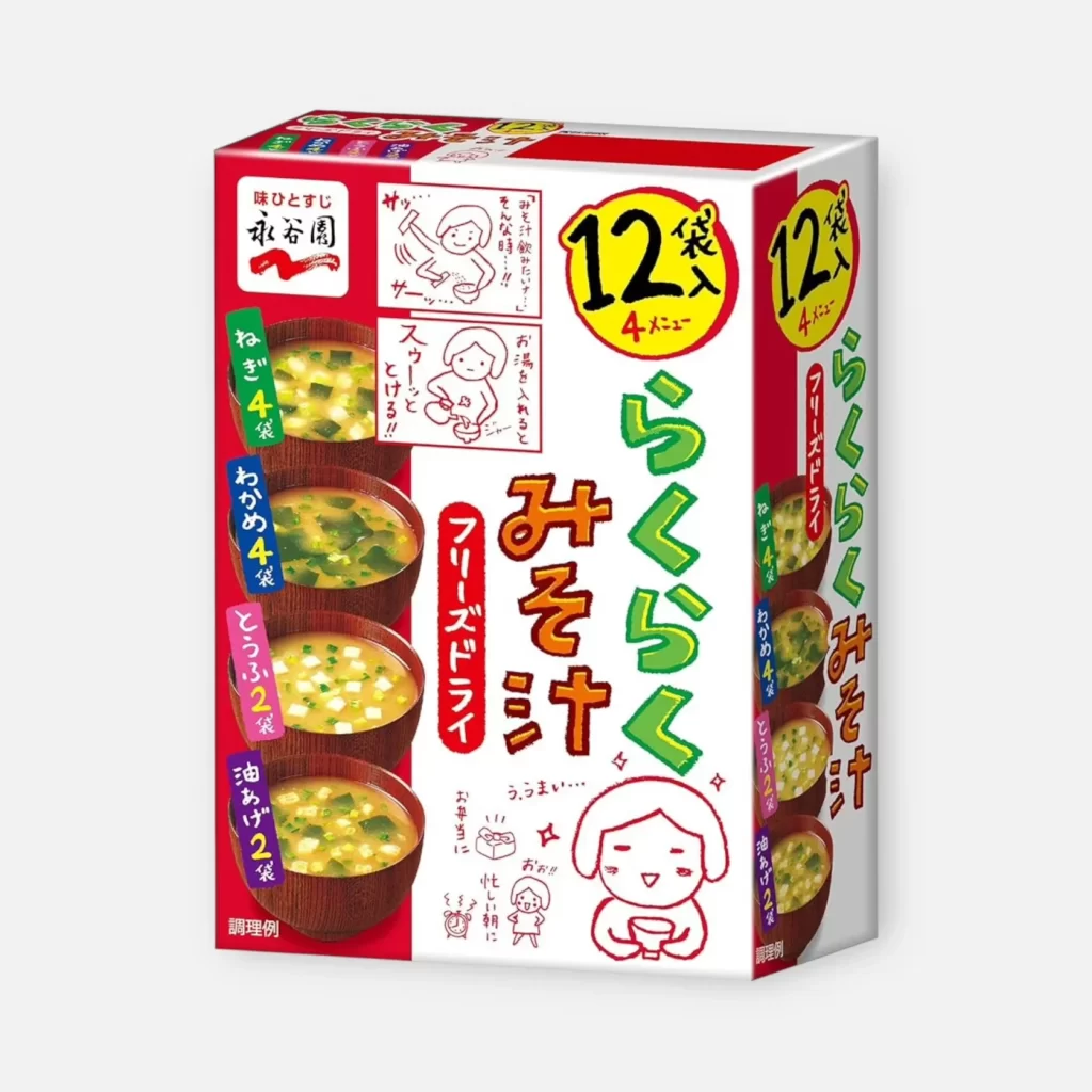
Nagatanien Furikake 5 Menu Assortment Packaging
Topics
Details
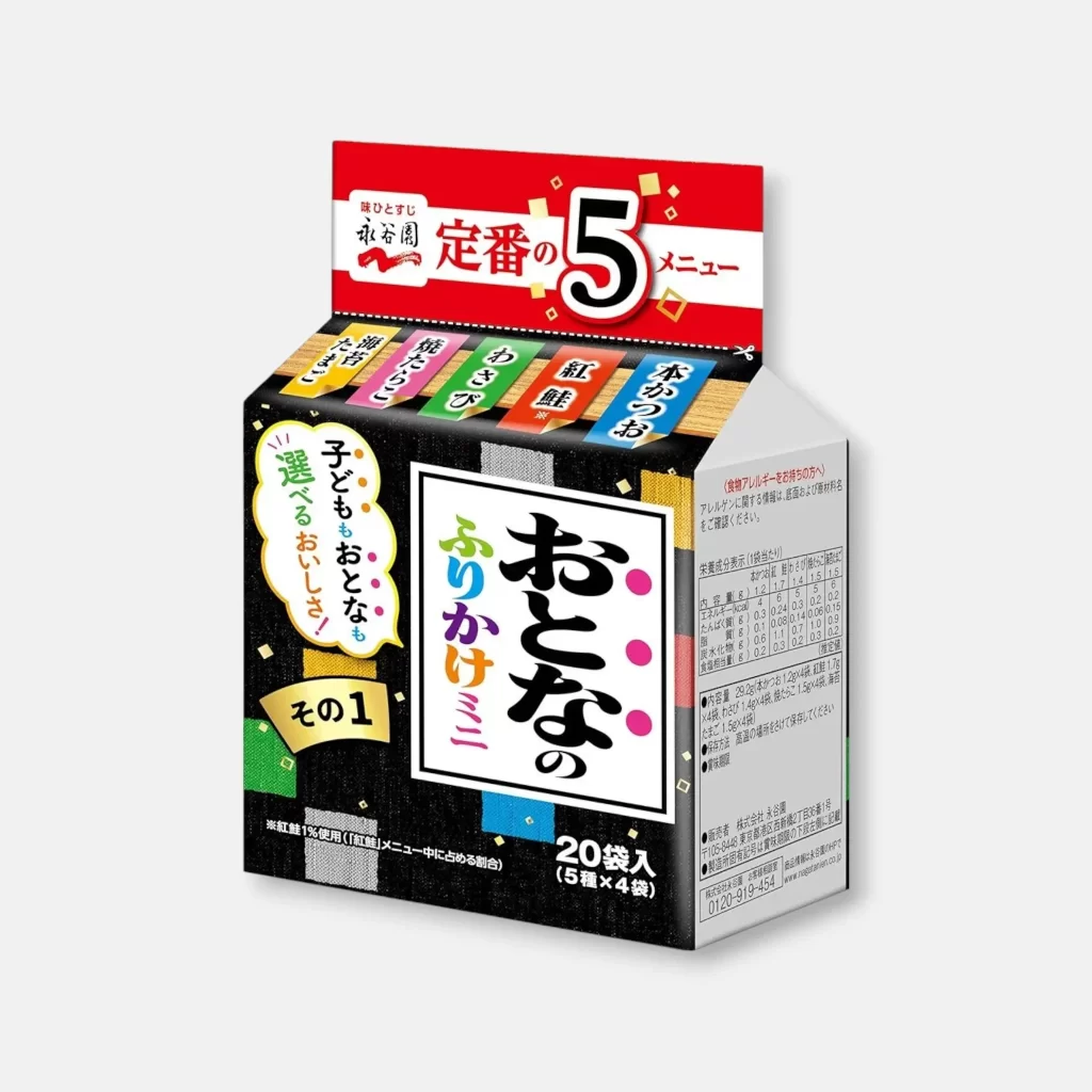
A rectangular gable-top carton angled to reveal its front and right-side panels dominates the frame, resting on a neutral white surface. Deep black packaging featuring a subtle textured grid pattern provides high contrast for the central white square containing the bold, black calligraphic characters for 'Otona no Furikake.' The right panel displays detailed nutritional information in a dense table format, while the top red header announces 'Teijo no 5 Menu' (Standard 5 Menu) alongside the Nagatanien brand name.

Visually, the design leverages a sophisticated interplay between traditional Japanese typography and modern, pop-art graphic elements to target an adult demographic. The use of a dark, matte background allows the neon-bright accent colors of the menu tabs and the multi-colored vertical text on the main label to vibrate with intensity. Furthermore, the inclusion of organic shapes, such as the scalloped yellow speech bubble containing promotional copy, breaks the rigid geometry of the box, creating a dynamic visual hierarchy that guides the eye from the brand promise at the top down to the specific product identity.
Brand strategists and packaging engineers would utilize this reference to analyze how color-coding systems can effectively differentiate multiple SKUs within a single retail unit. Additionally, typographers might study the balance between the heavy brush-stroke weight of the primary logo and the lighter, more utilitarian fonts used for regulatory information. For those involved in commercial photography, this image serves as a benchmark for how soft, diffuse lighting can eliminate harsh shadows on glossy laminated surfaces while maintaining legibility across complex text layouts.