Dinshaw’s Toasted Snack Pouch
Topics
Details
Against a saturated red background, four flexible snack pouches are arranged in a diagonal row, alternating between orange and white packaging. The white bags feature the brand name 'Dinshaw's' in red cursive above the green text 'TOAST TUTTI FRUTTI', while the orange variants display 'KHARI' in bold brown letters beneath the same logo. Each package showcases a large, stylized letter 'D' formed from the actual snack product—either a ring-shaped biscuit with red fruit bits or a flaky, layered pastry—surrounded by smaller photographic cutouts of rectangular toasts and puffed squares.
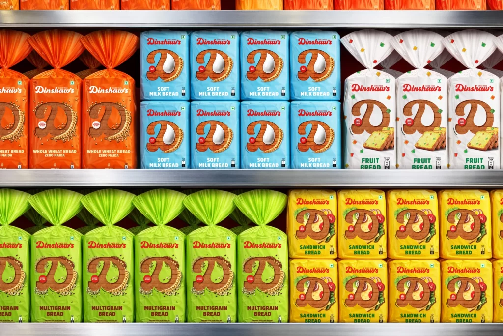
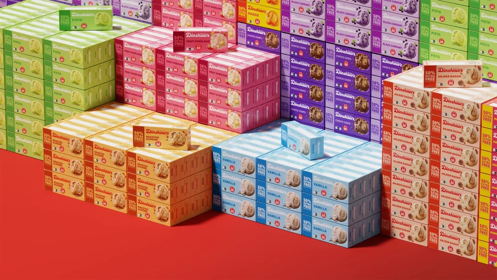
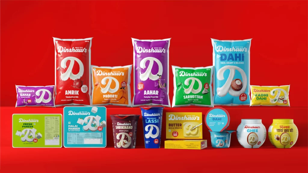
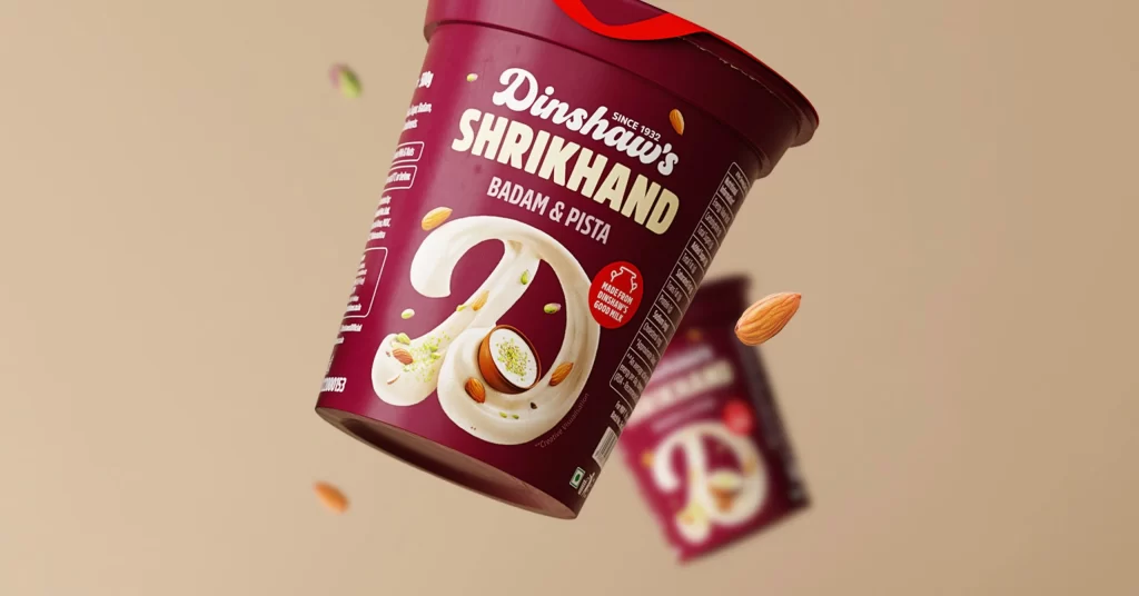
Visual distinction arises from the clever integration of typography and product photography, where the initial of the brand name is literally constructed from the edible item itself. The color-coded system creates immediate flavor differentiation, with the warm orange palette suggesting savory khari and the clean white background emphasizing the sweet tutti frutti variant. Small graphic elements like scattered red squares and circular badges indicating 'MULTI GRAIN' add texture without overwhelming the central product imagery.
Packaging designers studying FMCG branding could analyze the balance between photographic realism and graphic elements in this layout. Marketing teams developing snack product lines might reference the color-coding strategy for organizing flavor variations within a unified brand family. Art directors planning food photography shoots could examine how the oversized letterform creates a memorable visual anchor while simultaneously demonstrating the product's physical characteristics.