Dinshaw’s Bread Bag
Topics
Details
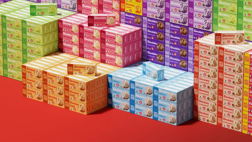
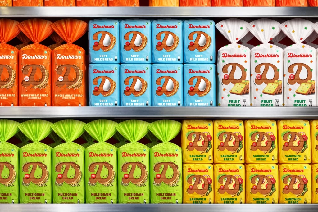
Arranged across two metallic supermarket shelves, a vibrant spectrum of Dinshaw's bread packaging creates a grid-like composition of saturated color blocks. The upper tier displays deep orange whole wheat bags, light blue soft milk bread cartons, and white fruit bread packages adorned with multicolored confetti dots, while the lower shelf features bright lime-green multigrain bags and sunny yellow sandwich bread. Each package prominently features a stylized brown 'D' logo containing a bread slice illustration, with product names rendered in red serif typography against their respective background hues, all captured from a straight-on perspective under even, shadowless retail lighting.
Visual distinction emerges from the systematic color-coding strategy that differentiates each bread variety at a glance, transforming functional grocery items into a cohesive chromatic study. The contrast between the crinkled plastic textures of the loaf bags and the rigid rectangular geometry of the soft milk bread boxes adds tactile variety to the display. Consistent branding elements—the circular D-mark, red badge accents, and standardized typographic hierarchy—unify the diverse palette into a recognizable family while allowing individual products to maintain distinct visual identities through their signature background colors.
Packaging designers analyzing retail shelf presence would examine this reference to understand how color psychology influences consumer navigation within bakery aisles. Brand identity specialists might study the logo scalability and typographic consistency across different substrate materials and package formats. Environmental artists constructing contemporary grocery store scenes could utilize these specific hue values and material finishes to achieve photorealistic accuracy in their virtual environments.