Dinshaw’s Ice Cream Box
Topics
Details
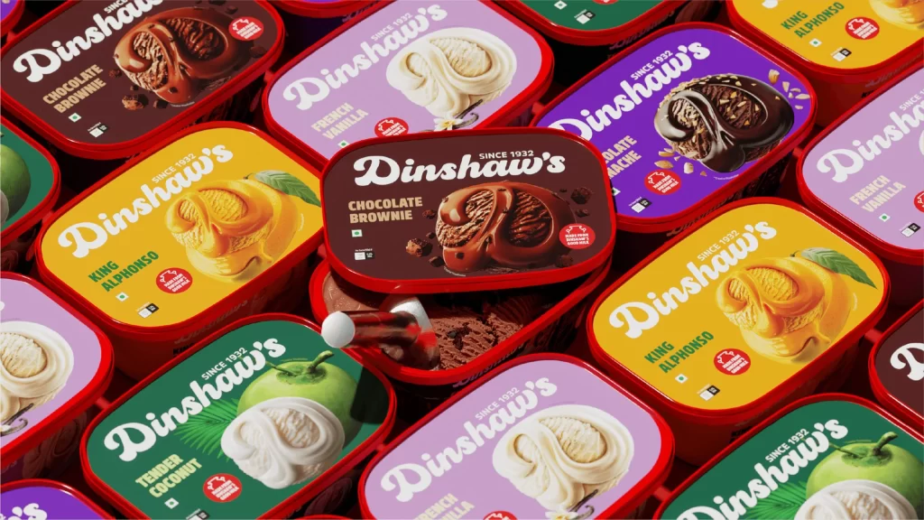
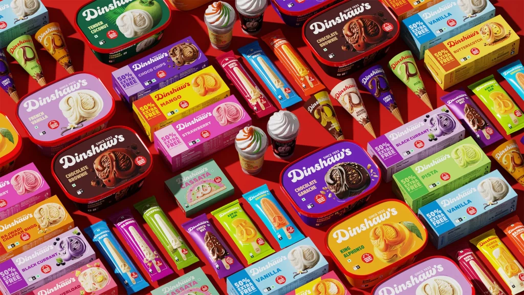
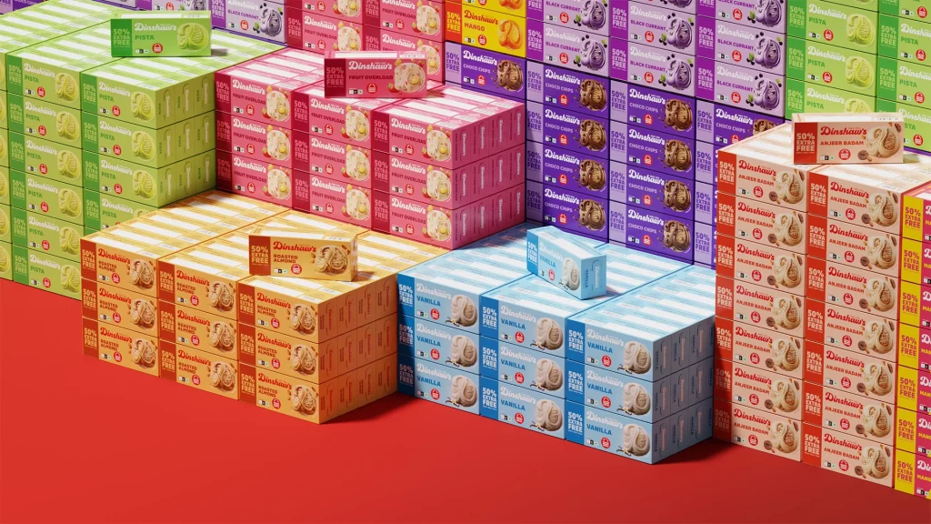
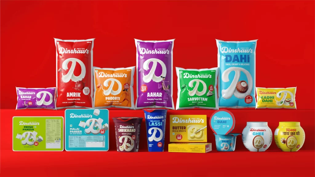
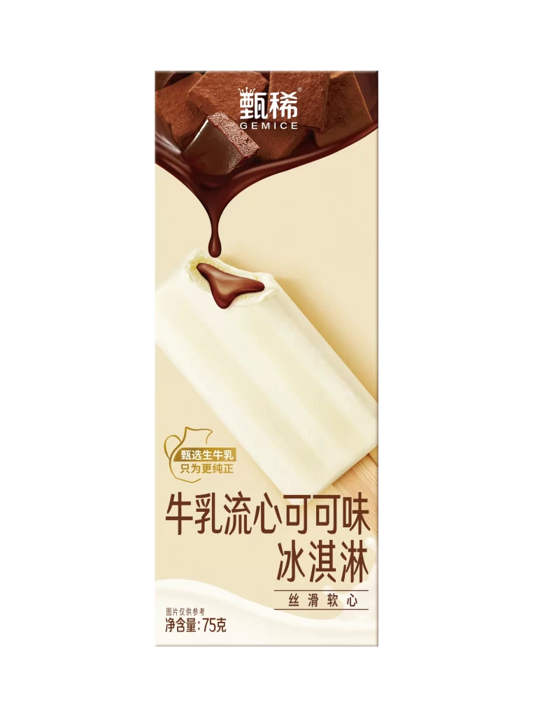
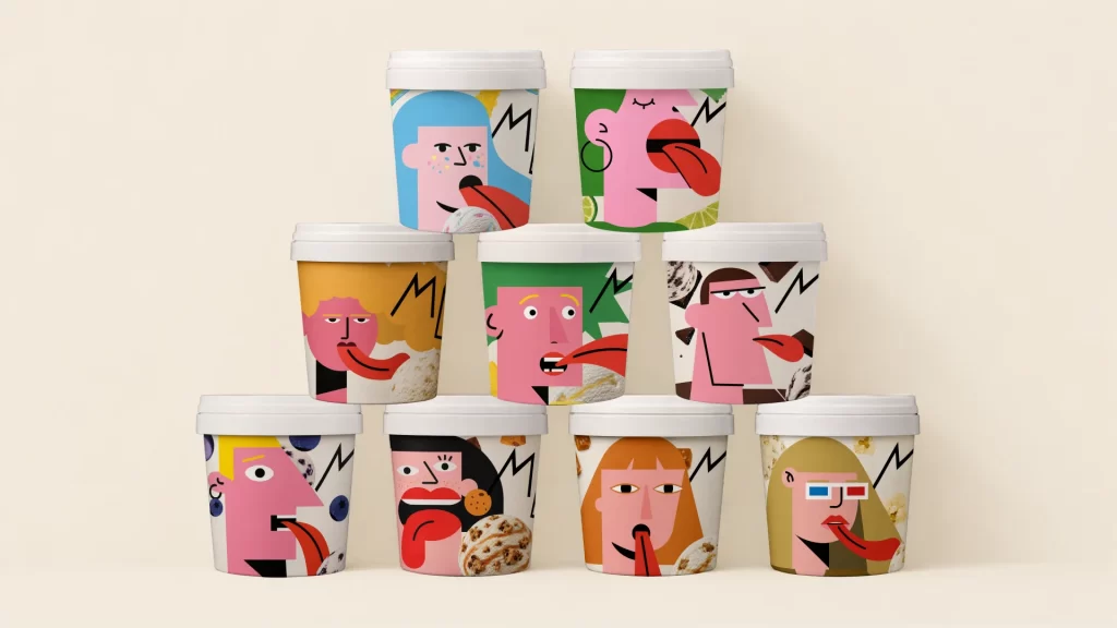
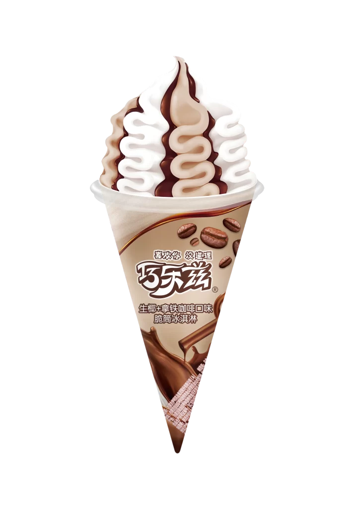
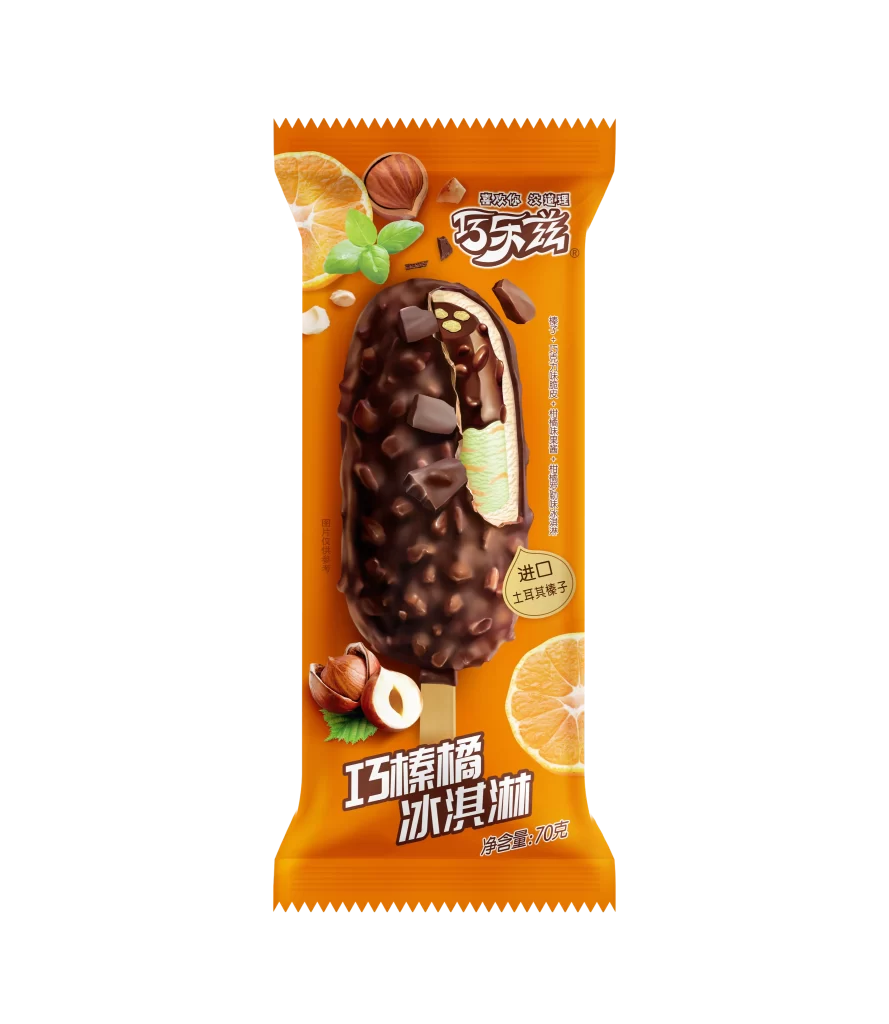
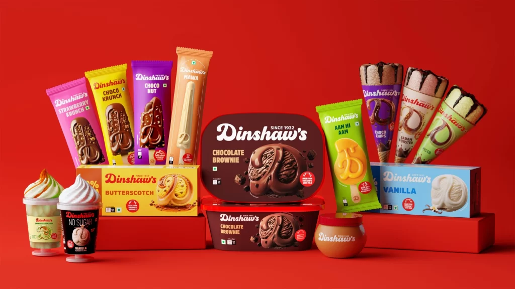
A saturated crimson backdrop anchors this commercial product arrangement, where a tiered red platform elevates an extensive lineup of frozen desserts. The composition features cylindrical tubs, rectangular cartons, and conical wrappers displaying vivid magenta, canary yellow, deep violet, and forest green packaging, each emblazoned with the 'Dinshaw's' logotype in white serif lettering. Soft directional lighting from the upper left casts gentle shadows beneath each item, emphasizing the glossy finishes of the plastic containers and the matte textures of the cardboard sleeves while maintaining a straight-on camera perspective that presents every label legibly.
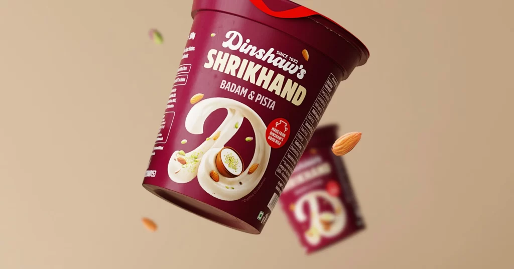
Visual hierarchy emerges through the strategic deployment of complementary color contrasts, particularly the way the chocolate brownie tubs interrupt the spectrum of brighter hues to anchor the central focal point. Typography varies significantly across the range, utilizing bold sans-serif fonts for flavor identifiers like 'CHOCO NUT' and 'BUTTERSCOTCH' while reserving elegant script for the brand name, creating a readable yet dynamic information architecture. The physical diversity of the packaging formats—from the tall slender stick-bar wrappers to the squat wide-mouthed jars—demonstrates how dimensional variety can prevent visual monotony within a unified product family.
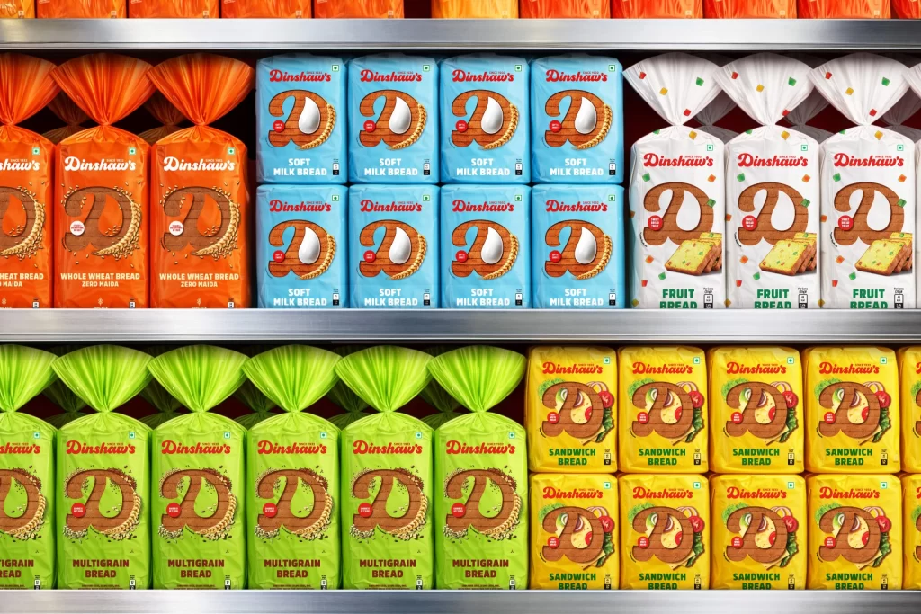
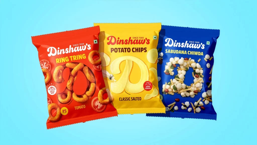
Brand strategists examining cohesive identity systems across multiple SKUs would find this arrangement useful for analyzing color-coding consistency and typographic scaling. Packaging designers tasked with developing frozen-food line extensions could reference the balance between appetite appeal photography and mandatory nutritional labeling placement. Retail merchandising teams planning point-of-sale displays might study the elevation differences and spatial grouping to optimize shelf visibility for premium versus standard product tiers.