Dinshaw’s Toasted Snack Pouch
Topics
Details
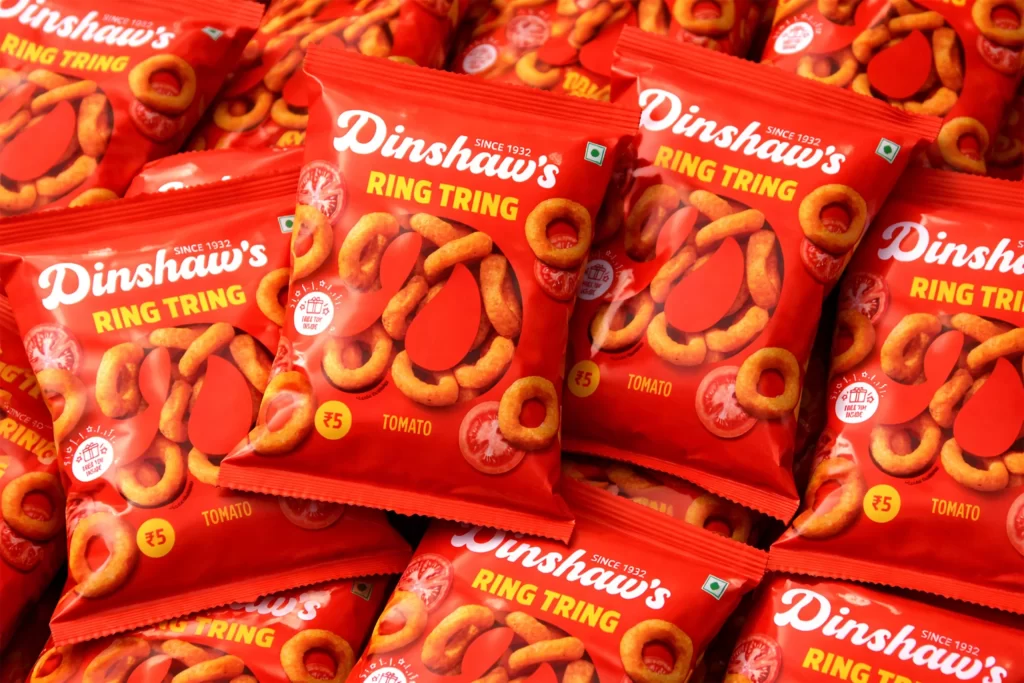
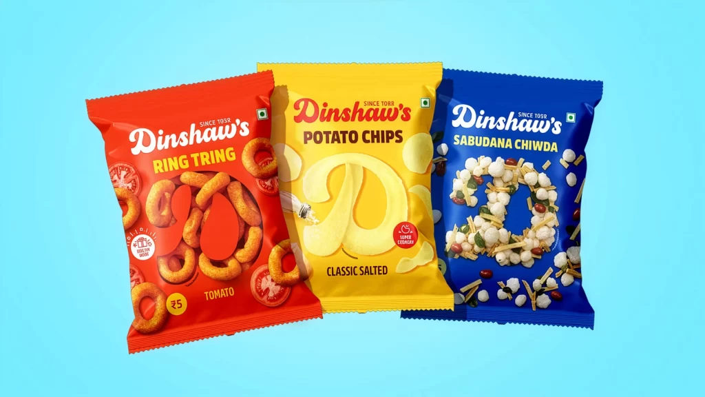
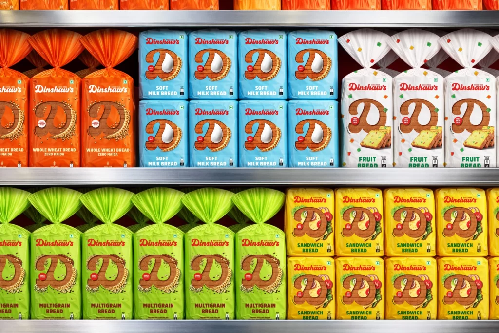
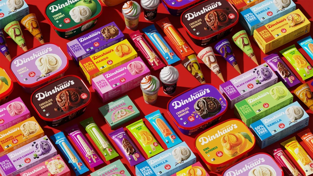
Four flexible pouches of Dinshaw's snacks fan out diagonally across a saturated crimson field, creating a rhythmic visual cadence from left to right. The packaging alternates between vibrant orange and crisp white backgrounds, each featuring a large, stylized letter 'D' formed by the actual baked product—either flaky golden Khari rings or rectangular Tutti Frutti toast studded with ruby-red candied fruit bits. Bold serif typography in deep red and forest green spells out the brand heritage with 'Since 1932' positioned above the product names, while scattered square confetti and floating snack fragments add dimensional depth to the flat-lay composition.
Visual hierarchy is established through the ingenious integration of typography and product photography, where the edible items themselves construct the brand's initial letterform. The color palette leverages high-contrast complementary tones—warm orange against cool white—to differentiate flavor variants while maintaining cohesive brand recognition through consistent logo placement and badge elements. Subtle drop shadows beneath the three-dimensional snack illustrations create a tactile quality that suggests crunch and freshness, bridging the gap between graphic design and sensory expectation.
Packaging designers studying FMCG branding strategies would examine this layout to understand how historical legacy markers can coexist with contemporary appetizing photography. Marketing teams developing snack product lines could reference the alternating color-coding system to organize flavor variations within a unified retail display presence. Food stylists and commercial photographers might analyze the lighting techniques used to render the buttery textures of the Khari pastry and the jewel-like transparency of the Tutti Frutti inclusions for their own advertising campaigns.