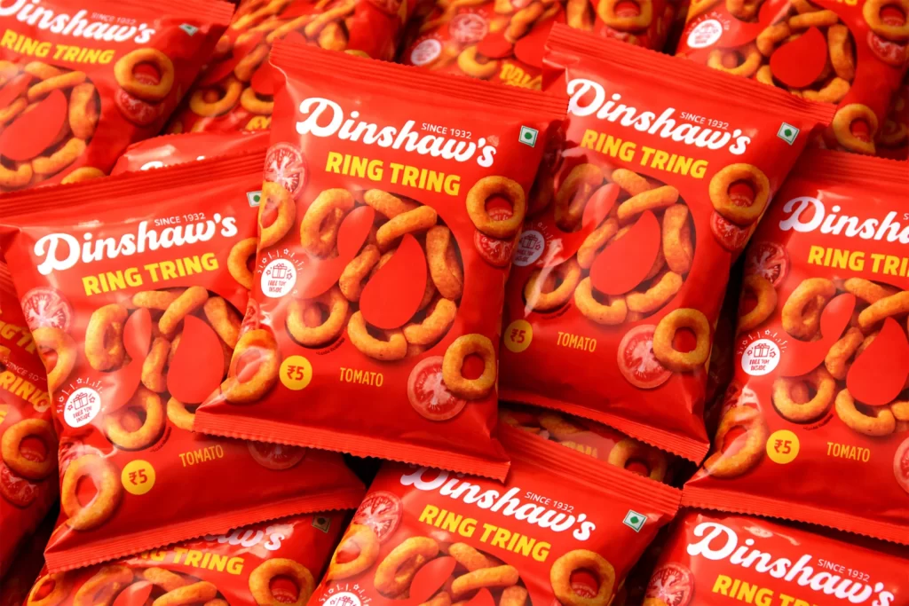
Dinshaw’s Ring Tring Bag
Topics
Details
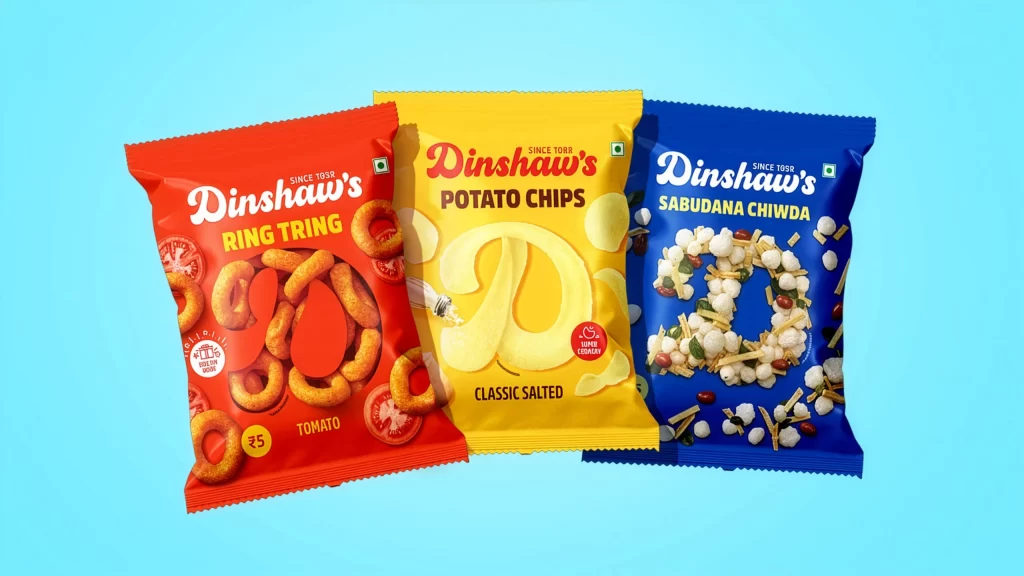
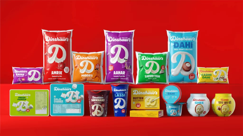
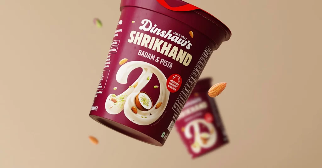
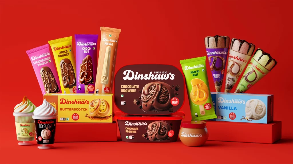
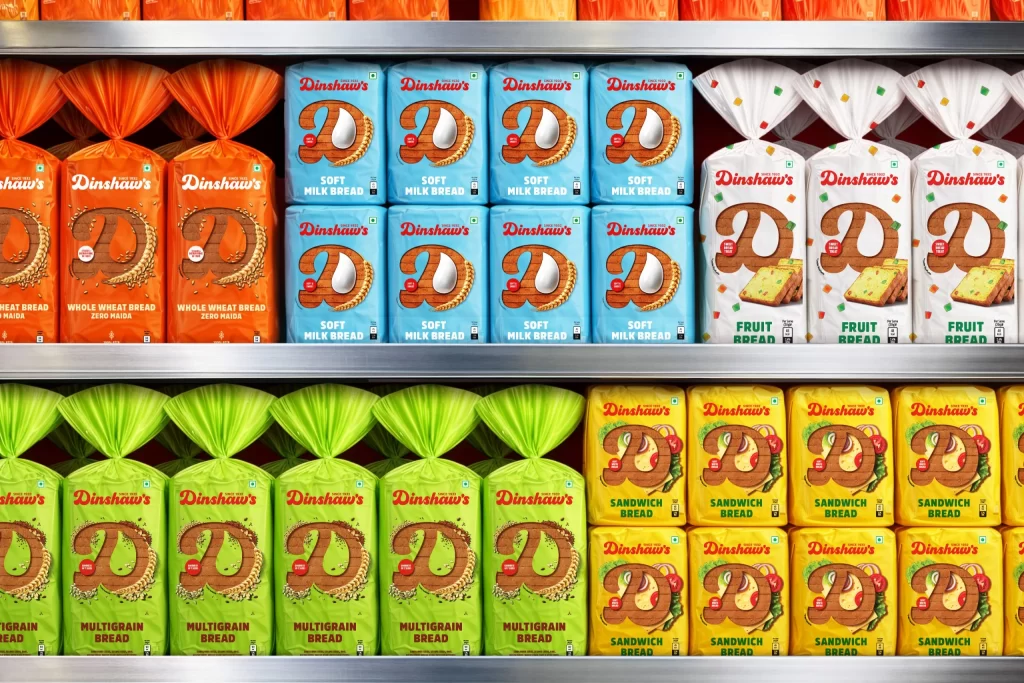
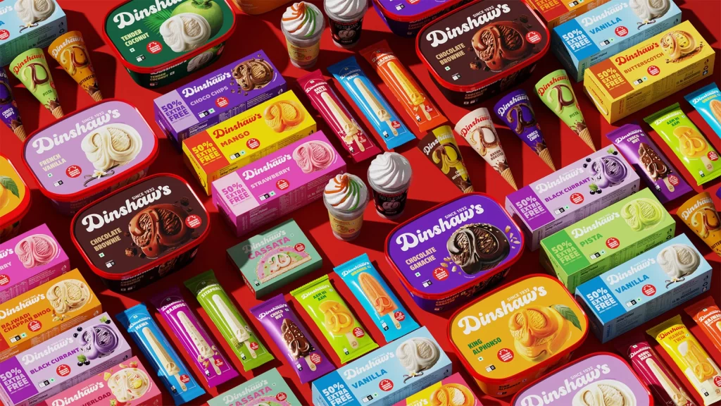
Vibrant red foil packets dominate the frame, each emblazoned with the white cursive script 'Dinshaw's' and the bold yellow sans-serif 'RING TRING' beneath it. Golden-brown onion rings and sliced tomato graphics cluster across the glossy surface, while a small green Indian flag icon and the text 'SINCE 1932' anchor the upper right corner. Shot from a slightly elevated angle, the composition layers these snack bags in a dense, overlapping arrangement that fills the entire background, creating a sea of saturated crimson under bright, even lighting that highlights the crinkled texture of the packaging material.
The visual impact stems from the aggressive color blocking between the primary red background and the high-contrast yellow typography, which ensures immediate shelf visibility. Circular motifs repeat throughout the design—from the actual ring-shaped snacks depicted to the tomato slices and the ₹5 price badge—creating a cohesive geometric rhythm that guides the eye across the package. This particular tomato-flavored variant employs a specific palette of warm oranges and deep reds that suggests both appetite appeal and brand consistency across the product line.
Packaging designers studying FMCG branding might analyze the typographic hierarchy and color psychology employed here to balance heritage messaging with modern snack aesthetics. Photographers working on commercial food shoots could reference the lighting setup and shallow depth-of-field technique used to keep multiple units in focus while maintaining text legibility. Marketing teams developing regional product lines for the Indian market would find value in examining how cultural markers like the flag icon and rupee pricing integrate seamlessly into the overall visual identity without disrupting the core brand language.