Dinshaw’s Label
Topics
Details
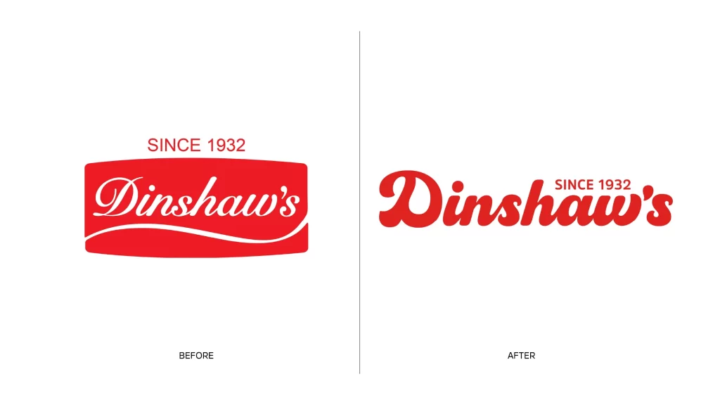
Split down the middle by a thin vertical line, this visual comparison presents two distinct iterations of a brand identity against a clean white void. On the left, a vibrant red rounded rectangle houses the word 'Dinshaw's' in an elegant white cursive script, underscored by a sweeping white curve and topped with 'SINCE 1932' in small red capitals. The right side abandons the container shape entirely, rendering the same brand name in a bold, chunky red serif typeface with the founding date tucked neatly beside the apostrophe-s.
What strikes the eye immediately is the shift from a badge-like emblem to a pure typographic mark, signaling a move toward modern minimalism. The original design relies on the high contrast of white lettering within a solid red field to create a classic, almost vintage label aesthetic. By removing the background shape and switching to a heavy red font, the updated version gains more versatility and a contemporary feel while retaining the brand's signature color.
Brand strategists and logo designers might study this evolution to understand how heritage companies can refresh their visual identity without losing recognition. Marketing teams could analyze the typography choices when planning their own rebranding efforts, particularly for food and beverage sectors. Students of graphic design will find value in comparing how the same textual information can be rearranged for different eras and applications.