Dinshaw’s Potato Chip Pouch
Topics
Details
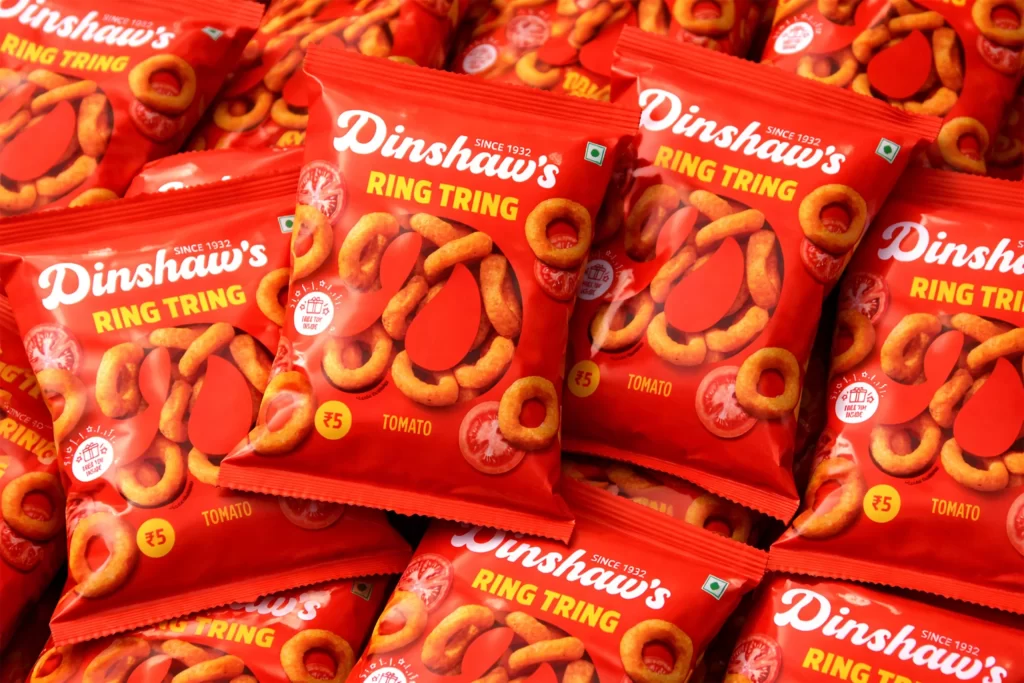
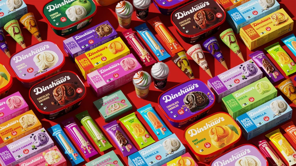
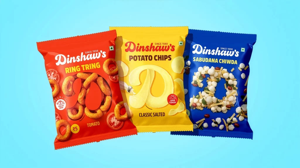
Against a solid cyan backdrop, three crinkled snack pouches stand in a slight arc, each angled to reveal its front face. The leftmost bag glows with a saturated red hue, displaying the brand name Dinshaw's above the product title Ring Tring, accompanied by golden-brown onion ring graphics and a ₹5 price tag. Centered is a bright yellow package labeled Potato Chips Classic Salted, featuring a large stylized letter D and translucent chip illustrations, while the rightmost deep blue pouch presents Sabudana Chiwda with white sago pearls and nut fragments scattered across its surface.
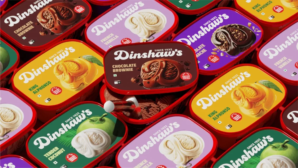
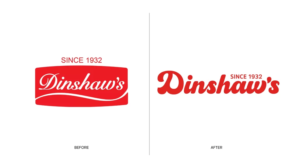
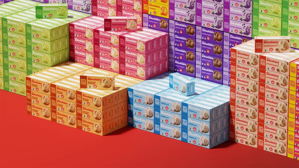
Visual hierarchy relies on bold, contrasting primary colors that immediately differentiate the flavor profiles within this product line. Each package employs distinct typographic treatments and photographic food elements—rings, flat chips, and spherical grains—to communicate texture before the consumer even opens the seal. The consistent placement of the brand logo and the 'Since 1958' heritage mark creates a unified family identity despite the varied color schemes and graphic motifs used for individual items.
Packaging designers studying snack-food branding can analyze how color psychology is applied to distinguish savory flavors across a single manufacturer's catalog. Marketing teams might reference these layouts when planning point-of-sale displays that require immediate shelf recognition through shape and chromatic coding. Students of commercial illustration could also examine the integration of realistic food photography with vector typography to create appetizing yet clean retail presentations.