Dinshaw’s Storefront Signage
Topics
Details
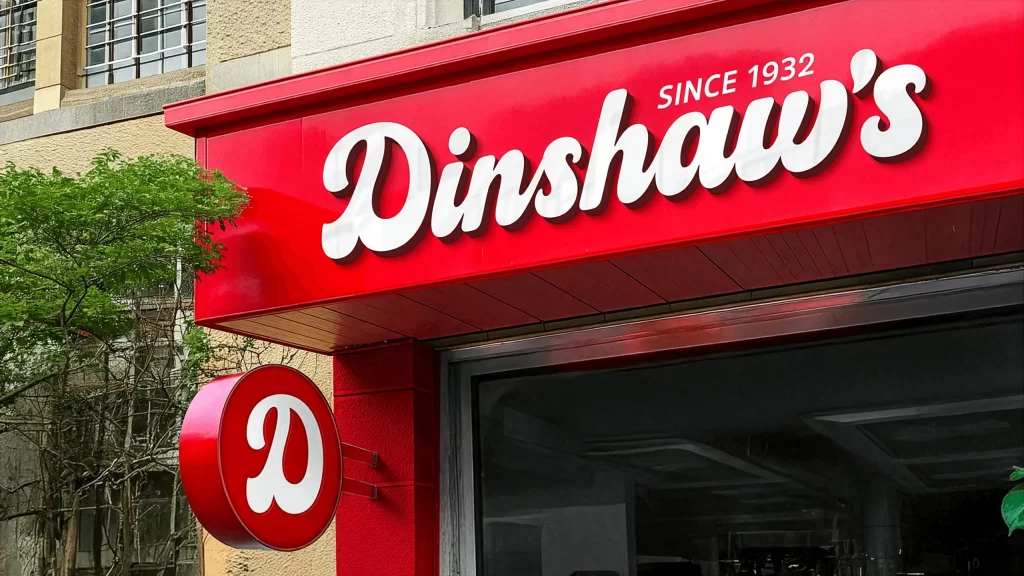
A vibrant crimson fascia dominates the upper portion of the frame, featuring the brand name 'Dinshaw's' in a thick, white, retro-style cursive script. Positioned in the upper right corner of this main sign, the text 'SINCE 1932' appears in a smaller, clean sans-serif font, establishing a sense of heritage. Below and to the left of the main structure, a circular red pendant sign hangs perpendicular to the wall, displaying a matching stylized white 'D'. The background reveals a textured beige building facade with barred windows and lush green foliage peeking in from the left edge, all captured from a slightly low street-level angle under bright, natural daylight.
What makes this signage particularly striking is the high-contrast pairing of the saturated red background against the heavy, rounded weight of the white lettering. The typography choice leans heavily into a mid-century aesthetic, utilizing soft curves and varying stroke widths that evoke a sense of nostalgia and approachability. Furthermore, the physical depth of the signs—evident in the drop shadow cast by the 3D letters and the thickness of the circular hanging emblem—adds a tangible quality that flat digital designs often lack.
Brand identity specialists studying legacy retail aesthetics would find this composition invaluable for understanding how to balance historical cues with modern visibility. Environmental graphic designers tasked with creating storefronts for bakeries or ice cream parlors could look here to see how bold color blocking draws the eye from a distance. Additionally, illustrators working on urban scenes might utilize the specific interplay between the rigid rectangular main sign and the organic shape of the hanging circle to add visual rhythm to their architectural renderings.