Dinshaw’s Donut Box
Topics
Details
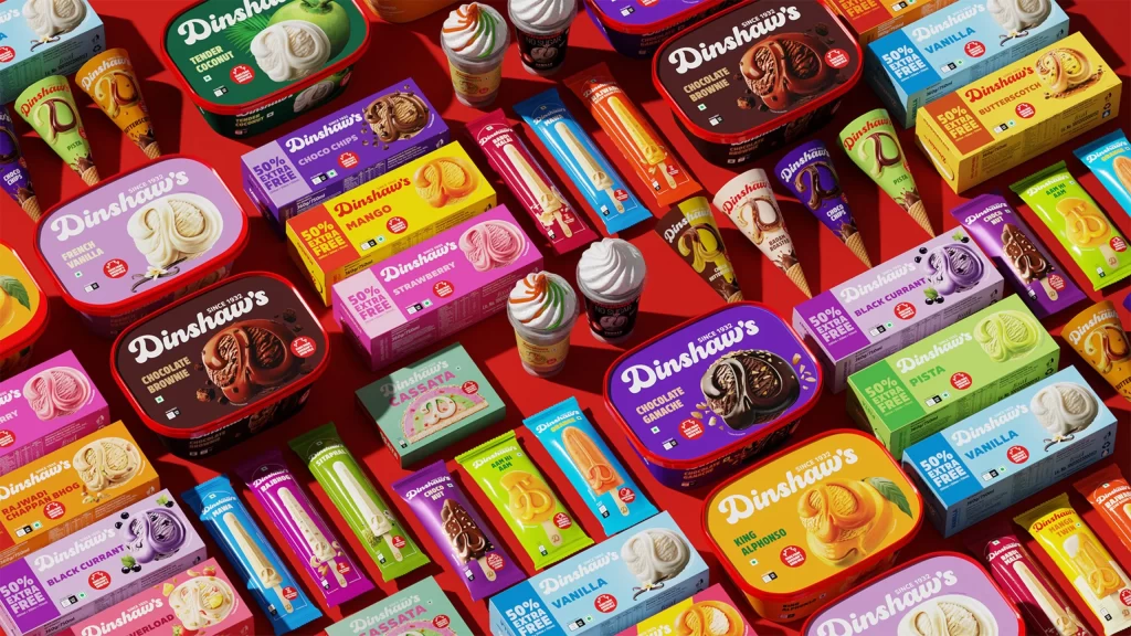
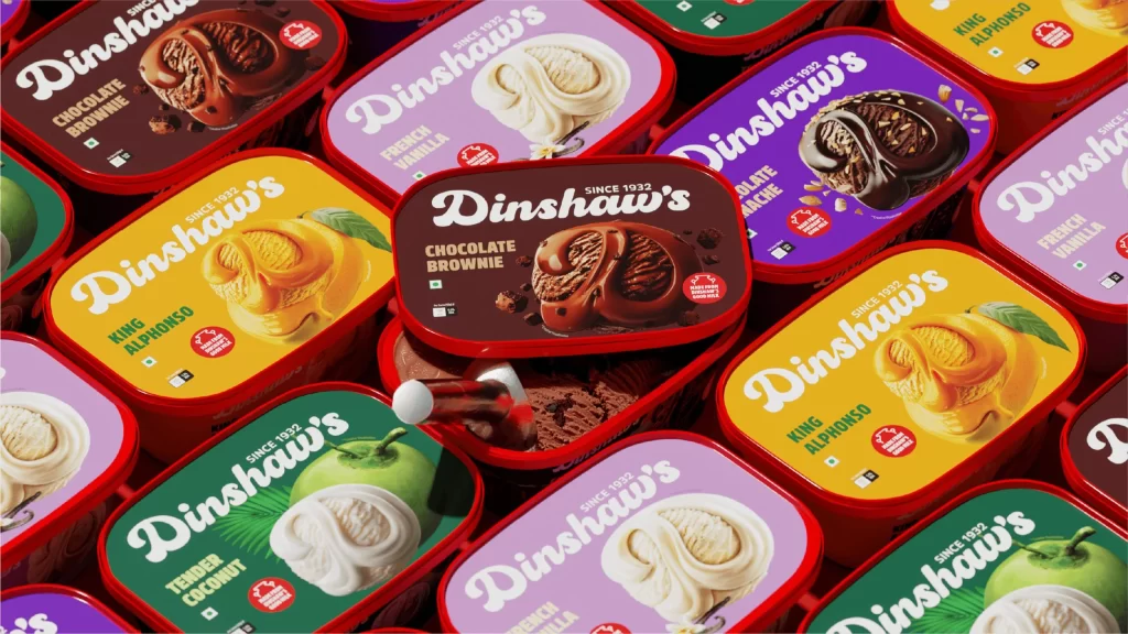
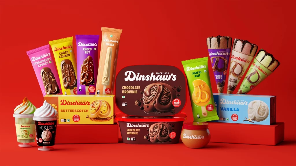
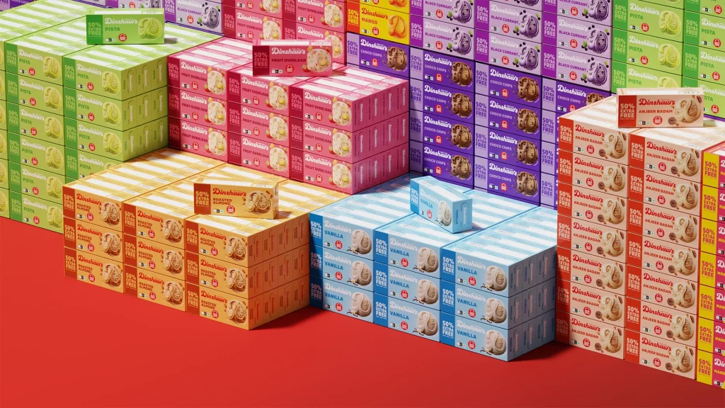
Against a bold red backdrop, a vibrant mosaic of Dinshaw's ice cream cartons creates a striking geometric landscape. The composition features rectangular boxes in distinct color families—lime green, soft pink, deep purple, warm orange, sky blue, and creamy white—each stacked in neat pyramids that recede into the distance. Visible text includes 'Dinshaw's' in elegant script, '50% Less Sugar' badges, and flavor identifiers like Vanilla, Choco Chips, and Black Current, all printed on what appears to be glossy cardboard with subtle highlights suggesting studio lighting from above.
What makes this arrangement particularly compelling is the systematic use of color psychology to differentiate product lines while maintaining brand cohesion. The diagonal placement of individual boxes atop each stack draws the eye across the frame, creating a dynamic rhythm that transforms commercial packaging into an abstract art piece. Each hue serves as a visual shorthand for its contents, making the entire display function as both a practical inventory showcase and a study in chromatic organization.
Packaging designers studying retail shelf presence would find this layout invaluable for understanding how color blocking influences consumer navigation. 3D artists working on supermarket environments could utilize these specific proportions and stacking patterns to achieve photorealistic results. Marketing teams planning physical store displays might reference these pyramid formations to maximize visual impact within limited floor space, while brand strategists could analyze the typography hierarchy to refine their own packaging communication systems.